
*ooof*: Tie me up, tie me down
Hello everyone. Guylty here. Before I launch into my first ever blog post on me+richard, please let me say how thrilled I am to have been invited to contribute to Servetus’ blog. It is – believe it or not – a bit of a dream come true. Because like many of you, me+richard was one of the first blogs in Armitageworld that I encountered when RAddiction hit me and I had to start supplying my expensive habit with a daily dose of raw RA. For those of you esteemed readers who are unfamiliar with the *ooof* of the day, here’s a little intro.
*ooofs* are – as suggested by the name – pictures of Armitage that make you go *ooof*: drool-worthy, ovary-threatening, stomach-fluttering images of Armitage in character or as himself. I try to *ooof* only such shots which originate from professional photography. I do not mind whether they are studio-based or event work, but I try to discuss professional work only. That is not because I am snobbish about pro-photographer work. The reason I am concentrating on their work is, that the resulting images can be considered deliberate and planned portraits (whereas much amateur stuff – no offence – must be considered incidental…) and therefore a critique of their technique, message and concept is fair. You are very welcome to respond to my interpretations in the comments. I will always try to answer your questions or reply to your critiques. And I would be thrilled if you had suggestions for a favourite RA image to begiven the *ooof* treatment.
For my first *ooof* on me+richard, I am turning to a familiar image – as it happens to be part of the blog design on me+richard.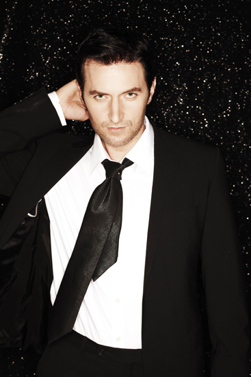
What have we got here? This is an image from a photoshoot that appeared in the Daily Mail in 2009, shot by photographer David Venni. We have Armitage standing in front of a dark backdrop, a smoulder of medium intensity on his face and his body in an intriguing pose. For me, this is the quintessential *ooof* – the first image of Armitage’s, actually, that I could not resist saving on my desktop. For the purpose of this *ooof* I asked myself why exactly I love this photo so much and studied it extra-intensely *coughs*. (Someone has to do it, you know.) It took me a while to figure out why this shot stands out for me. After all, there are plenty of hot-smoulder shots of Armitage out there. Particularly the cropped version of the image is used much more ubiquitously than the half-length portrait. And yet it is the version that includes Armitage’s torso that I find much more evocative.
Initially I thought it was the lighting in the shot that drew me to it: Interestingly and unusually for most Armitage portraits, there is rather little evidence of shadow in this photo. The light in this set-up seems to come from pretty much straight-on. There is no particularly strong tell-tale shadow under his nose, under his brow, under the tie and particularly none at all where it usually always catches him – on his characteristically angular forehead. Normally, even in shoots that were lit from straight on, there always appeared two shadows on Armitage’s temples. In this one: none. That kind of effect can be gained by using two strip lights placed to the front right and left of a subject, but looking into Armitage’s eyes (*swoooon*, oh, sorry, ladies, took a look too deep) to study the reflection, it is clear that no striplight has been used, but one single soft box. Curious. Now, this image unfortunately does not come in a high-res version, so I am on unsteady ground here with my analysis. I was tempted to say that there was no Photoshop used on the image. The traces of wrinkles in the corners of his eyes seemed to indicate that. But now I am not so sure – I just cannot believe that the photographer managed to eliminate the forehead shadows with only one softbox – even if he did use a reflector (of which there is no evidence). I suspect, the clone stamp tool has been brushed over Mr Armitage’s features – and done away with some of the lines at the same time.
Admittedly, being turned on by lighting (if you pardon the pun) would be a step too far, even for a photography geek like me. So if it wasn’t the flash that punched me in the solarplexus, then what did? The pose! Because despite all his baddie roles, Armitage is not usually an actor doing saucy poses. (Let’s draw the veil of silence over the Cold Feet shoot from 2003, please.) We see him smoulder and glower to great effect, but in promo shots that represent him and not a character we do not usually see him in a suggestive pose. This one feels highly suggestive to me: Armitage has inclined his head slightly down front, giving us that dead-pan stare which shows plenty of white under his pupils. The predator look. What intensifies the suggestiveness, however, is his raised right arm which he is holding behind his head. He thus exposes his right side – giving access to typical human weak spots such as armpit and organs. At the same time, the supposedly deliberate exposing of his weak spots takes on a hint of teasing. He is boldly staring at us while revealing his body as if to say “I am not afraid of you. I don’t have to defend myself against you. Touch me if you dare.” He has taken his hand away and thus cannot defend himself. On the contrary, he is almost inviting us to look, examine and touch…
And yet, it is just an illusion. Not only is that out of character for our boy (…), but the photo tells me that that was not really an intended message. This image is probably a bit of a lucky fluke! The proof is in the tie. It should be pointing down (No innuendo, ladies!!) but instead it has moved to his right. This is an indication that the photographer has caught Armitage in mid-movement, hence the tie is suspended in the air. Armitage has just moved up his arm to the back of his head. It is quite likely, that he is not really attempting the suggestive pose at all but is merely scratching his head. The result, however, is an almost risqué pose that carries a lot of erotic meaning… And what a delicious one!
There is more to be said about the styling of Armitage and the choice of background. Much of that is a question of personal preference. I am a sucker for black-on-black images – dark haired subjects or dark-suited men on a black backdrop. When they are done well, as in this case, they are highly suggestive and attractive images. They evoke associations of dark and night and all the activities that humans preferably engage in at night *ahem*. Having said that, Mr Armitage could smoulder at me at high noon and he would probably still set my stomach aflutter. And not that I mind – I’m on a constant diet, but not when it comes to delicious eyecandy made by Armitage.
All text © guylty at me+richard, 2012. Please credit when using excerpts and links.


It’s interesting to know that this pose wasn’t intentional. I often wonder if he’s chuckling to himself on unintentional sexy pics…
LikeLike
Chuckle. Yes. Or cringe? He comes across as such a modest man in TV interviews – I sort of assume that he probably does not particularly like posing as Richard Armitage…
LikeLike
Agree.
LikeLike
True.
LikeLike
Thank you so much Guylty! What a wonderful post! So, you don’t like the Cold Feet photoshoot, I take it? I heartily dislike it myself. On the other hand I love,love, love the David Venni photos so much that I even googled David Venni himself to check out his other work. 🙂 Would be nice if he could photograph RA again. Can’t wait to read your next ‘ooof’ post!!!
LikeLike
Same here, Judit – that Cold Feet shoot gave me the shivers, how appropriate… I might do an anti-*ooof* of that at some point. There’s so much wrong with it, I don’t know where to begin. – David Venni? Yes, I have checked him out, too. Nice work. Glad to read that you agree 🙂
LikeLike
I like the question that this raises about the potential limits of representation of a particular subject.
LikeLike
I suppose representation has a limit because it does depend on the subject’s participation in a shoot. As much as a sitter is the “victim” of the photographer’s lens: If you really do not want to be photographed a particular way, you can really ruin it for the photographer. In any case, it shows when a subject is uncomfortable.
LikeLike
I think RA was most definitely uncomfortable during the Cold Feet shoot!! They wanted a beefcake and he is SO NOT a beefcake! I’d be very interested to read your anti-ooof post!
LikeLike
I too would love to read your anti-ooof. My only consolation for that shoot is that seems to be about Lee, not RA. But the result is terribly pretentious, and the subject looks closer to the ‘douchebag’ (is it ok to use this word here?) territory than even Lee 🙂
LikeLike
Loving your analysis! Sort of a serendipitous combination there–the professional photo shoot and the sudden movement that results in a sexier picture than anyone could ever have planned.
LikeLike
Here is a very well-kept secret, straight from the photographic profession: To a large degree, photography depends on luck and is constant problem solving. Cos something always goes wrong… And the (ogling) public never knows, because all they see is that *one* shot, but not the 250 duds… Psssst…
LikeLike
LOL yes, I guess there is a certain amount of luck going on…but it’s the clever photographer who’s there, ready and waiting to click the shutter!
LikeLike
As one who has been a sitter, I know how many rolls of film the photographer shot to get 15 good pictures, roughly one keeper per roll of 36 exposures. I also had a physical problem on the day of the shoot, so the clothing choices were limited and the positions were limited, too.
LikeLike
*lol* Now my mind can be at peace when I’m gonna look through so many photographs I made…
LikeLike
But he does have the tie on the first place, which allows the accidental click.
LikeLike
Not sure if I have caught the causal connection between tie and accidental click, Servetus?
LikeLike
Just that had he not put on that tie in the first place (i.e., styling choices have valence — and it’s distressing how often he’s poorly dressed in professional photos, IMO), there’s no chance that we could catch it swinging and draw conclusions on that basis.
LikeLike
True. Except that the choice to put on that tie was probably not made by him but by a stylist. So there is another factor coming in. In any case – funny how the smallest thing can actually change perception… Mind you, the Army is rather perceptive…
LikeLike
But in the end, this wasn’t a shot for a specific character — in that sense it’s not like Lee, where those excruciating photos are supposed to connect the actor to the character. IIRC this was a shoot to accompany publicity for the second season of Spooks; but he’s clearly not Lucas North here (and that publicity all had stills in which he was dressed as LN as well). Presumably, he could have said “no, I don’t want to wear a dark suit, tie, and white shirt.” (I don’t know why he would have, specifically, in this case.)
LikeLike
I am relieved that a photo expert thinks this pose wasn’t intentionally but he was merely scratching his head, because I hate his shot. I usually hate all the posed pics with a fake smoulder. He is a great actor and a great guy when he is just being himself but I don’t think he is a good model, at least not when he’s trying to be sexy. He is too much aware of the camera and I think it still shows after all those years that he doesn’t like it. In character he can smoulder like no other and who knows if he would smoulder in a really private situation, but it is not in character for him to smoulder when he’s among relative strangers and looking into the camera. It looks awkward. And I am afraid the “suggestive” pose makes it even worse. There are some pics from the same photoshot when he looks more like he behaving as he would as himself that I much prefer.
Among the recently released Hobbit pics are some that are truly breathtaking and they are all either from the movie itself or behind the scenes shots when he’s not aware of the camera. Pics of him running and screaming are great as are those of him concentrating or in the make up chair. But there are two with a grey background that are clearly posed (I think a headshot from that is used for the big dwarf poster) with the fake awkward smoulder that I really dislike.
LikeLike
I have to admit, Jane, that I always fall victim to the smoulder. And I am also quite receptive to the suggestive pose, at least when it comes to RA. Never mind that I agree with you that Armitage probably does not particularly enjoy putting on the predator look unless in character. I sympathise with that and it is something that makes me like him a little bit more.
LikeLike
Fascinating analysis, Guylty. I always had the impression that Richard was lying down on top of that starry-night backdrop, lit from above, and he was just reaching behind his head because his neck was sore. Yet the effect of the “sanpaku” gaze is stunning to me, and the pose is suggestive to me, as if I were looking up at some sky-god’s avatar. (I don’t require that others share my view, just pardon me while I surrender.)
LikeLike
Leigh, you gave me a bit of a fright there for one minute. Had I got it completely wrong re. a lying subject, not a standing? I checked again, but no, I am pretty sure he is standing. Also, shooting down on a sitter (lyer??? hehe) is technically quite difficult to achieve in a studio setting. In any case, I surrender with you!
LikeLike
(I didn’t see this till now b/c for some reason WP didn’t send me *your* post. Aha, working out the kinks.)
Thanks for picking this for your first *ooof* here, because you very perceptively saw that this was an image that had a lot of meaning to me. It is also the first image that I downloaded to save and look at again.
At that time, I was really involved in dealing with work issues via Armitage. In this image I saw the picture of the “man on the make” that I felt I was being forced to be. I agree that it looks constructed, not unconscious, but I found being made witness to that attempt by the photo very sympathetic. I also spent a lot of time looking at the tie — there’s a sort of odd confluence here between the British schoolboy look, harried adult, and the fact that the tie is made of some very silky / reflecting / sexy material.
I also love the contrast of the near-cruelty of his mouth with the tone in his eyes.
I agree with you that this photo was noticeably edited — and wonder why they spent all that time on the face and didn’t brush out the cloth strap under his right arm.
Fantastic. This is going to be really productive for me. Looking forward to more.
LikeLike
Another funny coincidence – the fact that we picked the same image for our initial download. You have an interesting take on this image, the “man on the make” interpretation. That did not occur to me, but rings true considering both the attire he is in, as well as being directed to sport a certain look and pose. Direction is a tricky business in itself – again the problem of representation: The photographer has a different view of the sitter than the sitter himself. Many celebrities therefore take very strict control of the images that get circulated of themselves.
I cut myself a bit short here in this *ooof* – I had a couple more things to say about the attire and also the starry backdrop, but I didn’t really want to overwhelm this lovely readership with my observations. If we ever run out of images of RA (unlikely) I shall come back to this shot…
LikeLike
Oh please guylty, I don’t mind being overwhelmed at all!! I get overwhelmed by Richard on a regular basis, I’m quite addicted to the feeling now!
LikeLike
I love these analyses. I know what I respond to artistically, but it is really interesting to have it broken down as to why specifically it is evocative. Can’t wait to see more.
LikeLike
Thanks obscura. I hope I am not too wordy or too jargon-y in my analyses. And please always remember that what I write is *my* interpretation. Even if based on indications in the images – they are not written in stone. And open to discussion.
LikeLike
Isn’t that the great thing about art – the eye of the beholder and all. I could, and maybe should have said, “why it is evocative *to some*” since any given piece of art (photo in this case) will just leave some people completely flat while sending others to raptures. Thanks for allowing room for discussion…I’ve encountered a few artists and critics who are not so flexible 🙂
LikeLike
Yes, I am a firm believer in postmodernism, as in: truth is relative. And how much fun would this be if I didn’t allow you readers to voice your opinion? None. No, I love having discussions, even if I always want to convince the other participants that I am right 😀 That’s actually why I have so gladly accepted to share Servetus’ platform – and this whole comment section is proof that the decision was right. Thank you, ladies!
LikeLike
As I’m always saying to my students — the fact that truth is usually contextual does not mean that there are no better or worse arguments 🙂
This is a point upon which poststructural thought is frequently misunderstood. It is not *absolutely* relative. There are arguments for which this photograph gives little or no evidence. The key is to figure out the context. I’ve been very frustrated in the past about people making arguments based on evidence that they’ve miscontextualized. Relative or contextual truth is no excuse for bad reading 🙂
LikeLike
Whoops! True! And exactly one of the gripes I have with postmodernism/relativism. It turns everything wishywashy. “Everything is allowed, no right or wrong.” That would be oversimplifying things. There *are* rights and wrongs based on context. I certainly learnt that you need to back up your interpretation or opinion with evidence. As long as you can do that – happy days…
LikeLike
Too true…I’m always willing to entertain alternate views on topics, but they have to based within the knowable context. I don’t have to agree with an analysis, but I do need to see where it is coming from. I will admit to being leadable in some genres of art…I just don’t have enough context to know when I’m being BS’d – you wouldn’t do that would you Guylty 😉
LikeLike
hahaha, no, if I BS, it is usually quite obvious 😉 Besides my need for harmony is usually too big…
LikeLike
Just use lots of big words…adverbs especially. I find it distracts my students when I’m talking about something that I really know very little about. I live in fear of the day that someone raises his/her hand and says, “Prof. Obscura, you don’t know s@$t about ( ) do you.”
LikeLike
I do think there’s a utility in writing, where you find yourself writing something that you don’t quite understand the implications of and then are forced to think about them. This can sometimes verge on BS. (That happens to me when I’m writing English — when I’m writing German in contrast I have to know exactly what I mean to say before I start formulating it.)
LikeLike
Have you been reading my dissertation?!
LikeLike
oops premature send… in that I think about 1/2 of it is total BS – or maybe I’m just brilliant?! (part of the problem is that there is very little comparative material, so I feel like I’m making stuff up because I have to rely only on my interpretations of the material)
LikeLike
…maybe the movement of the hand could be read as a sing of embarrassment? PS:”Let’s drow the veil of silence over the Cold Feet shoot..” hahaha! Thank you Guylty for everything:) .. I was thinking that something is wrong with me!
LikeLike
Yes, I would interpret that scratch of the neck very much as a gesture of embarrassment. A sort of replacement activity when you don’t know what to do and how to move… And no – there’s nothing wrong with anyone who does not like the Cold Feet shoot *skincrawls* 😉
LikeLike
Fascinating *ooof* Guylty. I’m always a sucker for the Armitage smoulder, but this particular shot has never really “done” it for me, and I think your analysis explains why. Like Jane, there are others from the same shoot that I prefer over this one.
LikeLike
Which ones are you talking about, Mezz (and Jane)? The blue and white t-shirt shots? I think I *ooofed* one of them once.
LikeLike
Those of him sitting on a stool are great, with expressions ranging from laughing out loud to looking down like a shy boy. (Looking down gets me every time) There are some others ranging from boyish to “James Bond” that I quite like.
LikeLike
I like some of those a lot, too — but not all of those became available at the same time. The other ones from that shoot came out several months after I became a fan.
LikeLike
I absolutely adore the blue T-shirt ones, the white shirt “washes him out” a little IMO.
LikeLike
I’m in the group that doesn’t care for the photo. In fact, this photo is one of my least favorite. To me there is just something so feminine about this picture. I’m not sure if it’s his overall pose, the expression on his face, the backdrop, how his face appears so smooth despite the stubble, the look his eye and the more I look at it, it may just be the head tilt. It should be a pic that totally turns me on yet I just can’t do it.
The analysis is interesting and I’m looking forward to reading about other photos.
LikeLike
The pose *is* really feminine, now that you mention it, Snickers’ Mom. It’s the classic model pose, holding up the hair, raising the boobs that way, and sort of exposing them simultaneously. Thanks for pointing that out. Funny how my perception of Armitage’s masculinity completely overshadows that. Talk about selective perception, I guess.
LikeLike
Another thing I don’t like (and that may add to the “feminine” impression) is that thanks to the camera angle his jaw looks weak, and in fact he has quite a strong jaw.
LikeLike
Good point, actually. And to me also this picture is too fake. My favorite shoot is the one from 2008. He is too thin there, but so beautiful and sweet, and there are many picture where he seems very much himself.
LikeLike
I like the 2008 shoot, especially as i think the stylist took the day off. The clothing is so casual I can almost believe they are his own clothes. These photos leave me smiling, the 2009’s leave me feeling manipulated.
LikeLike
This picture was never one of my favourites as it is a bit too “geschleckt” to my mind. I actually don’t know a respective English phrase for that?? Although I love him wearing a perfectly fitting suit, that we e.g. can admire on the photos from his 2010 BAFTA red carpet appearance. Still I found your description of the pic brilliant and eye-opening, though I now can see quite a lot of other facets in it ….and besides you left me woolgathering about predator looks and evocative torsos with suggestive poses.. 😉 Yeah, hardly anything is left to chance!
LikeLike
“geschleckt” = too smooth, overdone ?
LikeLike
Mmmmmm. Ja, es liegt immer alles auch im Auge des Betrachters… 😉 Thanks!
LikeLike
Oh no, my response must have been eaten up. Sorry to be a bit late; Linda – I am a bit stressed out at the mo (my degree conferral tomorrow, with my folks coming over today… )
Yes, “geschleckt” – licked clean like a kitten. Not real, almost. I do not really mind in this case, even though I agree he has been styled to look “sleek”. But the context of the image is made for that: the starry dark background is everything but realistic, therefore the clothes fit well (it would make no sense if he was wearing t-shirt and jeans against that background).
As regards the “nothing left to chance” – that’s entirely the point with studio photography. Hence the stylist, the intricate lighting and the 500 shots from which only 5 will survive. I will probably write about that quite often in the course of the next *ooofs*.
LikeLike
BTW am I the only person in the whole wide world that dislikes the Empire cover? If I would buy one, it would probably be one with another character.
LikeLike
Do you think it overdramatic? I never read Tolkien (i know i should be ashamed), but from what I’ve read about Thorin, I assumed this picture fits the character. And it is, basically, an advertisement, so they wanted it dark and striking….
LikeLike
It has nothing to do with Tolkien, it is another of those “fake smoulder”, overly glamorized pics. Those snow(?) looks cheesy and I think he even wears eyeliner?
LikeLike
Well yes, but he is in character, so to me it excuses the fake smoulder (and it’s not a sexual smoulder). It is an advertisement, which makes overly glamorized and dramatic understandable. If you look at promo shoots for Robin Hood or Strike Back, you’ll see the same style. And he definitely wears eyeliner (along with some extra nose and other stuff). The guy is actually not that far from blond, it’s the only way to highlight the eyes 🙂
LikeLike
Now that you say it, I dislike almost all posed pics in character. The first pics that appeared of Guy almost drove me away forever. I don’t think he can really get into character in the way he does when he is acting in a photoshot and it shows. It always looks awkward. He is always aware of the camera and you can see he’s uncomfortable and trying too hard. Whereas screencaps very often are stunning and completely natural. What he desperately needs is a photographer that makes him forget the camera.
re eyeliner: they can dye his lashes and eyebrows and they do, and it is okay, but eye make-up on a man is a no-go. Sorry all guyliner fans.
LikeLike
To dye eyebrows and eyelashes is very dangerous. Even a speck of the dye can damage the eye, which is really an exposed part of the brain. I know it can be done, but it should not be. Makeup can be very subtle, but for film it has to be more obvious, and for live theatre even more so.
LikeLike
Jane, i know nothing about the industry, but I suspect that neither naturalness (is there such a word?), nor subtlety is an object in promo pictures. Rather, the opposite is likely the case. The intention is probably to grab attention, even shock, if possible. They are not designed for any sort of in-depth analysis, and fans of a specific actor are not the target audience.
LikeLike
What i was trying to say – the fakeness which i would dislike in a shot of RA is OK for me in a shot of a character, especially as dramatic as Thorin.
LikeLike
I totally agree with you here, rbb. But that probably only applies because we are not only familiar with Richard Armitage, the actor, but also with his many roles. We have a notion about his RL persona, therefore we surmise that “the smouldering predator” is not really him at all. The question is what people think who are not familiar with the actor but only his roles. – I would love to get Armitage into my studio and shoot him (with the camera *coughs*), see how he moves and behaves in front of the camera. And I would love to find out how *he* would like to see *himself* represented photographically.
LikeLike
Oh, I can see him having the predator look in real life, what about when he dances the tango with someone he fancies?
LikeLike
How I would love for you to get the chance, Guylty! And how I would love it if he felt comfortable with you as the photographer . The results of such a session, *guuh* just thinking about it.
LikeLike
Nah, Leigh, I better not think about that too much, or the remainingovaries will explode, hahaha. Maybe I should channel all that imagination into my fanfic that I started and then brushed aside… But on a serious note – If I am perfectly honest, I am not sure whether a “fan” is the best person to photograph and represent Armitage.Mind you, when I work, I completely forget my thoughts and concentrate on what I see through the lens. And that tends not to be a specific person but colours, light, shade and shapes. I’d probably only appreciate Armitage after he had left my studio 😦
LikeLike
Yet as a model, when I was comfortable with the photographer, even though I knew what mattered was composition, colour, light, shadows, etc., the photos that came out of that session were the best representation of me of any ever taken, professional or amateur, before or since. It’s that empathy thing, I’m convinced. Other people have shot me, and the results were “good”, but they’re not me.
LikeLike
Rapport! Yes, you need to connect with your sitter, otherwise the result lacks soul and truth. I know exactly what you mean, Leigh. I have occasionally sat for friends. I have a strong connection with one of them and he brought out facets of me in the shot that I thought hidden and buried. Scary 😉 We need a “connected” photographer to shoot Armitage!!!
LikeLike
Actually, guylty, I would love to hear your thoughts on something: I can not think of another person whose appearance covers such a wide range on the beauty scale. He seems to go from looking surrealy beautiful on some (most) pictures, or movie stills, to almost ugly in others. This still is, to me, an example of the latter: http://www.richardarmitagenet.com/images/gallery/nands/album/episode2/slides/ns2-291.html
Would you agree with that? And if yes, what makes it possible? The sharpness of his features? Or is it mostly lighting and makeup?
LikeLike
Hm. Difficult one, rbb. For starters, I must admit that I find RA attractive in every shot that I see of him, so bad is the infatuation ;-). I can see what you mean, though. So in answer to your question – the example you have chosen *does* illustrate the beauty issue only to some degree. In my opinion, the only thing that distracts from his beauty here is his look of intense concentration coupled with the angry brow. It’s the anger lines between his eyebrows that makes this shot (sliiiiightly ;-)) unattractive. imo the light only emphasises it a little bit – the light is not really that strong in this example. However, yes, I do agree that the sharpness of his profile *can* contribute to the “unattractiveness” – and also his eyes. His grey-blue iris can give the impression of a rather piercing stare that makes the viewer uncomfortable. (Unintentionally, for instance, it evokes that response in me when I look at one of his early actor’s headshots – this one here: http://www.richardarmitagenet.com/images/gallery/Richard/Promos/Miscellaneous/14-Richard-date-unknown.jpg – could be only me, though…) Similarly, the way he shows a lot of white underneath his iris when he angles his head for the famous Armitage smoulder, can be seen as threatening/unattractive. Again – I am at this point immune to the potential unattractiveness because I just love the man in all roles and looks and poses…
There are other ways of making someone look bad/unattractive in a shot. I shall try and see if I can find something like it and put it into an *ooof* soon.
LikeLike
Thank you for replying. I have sort of a little test to decide if I like a particular photo: if it were the only picture I’ve ever seen of the man, would I fall for him? For the one I’ve cited, the answer is probably no, although it is still a remarkable face, intelligent, very masculine and original.
Now that I’m looking at it, I think you are right: the brow, and actually the whole face is contracted and tense, throwing off lines and proportions. The light is not strong, but wrong – it hits the nose, and sort of washes out the eyes, making them look sunken. I think that’s it for me…
Ironically, I love the picture with very light eyes that you brought up 🙂 I’ll be very much looking forward to your ooofs.
LikeLike
[…] any more, and I wanted to remedy that, as it was invigorating. Guylty’s arrival and the sharpness of her analytical intellect have also encouraged me to dare more here. Finally, and probably most important, my own identity […]
LikeLike
My Richard Armitage: An interpretation. Preface « Me + Richard Armitage said this on November 17, 2012 at 5:53 am |
[…] if the subject was standing.) In all honesty, it could all be fluke, as much of photography is (see this *ooof*). In the heat of the moment the photographer may not notice all the elements of the shot in the […]
LikeLike
*ooof*: Alienated Richard, Part ii « Me + Richard Armitage said this on January 9, 2013 at 12:24 pm |
[…] of Richard Armitage I ever downloaded, from the Daily Mail, October 10, 2009. Guylty *ooof*ed it here. Source: […]
LikeLike
“me + richard armitage” at three years old. Stats and thanks. | Me + Richard Armitage said this on February 25, 2013 at 1:01 am |
[…] in Armitageworld. Most of my blogging happens over at me+richard armitage, and I have decided on my debut post on me+r as the date of my bloggoversary. But this being my inofficial head quarters, I ought to […]
LikeLike
[…] The first *ever* image of RA that I saved on my PC’s hard drive. The smoulder hit me right in the solarplexus. It’s also the first image I ever *ooof*ed on me+r. […]
LikeLike
[…] images of RA ever. Oh, and the picture that really hits me in the feels every time I see it. ooof […]
LikeLike
[…] if the subject was standing.) In all honesty, it could all be fluke, as much of photography is (see this ooof). In the heat of the moment the photographer may not notice all the elements of the shot in the […]
LikeLike
[…] Richard Armitage, photographed by David Venni, late 2009. The first picture of Richard Armitage I wanted to blog: the man on the make. Guylty talked about it, too. […]
LikeLike
Those are pearls that were his eyes: me + Richard Armitage sea-change? | Me + Richard Armitage said this on March 21, 2017 at 7:40 am |