
*ooof*: Alienated Richard
A happy new year to all of you me+richard readers all over the world! I hope you all had a great 2012. 2013 is set to be an interesting one for all of us Armitage Afficionados – Richard’s star is set to rise and shine brightly, as we have already seen from the amount of press and promo that has come our way in advance and in the wake of The Hobbit – An Unexpected Journey. How exciting! I have high hopes for an avalanche of Armitage news, interviews, images and sightings that will bury last year’s drought.
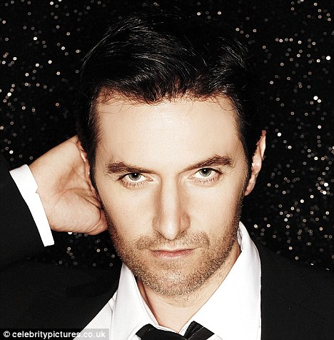
While our dear Servetus is killing the miles today on her big trek back from the holidays, I have decided to sweeten her absence by presenting you with a new *ooof*. As a little nod to our hostess I am picking up on a suggestion of hers for today’s instalment of *ooof*. She suggested a look at the most recent photoshoot of Richard’s – the FAULT magazine fashion spread, shot by Paula Parrish in New York. This is an as-yet unpublished spread, and all we have seen so far are a couple of previews that FAULT themselves are teasing us with, plus the caps and behind-the-scenes video of the shoot itself. I have chosen the image that is also going to appear as the alternative cover for FAULT 13, due to come out in two weeks’ time. There is another reason why I am following Servetus’ suggestion. After my last *ooof* which concentrated on the photoshoot of Richard by Victoria Will, this will provide quite a contrast to the images that I hailed so enthusiastically last time. In fact, the differences – both photographically and in terms of approach – could not be greater between these two female photographers. Let’s look at the image itself first.

Thinking hard?
Richard Armitage in a fashion image by Paula Parrish from forthcoming FAULT magazine, issue 13.
Image sourced on richardarmitagenet.com
Armitage is thoughtful. Reminiscent of Rodin’s thinker, Armitage is posing outdoors, head (almost) in hand, staring off-camera. He is sitting at an angle to the camera, leaning against a wall in what is obviously an outdoor space. His head is at an angle, with his right hand reaching up to the crown of his head to give us the pensive pose. Parrish has chosen a nice pose for her subject – the half-profile of Armitage’s head accentuates Armitage’s prominent nose – a trademark of our man??? – while bringing his left eye (almost) into the centre of the image. For the droolers among the viewers, there is also the exposed neck which stands out clearly against the background and which is crying out loud to be stroked and touched, while the right hand with a slender-looking wrist invites the viewer to gently grab and clasp in an effort to move Armitage’s head closer for a little snog. (Oooops, has my imagination run away with me again???)
Has Armitage just come back from mucking out the stables? Or has he been on a two-month mission in Afghanistan again? His skin appears dirty, with streaks of mud on his wrist and forehead, stains on his jumper and a solid stubble on his cheeks. Rhetorical question – you and I know from watching the FAULT video again and again and again that Armitage had scrubbed up pretty well, was squeaky clean and in fact quite nicely, even if casually, dressed for this shoot. The stains and dark patches we see on the images are caused by a very special type of post-production that is more or less a trademark of Parish’s: This image has effectively been photographed twice. Parrish has firstly done her primary shoot with Armitage. At a later stage she has rephotographed the photograph to achieve this visual effect. If you are interested, hop over to her portfolio page where you can see how she does it: She projects the image onto a rough, uneven wall and then photographs the projected image again. And there is her final image.
This leads to an interesting effect. While, on a superficial level, the viewer might get misled into believing that the sitter is dirty and just home from a Rugby match, in fact she is effectively “de-facing” her subject. The image itself almost becomes a meta-image. As a photograph is only one interpretation of a (person at a) given moment in time, this is now an “interpretation of an interpretation of a (person at a) given moment in time”. (Do you still follow me? I know, I am drifting into structuralist thought again.) As such, it interestingly supports Barthes’ reading of an image as a “punctum” rather than a “studium” – due to the added layer of alienation, the image receives more personally, emotionally touching detail than if viewed in its original version. (Now, that’s all my fancy analysis – it could well be that Parrish does not give a flying f*rt about this and simply likes the visual interest of her photographed projection…)
Whether substantiated with some high-flying, pseudo-academic theory or not – the image *is* interesting to look at. But having said that – this technique is rather unusual for a fashion spread. It is not unusual for a photographer like Parrish to churn out work like this, though. A look at her website will tell you that she is a fashion photographer – but she is also pursuing fine art photography at the same time. In this shoot – and a number of previous fashion spreads – she has married her fine art aesthetics with the commercial brief and created rather distinctive fashion images. It can be argued, that this alienated depiction of clothes (and their wearer) may not be ideal for a fashion spread. After all, the clothes are getting obscured by the grainy, bumpy, dirty textures of the projection surface. The conversion into b/w adds another layer of alienation/divergence onto the intended presentation of clothes… In that respect, I would not necessarily call this a good fashion concept.
In terms of portraiture, however, this is extremely thought-provoking and interesting. Yes, the sitter is getting obscured, too. The viewer now has to penetrate two layers of interpretation instead of one. (Or even possibly more if we consider that the sitter himself is only offering us an interpretation of self as he is consciously posing for a fashion shoot and acting a part as requested by the photographer/client/stylist/himself…) I find this a fascinating challenge. Not only is my eye engaged in discerning details, in telling fact apart from effect, but my brain also needs to interpret fact and effect into a meaning. Moreover, images such as these score less on droolworthiness and more on the aesthetics – giving “the thinking fangirl” a good excuse to ogle “Alienated Richard by P. Parrish”… I mean, seriously, which intellectually equal husband could ever complain if his esteemed other half stuck an artsy-fartsy murk shot of Armitage to the wall…
Hope I haven’t alienated *you* with my theorizing! I have only really scratched the surface of what I wanted to address in this *ooof* – it looks as if I have to do this in two parts. I don’t think I can rely on your patience much longer today. And nor can I on mine 😉 – I will finish this up asap but am meanwhile looking forward to what you have to say about this shoot…
All text © Guylty at me + richard armitage, 2013. Please credit when using excerpts and links. Images and video copyrights accrue to their owners.


As someone with an art ed background who loves playing with photo editing re images of Mr. A, I really am intrigued by Parrish’s approach. I agree, it hardly seems the way to promote the clothing, as you would assume you’d want to do in a fashion shoot. But in terms of eye-catching, thought-provoking artsy-fartsyness, it definitely has got it going on. I have always though Richard Armitage was a word of art, anyway. 😉
LikeLike
Didn’t you say something about using a technique similiar to this? I know I’ve read about this somewhere before and I thought it was on an RA blog. Just wondering? My mind is mush from the holidays and too much of everything that goes with it.
LikeLike
By the way, I see Armitage Afficionados is catching on. Sounds good.
LikeLike
Yes, I’ve noticed. 😀
LikeLike
I haven’t had any sleep—my FMS has been causing havoc—so my mind is a bit mushy, too. I did mention obtaining some similar results with photo editing. Some programs have overlays that allow you to add texture to your images—metal, wood, fabric, natural materials such as leaves, water, and so forth. I like to use multiple overlays with characters such as Porter to give the image a grittier look that suits his personality.
LikeLike
Hi Fedoralady and sloan – thanks for your comments. Yeah, the effect can easily be mimicked by photoshop overlays. I would only say that Parrish’s method – though labour-intensive – is slightly more effective because the smudges, stains and blots will always be different, according to the wall surface she uses, every image an original…
Re. Armitage Afficionados – I didn’t know the phrase was already used 🙂 but I am glad I am in good company if it means that you were the inventor of the term, Fedora!
LikeLike
Oh, you are absolutely right, her method would give each photo its own distinctive stamp of originality that you would not get with a photo edit overlay.
I don’t know for certain that I originated that term, Guyity, but I am extremely fond of alliteration and love AAA—Ardent Armitage Aficionados. I think even the fellas who are fans (loving a conversation I am having with one over at YT) wouldn’t object to that moniker.
LikeLike
Consider me one of the AAA then, Fedora 😉
LikeLike
You got it, baby. 😀
LikeLike
For some reason, this photo reminds me of pictures taken by Dorothea Lange during the depression.
Re Armitage Afficionados: It was sort of a group effort. One day we were all discussing new names for the fandom. I suggested Armitage Afficionados. Fedoralady liked it and someone else also suggested it ….would that be you?
LikeLike
Good one, Sloan – Dorothea Lange indeed comes to mind. Migrant Mother, anyone? Although it is probably the pose that is particularly reminiscent of that great portrait… It’s one of my favourite ever (documentary) portraits – despite revelations later that Lange did stage the picture to some extent and was very careful how she depicted the migrant woman and her children for maximum impact. Sorry, veering off…
LikeLike
I agree it’s the pose, but it’s also the grittiness of the photo. And we can throw in the timelessness aspect of RA too. I agree with Fedoralady that he has an “old soul” and that’s one of the reasons I’m attracted to him…he looks like he stepped out of the past.
LikeLike
Agreed. He has a very timeless face that makes him believable as an overbearing 19th century master as much as a 21st century spy. His age, btw, suits him well, I think. He looks much better nowadays than he did when he was still a young pup… Although I admit that I like to see my own age reflected in him.
LikeLike
Fully agree with your interpretation and very much like your analysis of the different layers of interpretation playing into this image.
In my view, the technique also gives a slightly time-distanced impression, as now modern photography is similar to high resolution and accurateness to the subject. To take this aspect away, puts the picture alongside historic shots, where either the camera technique was faulty or the storage till today.
So the technique in my view creates a time-surpassing tradition/value effect the modern picture normally would not have.
LikeLike
A really interesting point you are making, cdoart, and one that I hadn’t really thought of. Mainly because the amount of “staining” that appears in this shot would be quite unusual in discoloured, aged, antique prints/positives or even in faultily processed negatives or smudged original prints. But I like your interpretation of it – the adding of a time value to the portrait of Armitage. Has he aged before his time or has he become timeless as a result???
LikeLike
The picture and stains remind me of the photos, my grandfather brought back after the war. They were not handled all too well, as they had to stand extreme cold, wetness, crinkles, …
So I fully agree with Joanna and Kofika about the soldier connection. This is also the reason, why I am not euphoric about those pictures or why they don’t make me happy. On the contrary, they make me thoughtful and sad, though I see the excellence in the photography.
And RA makes every aspect of thoughtfulness worth watching. That is also the reason, why I so would like him to depict the ambiguous life of King RIII. He could show the warring aspects of this intelligent king quite nicely and could show all his own talents and depths that way. Those pictures make me long more for the realisation of the RIII project.
Sorry, for getting that aspect of RIII in here, but that were my first thoughts, when coming across this picture series ;o)
LikeLike
I am beginning to get the argument about the “antique-d” photos and the war connection. Interesting how the image here brings out associations of King Richard III. Yes, RA does the pensive ruler very well. I hope that project gets off the ground, eventually…
LikeLike
I like reading your comments on the technique and the meaning behind the image I always feel like I don’t get these details on my own, so it’s great to have such an expert guide to understanding this lovely picture. Thanks.
LikeLike
Thank you Saraleee – that is a great compliment for me. However, I am sure, if forced you would come up with quite a few observations of your own. Some of this analysis malarkey is a matter of routine. Having said that, I *did* study this, so I guess there is some personal interest and affinity to visual analysis on my part, too.
LikeLike
Thank you Guylty 🙂 and Ditto to this what Saraleee said.
My soul mate Kofika ( from polish branch of AAA;)) said that RA reminds her of tormented soldier from World War II…and I immediately saw a leader of the resistance movement…or maybe tired pensive pramedic….
LikeLike
I am lovin’ your excellent interpretation of this, as you say “artsy-fartsy murk shot”. LOL!
LikeLike
Thanks Phylly – it’s fun to be a little dismissive about these things sometimes, isn’t it? After all, this is neither rocket-science nor life-threatening kind of stuff but just entertainment.
LikeLike
Very interesting Guylty,thanks:)
My soul mate Kofika ( from polish branch of AAA;)) said that he reminds her of tired soldier from World War II..and I thought,yes! .. a leader of the resistance movement…or maybe tired pensive paramedic…
LikeLike
Exactly Phylly and Guylty , but thank you my friend it was very interesting.
My soul mate Kofika (from polish branch of AAA;)) said that he reminds her of tired tormented soldier from World War II…and I thought..yes!…a leader of resistance movement …or mayby tired pensive paramedic..
LikeLike
I don’t know what’s going on Guylty, I tried to comment on your post but I still can not 😦
LikeLike
Ah, I have only just noticed the previous two comments – maybe they were stuck in moderation? That occasionally happens, for whatever reason. Anyhow, another interesting interpretation – a veteran soldier. Particularly with the whole smudgy, dirty thing going on that is a believable interpretation. Plus the pensive pose, like someone who is reflecting on the horrible things he has seen… I just somehow think that that kind of association is not really what a fashion editor wants to evoke with a fashion spread…
LikeLike
A bunch of stuff went to spam; I’m not sure why. Just saw it now. Cackle away, chicks 🙂 About to get in the car again.
LikeLike
Holy sh.t!!!… Cackle away,right? I call it revenge,Servetus! 😉
Drive safely.
LikeLike
This analysis and interpretation is wonderful! And that is a wonderful photo/portrait. Brow/nose/chin-jaw…less emphasis on eyes.
Just a sort of question – do you suppose Annie Leibovitz could also do anything with him? She is such an ICON. (And some devil/sceptic seizes me when confronted with ICONS – as with the Mona Lisa, I simply can’t apply an analytical eye to the work.) What do you think, Guylty?
LikeLike
With whom did I discuss Annie Leibovitz the other day on another *ooof*??? Cdoart? Anyway – I was saying there that I am not a massive fan of hers. I don’t like the theatricality and extensive set-up. (Cdoart (?) convinced me by suggesting Leibovitz photographs RA in a milk bath… alright – I am sold the idea… 😉 ) But yes, I am sure Leibovitz could do something with him. RA is quite an interesting type as such. I don’t even think he is that easy on the eye – quite the contrary: an obstinate kind of handsomeness that draws your gaze to his face again and again.
I can see RA in all kinds of dramatic scenarios, from horseback scenes as a native Indian chief to a gritty WWII u-boat commander in their respective but slightly romanticised contexts, with a few women in flowing dresses thrown in… I am beginning to sound cynical. I guess I am. I am still much more enamoured with a documentary style of shooting than with elaborate staging a la Leibovitz. Must be my own lack of imagination. Having said that – I’d be actually thrilled if he got to work with her – it would cement HIS status as an actor, too, being called to work with Leibovitz…
LikeLike
I also agree with those who are reminded of images of soldiers and of Dorothea Lange’s Depression-era portraits. It’s funny that you mentioned that about RA’s aging or timelessness because I have said before there is an “old soul” quality about the man and also a timeless quality about him.
He seems to slip in and out of the various decades and centuries so well.
LikeLike
Loved reading your thoughts on this picture Guylty. I’m really happy that the Ooof posts have become a series and just when I though this blog couldn’t get any better, smarter and more engaging, here comes you! 🙂

This Armitage picture reminded me of Brad Pitt on the cover of W from 2009, if I’m not mistaken. It’s that b&w pic with no airbrushing:
At first I thought that the patches/ blotches visible in the pic were created by using a very sensitive lense that picked out different colours and shades, highlighting them, but what you said makes more sense 😉
LikeLike
Hi Agzy – thanks for being so nice about me and the *ooofs*. I hope I can live up to everybody’s kind compliments! I certainly feel greatly motivated to give you my best shot and to improve my writing and my analysis.
Interesting comparison with that Brad Pitt shot, Agzy. That must have been shot with a really fast lens, i.e. a lens with a large aperture. F1.4? That would account for the interesting effect with only Pitt’s eyes, mouth and cheeks close to his nose in focus and everything else softly out of focus. A matter of depth of field.
As regards the Armitage image by parrish – you said you initially thought it might have been rendered blotchy due to a certain type of lens. No, a lens does not do that. But a filter can. For instance, if you want to bring someone’s red lips out in a b/w photo, you would use a blue filter which filters all blue and lets reds appear dark, almost black… For part 2 of this *ooof* I’ll take a closer look at the shoot’s accompanying video to see if I can at least identify Parrish’s camera. She didn’t use a filter, though, I am pretty sure.
LikeLike
[…] We have discussed this cover at Me+Richard Armitage in Guyity’s recent post (analyzing this “ooof” moment) which I highly recommend: https://meandrichard.wordpress.com/2013/01/02/ooof-alienated-richard/ […]
LikeLike
[…] Last week’s *ooof* on Richard’s cover for Fault Magazine was only the first half of what I have to say on the matter. Veering off into critical theory, I did not have time to discuss some of the practicalities of this shoot by Paula Parrish – and I think that was what Servetus had really thought about when she suggested I analyse this particular shoot. Because the great thing is – we have a little “Behind the Scenes” video of the shoot that I will draw on to give you a little insight into a pro (fashion) shoot. I urge all interested readers to refresh their memory and have a drool look at the video here (the hardship…) For your delectation and the purely aesthetic illustration of this text, I am giving you the other finished Fault shot from the same series that has so far been seen. […]
LikeLike
*ooof*: Alienated Richard, Part ii « Me + Richard Armitage said this on January 9, 2013 at 12:24 pm |
[…] a country house or indeed a palace). Could this be what some of you hinted at when we discussed the edgy b/w graininess of the Fault photos? So is the sitter an artist? A fashionable person? In any case, he must have a sense of art and […]
LikeLike
*ooof*: A Tasty Dish « Me + Richard Armitage said this on January 26, 2013 at 11:16 pm |
[…] in b/w again. The latest shoot of him for Fault Magazine – already discussed to death by me here and here, and pulled out of the dusty cupboard again upon special request of tumblr RArmy member […]
LikeLike
*ooof*: Monochrome Richard « Me + Richard Armitage said this on February 5, 2013 at 2:57 pm |
[…] chapter of photography professionals. Armitage sat for Victoria Will, and did a fashion shoot with Paula Parrish for Fault. And largely unbeknownst to me, he also did a video interview for USA Today. This must […]
LikeLike
*ooof*: Two Slices of Armitage, Please « Me + Richard Armitage said this on February 19, 2013 at 5:14 pm |
[…] in incessant over-drive eh (gettin’ there) our hearts persistently a-flutter (there we are!)? Paula Parrish for Fault. Anders Overgaard for Glamour. Robert Ascroft. And now we are looking at Ben Rayner, […]
LikeLike
*ooof*: Baby, It’s Cold Outside | Me + Richard Armitage said this on September 10, 2013 at 9:52 am |
[…] the point of obscuring the source image with filters and effects that look like stains or smudges. ooof ooof […]
LikeLike
[…] ooof appeared first on January 2, 2013 on me+r. Click HERE for the original discussion and comments on […]
LikeLike
[…] ooof appeared first on January 2, 2013 on me+r. Click HERE for the original discussion and comments on […]
LikeLike
[…] ooof appeared first on January 2, 2013 on me+r. Click HERE for the original discussion and comments on […]
LikeLike