
*ooof*: Alienated Richard, Part ii
Last week’s *ooof* on Richard’s cover for Fault Magazine was only the first half of what I have to say on the matter. Veering off into critical theory, I did not have time to discuss some of the practicalities of this shoot by Paula Parrish – and I think that was what Servetus had really thought about when she suggested I analyse this particular shoot. Because the great thing is – we have a little “Behind the Scenes” video of the shoot that I will draw on to give you a little insight into a pro (fashion) shoot. I urge all interested readers to refresh their memory and have a drool look at the video here (the hardship…) For your delectation and the purely aesthetic illustration of this text, I am giving you the other finished Fault shot from the same series that has so far been seen.

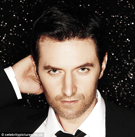
Another image of Richard Armitage by Paula Parrish for Fault:
Not quite himself, in Guylty’s opinion.
Source: richardarmitagenet.com
Let’s talk a bit about the reality of a photoshoot. No doubt you have seen fashion photos being produced on shows like America’s Next Top-Model and such like. It looks all very glamorous with fancy locations or brilliant white-walled massive studios, loud music blaring, 15 assistants on stand-by, no expenses spared on props (helicopters hovering in the background, anyone?), models stretching in poses that would send a Romanian gymnast into spasms, and a hyperactive photographer pornographically moaning “yes, baby, yes, hold that look, I liiike it, ahhh, that’s gorgeous!” Well, none of those shenanigans here. We know from the credits that besides Parrish there was also a stylist involved, two fashion assistants and the male equivalent to a make- up artist for the grooming. In keeping with the casual clothing that is being upstaged by Richard, a pared down location has been chosen. This appears to be the courtyard/backyard/enclosed outside space of a bar (The Diamond in Brooklyn, NYC, by the way). A beer garden actually. Not much to look at really, when you see it in the video. Brick walls, faded wood panelling, industrial lighting, some ivy clad walls. But that does not matter much. A pristine location is not really needed as it only serves as a partially seen backdrop. Only bits of it are visible in the finished images, and with her usual aesthetics at the back of her mind, Parrish can neglect that. Her final edits will show the rough texture of her projection surface and thus soften the details. Moreover, she appears to be shooting with a largish aperture, creating a moderately shallow depth of field, maybe an f-stop of about 5.6 or 6.7? This means, only the parts of the intended image she has focussed on will be seen in sharp focus while everything else falls off. Who cares then, what is in the background, especially if the resulting images will also be edited as a monochrome (sepia? b/w?) picture.
Note, however, how she carefully takes the graphically, abstractly represented background into consideration when she frames the shot. This is something that sets the snapshot apart from the intentional shot – or the amateur from the pro: backgrounds play an important part despite being, well, not in the foreground. A busy, overly colourful or confusing backdrop can be distracting. For viewers not used to closely looking at, never mind analysing, an image, this is an effect that is sometimes hard to put a finger on. And yet your brain will register it, and form a dislike to an image. In the example above, Parrish has very cleverly composed the image so that the top of the wooden panelling is exactly horizontal. This is particularly pleasing as this line also happens to lead directly to the subject’s eyes. It is one of those guiding lines in an image that serves to draw the viewer’s attention to the main focus (which most commonly is the eye of the sitter). The strong white line also serves to cut the background in two parts: a “stripy” lower three quarters and a blotchy, different quarter above. This adds visual interest without distracting the viewer. Compositionally, Parrish has also put on a little twist by “pushing” her subject in the right hand half of the image. This kind of composition sort of deviates from the rule. (Logically, we would expect the subject to occupy the centre of an image. That has conventionally always been the case in pre-impressionist painting and early photography. With the growing awareness of visual conventions, this deviation from the convention has become a much-used and yet still effectful way of creating added visual interest.) The space on the left, although here picturing “something”, serves as so-called negative space, i.e. unused space in an image that does not contain any information. It both gives the eye a spot to relax on, and with its emptiness also contrasts heavily with the onslaught of beauty information on the right. It therefore serves to divert the attention to the “positive space” on the right. The use of negative space always adds a certain edginess to the image. It screams “I break the rule (of thirds), I am unconventional”, both of which fits nicely with the subject matter (casually dressed man with casually stubbly face who is defying the rules of photography by refusing to smile ;-)) as well as the photographic aesthetic (dirty, gritty b/w with stains and smudges).
I must add here, that many compositional choices can actually be made in post-production. With the cameras that are being used today, photographers take images that have enough pixels to be easily blown up to A0 size (bus shelter ad size, in laymen’s terms, or 70”x42″) despite mimicking the 35mm film format. In order to receive a final image that is big enough to fit on a magazine page (roughly A4 size), the photographer can crop quite a bit before she loses definition, as you can imagine. There is no knowing whether Parrish has cropped much, here. It is also possible that she has straightened the image in post-production in order to receive the horizontal line, easily possible here as the subject is leaning forward and will not look out of place if not pictured sitting straight. (This would be not as easy to achieve if the subject was standing.) In all honesty, it could all be fluke, as much of photography is (see this *ooof*). In the heat of the moment the photographer may not notice all the elements of the shot in the viewfinder’s frame. The more experienced the photographer, the less likely the fluke, though. Mind you, I’d be flustered out of my brains if I had Richard in front of my lens, and I would mindlessly click away without being able to take much in aside that handsome face and hot body.
Parrish, however, does not look flustered in the video. As far as we can make out, she takes her time in setting up the shots and then carefully choosing her angles and framing the shot. The above jokingly mentioned gymnastics frequently do come into photo shoots – but for the photographer rather than the model. Observe how Parrish is balancing on benches and tables, bending down and forward to get to the exact spot from where she wants to take the picture. Much of this is trial and error. She just shoots away, creating as many variations on the one theme as she thinks necessary. She will only see on the computer screen later which of the experimental angles have worked out best. – As visible in the vid, she does prefer an angle that is slightly higher than her sitter’s eyes (hence the gymnastics). Some of that may be incidental as she has perched herself higher than her subject. It might also have to do with the fact that shooting from slightly higher than the subject’s eyes is usually more flattering to the sitter’s face. If looking into the camera, the subject has to move his face upwards – which will stretch unsightly, possible double chins out of sight and accentuate a pleasing chin line. Well, Paula, none of THAT was necessary with Mr Armitage!!! Not a trace of extra chin-material in sight. You can actually photograph Armitage from way below and still catch a chinline that you can cut diamonds on! (cf. kissing scene in N&S)
This *ooof* has positively turned into a medium sized thesis at this stage. Sorry, but one more point to raise and bring this picture analysis back to where I started last week, namely the comparison to Victoria Will’s black-on-black portrait shoot . And that concerns what I would call “capturing the essence” of the sitter. If you remember, I talked in *ooof*: Guylty appr*ooof*s how the images belied that Will had put her subject at ease and thus captured his personality in his varying facial expressions. In my opinion she did that by engaging him in conversation. His facial expressions are lively and varied, from amused to entertained to intent to thoughtful. In that respect, I argued, Will succeeded in representing images of the “real” Richard Armitage. This is not the case here. As is apparent from the video, Parrish does not seem to be conversing with her sitter. She probably will have given him direction on posing, but other than that there does not seem to be banter or conversation. In consequence, the shots of Armitage seem more artificial and consciously acted. This is not “Richard Armitage” but “Richard Armitage modelling”! Some of this could be the effect of Parrish’s style of working – she may prefer to give sparse direction only and otherwise concentrate on the task at hand rather than talk. And it is most probably also caused by the brief, which, I assume, was to create a fashion spread with the emphasis on the clothes (which happen to be modelled by Armitage), not on the sitter – even if the resulting images will also be accompanied by an interview with the actor. (The editing of the video may also have something to do with it, omitting all evidence of photographer and sitter communicating verbally.)
I don’t know if you have noticed it, but hence in this post I have also avoided the word “portrait” and used the words “shot”, “image” and “picture” instead. Because these are not portraits, imho, but fashion shots! I hope you can see how the two shoots differ in their portrayal of Armitage: Victoria Will creating a personal portrait of the actor and Parrish staging him in the role of a model. Neither is better or worse – they serve different purposes and are both splendidly executed. Which one you prefer is very much up to your own aesthetics and preferences. It’s a hard choice, though, when the subject in both is so strikingly gorgeous that he makes your mouth water and your eyes drool. Or the other way ’round.


Do you think he looks just a tad bored in this vid clip?
LikeLike
Hehe, yes, I think so, too. I mean, modelling must be the most boring thing for an actor – just standing, holding an expression for a length of time… Professional that he is, he seems to bear it with patience…
LikeLike
Thank you so much for this analysis. Helped me understand the photographers point of view. I have looked at her website so I had a bit of an idea of her style before reading your post.
All in a day’s work for an actor and for someone like RA doing his PR work for The Hobbit and his career. Let’s face it, we all do things at work we don’t particularly like, and are probably bored more often than RA is on any given day at work.
Even if he looks bored at times, understandably so, I actually loved the video (yes, kill me now!) and am looking forward to seeing the final results. Though I didn’t like all the clothes modeled, just one actually, I loved the model.
LikeLike
Thanks for your comment, Faboamanto. I agree, having to model or pose for photos is probably part and parcel for a career-conscious actor. From having observed models at work I must say it is a job I would not like to do. It can be quite demanding, even physically, and requires patience as well as creativity and sensitivity as you are required to offer poses and/or react correctly to the direction that the photographer gives you. This shoot – imo – did not look particularly “fun” though. RA seemed to be much more enjoying himself on the Victoria Mill shoot. – As a photographer I always tend to make a shoot a fun occasion. But then again, I am not one for moody portraits…
LikeLike
I wonder if that was part of the goal. It was a fashion shoot, so it’s about the clothes, but I also wonder if he (or his marketers) are trying to get a broodier, grittier persona across than some of these photos where he seems so sunny.
LikeLike
Could well be his publicist’s idea. But if so it is not particularly clever. A) Richard has plaid enough “gritty types” so far (Porter, North…) and has proven he can pull it off when needed. B) why force someone to take on an image that he does not really fulfill? Or asked the other way: Why would Richard need a grittier image? And what is wrong with a sunny image? Surely there is no greater compliment than being called a “decent human being”?
LikeLike
I don’t know about grittier image, my thoughts on the publications his PR people have chosen lately, including the ill fated Recognize Mag, is that they want a more cutting edge image for him, to make the art film or indie film market audience aware of him as more than an action hero.
LikeLike
Yeah — edgier is a good way of describing it. I think he still has “art” ambitions.
LikeLike
The other thing that occurs to me, particularly after reading carefully through his press from 2004-6, is that the mainstream press / entertainment press may really have contorted him and maybe he’s hoping for a slightly more nuanced picture of himself to emerge from these less traveled venues.
LikeLike
This seems very likely..he’s really not a one trick pony despite the difficulty in shaking the Richie Cunningham nice guy role early press focussed in…huge new market, just a bit of reinvention…saavy.
LikeLike
I did some modelling in college…it was novel for about a minute, then it was both boring and irritating – I don’t know how models do it full time, I obviously don’t have the temperment for it.
LikeLike
One reason I really wanted Guylty to comment on the work of the photographer here was because we had the video revealing a bit of it, but also because of the squabble over the vid. (I didn’t especially like the vid, but I didn’t understand the roots of the squabble, either.) I wondered if we had *only* seen the final result, but not the vid, if some of us might have felt differently. I probably would have. There’s one moment in the vid where he looks both like he’s resentful and that he’s suppressing the resentment (obviously, my interpretation) that I just thought, is this really necessary? But I don’t think that’s a reason to kill anyone 🙂
So, not killing you now or ever.
LikeLike
I don’t really like the posed shots that have little or no glimmer of Richard left in them. He looks blank. There’s nothing to read in his expression except ‘is this bada** enough for you?’ Ok, I hate the man meat pictures. Hate them. It make me feel uncomfortable for Richard, although I suppose he’s getting used to this aspect of his career. I love any picture that shows there’s something going on in his head besides ‘are we done yet?’
LikeLike
“Blank” is a good description, Trudy. I guess in a way the video shows what a good and professional actor he is – he has adapted to the role of model, has pared back his self and is only providing the canvas for the clothes. I much prefer to see him communicate with the photographer – as seen in smiles or sneers or some sign of life behind the big forehead…
LikeLike
Isn’t ignoring the photographer also a kind of communication?
LikeLike
Good point, Serv! Not a very effective way of communicating, though – is he saying he doesn’t like the photographer as a person? Has he issues with the (art) direction? Is he just generally annoyed with photoshoots? …
LikeLike
well — it’s one way of projecting a traditional masculinity.
LikeLike
A communication to whom? The public/viewer?
LikeLike
Thanks, Guyity! From my work experience I already had a fair amount of knowledge of what it’s like on a photo shoot and how tiring and yeah, boring it can be for the subject (I have said repeatedly I think RA would have been bored out of his handsome skull modeling full-time) but it’s good to hear it from the photographer’s POV.
I think this was Richard in acting/model mode, giving the photographer what she wanted like the consummate pro that he is. And I like the video, too, Fabo, it’s not just you. 😉 Everybody has preferences in terms of favorite characters, photo shoots, etc. of RA’s. Different strokes for different folks . . .
LikeLike
Agreed! This was a job to RA, and he did what he had to. I caught a whiff of boredom off the video, too. But maybe that was directed at the videographer? I’d be annoyed too, if I was filmed while doing something I don’t particularly like doing. But does he? We’ll never know…
LikeLike
Ah, the mystique of Mr. Armitage . . . see, these are things I would love to ask him. “Do you ever want to snap at people who bring up the old chestnut about running away to join the circus? Do you get really bored doing photo shoots?” Not that he’d tell me LOL
LikeLike
The “mystique” is what we love, I guess… And yes, there are a lot of unasked and as yet never answered questions. I’d love to have an off-the-record chat with him. And an hour in the studio. Both at the same time, actually!
LikeLike
As much as I’d like an official interview, the off-the-cuff, off-the-record chat would be so much fun, I think. While you were shooting him, I could be asking some questions! I’ve done quite a few interviews that way, With non-pros it sometimes helps them relax about having their photo taken.
LikeLike
We’re on, Fedora! I shoot, you chat! I’ve often assisted at shoots only doing that – putting the sitter at ease with my chatter. I’m sure we could get to the bottom of the “real RA” – and I am not referring to his backside here, although that would be a worth-while cause, too 😀
LikeLike
Exactly, get the subject’s mind off the camera in his/her face. Helps a lot. I just think he could be such a pleasure to talk with in an informal way. Might get some of those delightfully geeky giggles of his.
LikeLike
I saw video today and liked it (mainly because of the vision of RA) even though it was pretty obvious he was annoyed about something…first time I’ve seen that side of him. I guess I don’t get around enough to know about the squabble.
Enjoyed this informative post, particularly liked the part about the background. I’m always trying to get a good background. Remember when people would pose for pictures next to their cars…or is that a southern thing?
LikeLike
Actually I don’t remember that…it’s just that I’ve seen so many older photographs of family members posing next to cars.
LikeLike
Hi Sloan. I am still not 100 percent convinced that he really *was* annoyed or resentful. It is very hard to tell when all we have is a 1-minute-clip of a shoot. Who knows – maybe he was peeved with the videographer for disturbing him at his favourite past time, modelling (probably not, I know.)…
Re. Background – yep – really important. If one keeps that in mind for their private photography, they will soon see an improvement in their images. And the car posing – that really comes from a time when people were really proud of their cars, I guess. Mind you – Germans loooove their cars and would probably marry them if they could, but I have never seen much of what you describe…
LikeLike
I’m so glad it’s not only me 🙂
LikeLike
And I can also attest to the fact several of my regular blog readers really like it, too, so you are DEFINITELY not alone. 😉 As my daddy used to say, “Everybody to their own notion.”
LikeLike
Thank you ,Guylty 🙂
Yes, I like it! I prefer this kind of fashion session then all those bizzare (anorexic) contortions…..beside everything looks better on Richard:)..in addition to this ugly(funny) Louis Vuitton cardigan.
LikeLike
Oh Cod, that unmentionable cardigan. Unbelievable. I guess they were trying to prove that nothing can disfigure a beautiful man…
LikeLike
[…] again. The latest shoot of him for Fault Magazine – already discussed to death by me here and here, and pulled out of the dusty cupboard again upon special request of tumblr RArmy member […]
LikeLike
*ooof*: Monochrome Richard « Me + Richard Armitage said this on February 5, 2013 at 2:57 pm |
[…] of obscuring the source image with filters and effects that look like stains or smudges. ooof ooof […]
LikeLike
[…] ooof appeared first on January 9, 2013 on me+r. Click HERE for the original discussion and […]
LikeLike
[…] ooof appeared first on January 9, 2013 on me+r. Click HERE for the original discussion and […]
LikeLike