
*ooof*: Armitage – Body and Soul
You are really up-to-date, girls, aren’t you? It is quite interesting for me to see how the reaction to my *ooof*s differs from week to week. First of all I have to hand it to you – you are spot on with your comments and I am not talking about your kind compliments, although those are *always* 100% correct, of course. You point out details that I overlook and you create associations and connotations with your input. On a professional level it is also very insightful for me to see which kind of photography works with you as an example audience and which doesn’t. In terms of reaction I have noticed that you are more enthusiastic about (commenting on) recent imagery than older shoots. Images, it seems, in this day and age have a very short “half-time”, especially when it comes to celebrities. You have responded much more enthusiastically to the *ooof*s that refer to recent imagery, whereas last weeks 2008 shot stagnates at 21 lame comments (half of them my own, haha, because I respond to the comments). No accusation – at least not addressed to you, but possibly to myself. But since I am a crowd-pleaser sucker for attention, I take my cue from my findings and return to a recent, new image from our good old friend Robert Ascroft.

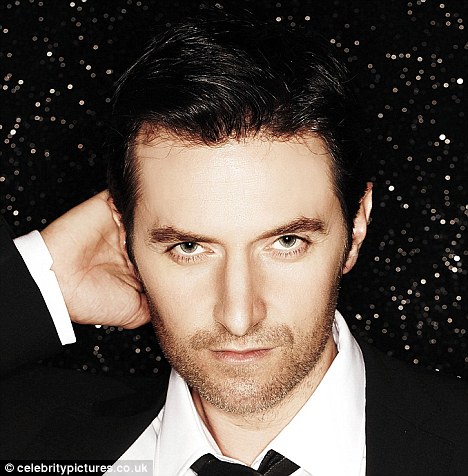
Classy in b/w.
Richard Armitage as photographed by Robert Ascroft, 2013
Image via RAnet.com
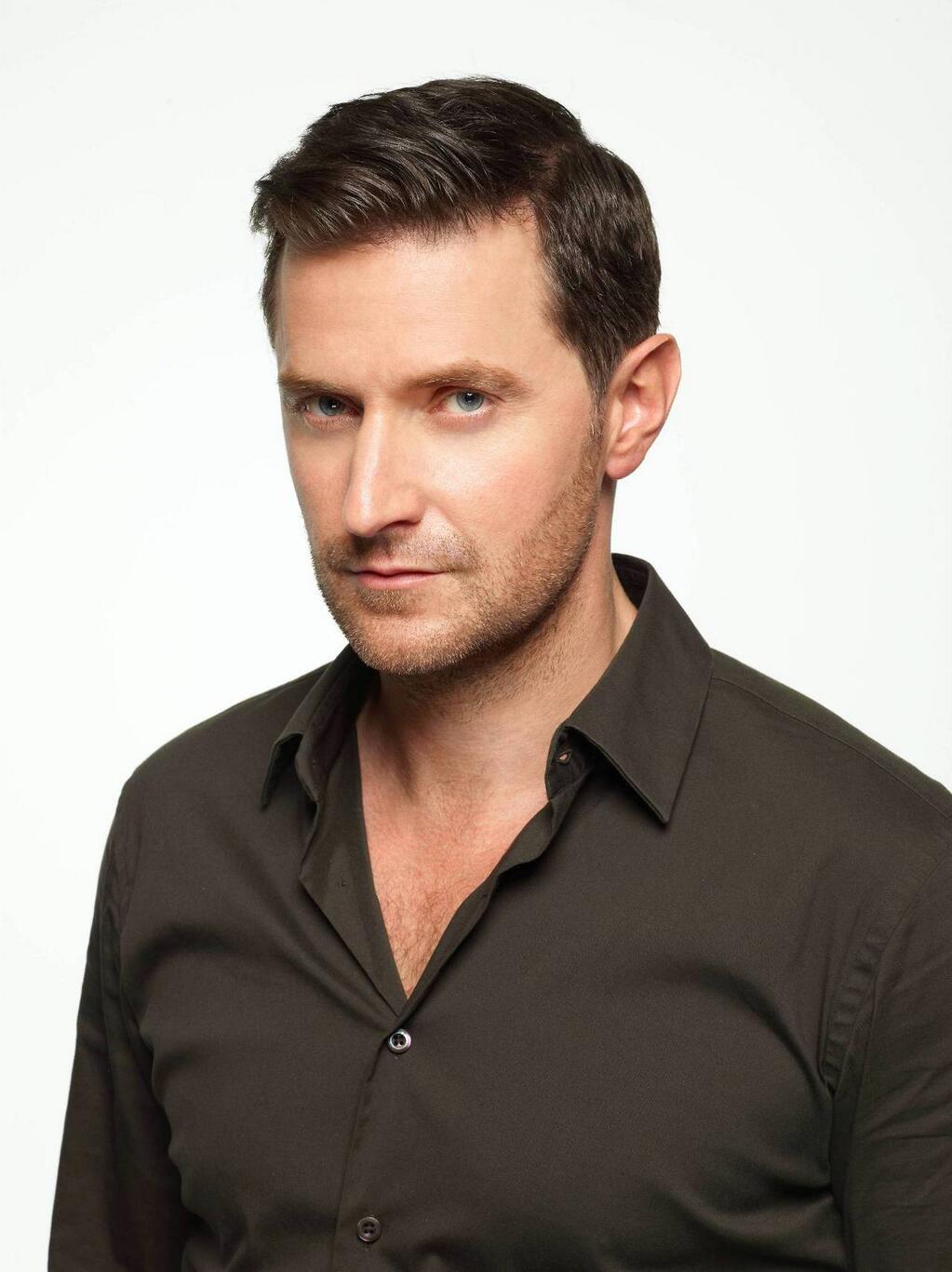
Once again, in colour
Richard Armitage as photographed by Robert Ascroft, 2013
Image via RAnet.com
Not only had I promised Andarielraine to *ooof* this image, but there is actually a good reason to give this my analytical once-over. Because it comes in two versions – and allows us to take a look at the editing process. As a practitioner, the editing is actually the part of the photographer’s workflow that I like least. One could even say that I actively *dis*like it. I tend to plan and shoot very enthusiastically. But then my energy lags and I have to force myself kick myself up the proverbial lazy arse to even transfer the recently shot images from camera to computer, never mind post-produce them. Ugh. I have a sneaking suspicion that that would not be the case if I had the good fortune of shooting someone as gorgeous as Armitage. I probably couldn’t wait to upload the images onto my PC and drool over the full, high-res images on my screen… We can assume that Ascroft is far more professional than me and probably gets his images edited asap. What’s more, he probably makes use of modern technology and already has an idea of which images he is going to give a post-production treatment *as he shoots*. Yes, that is possible, just by virtue of digital possibilities. Commercial photographers nowadays all shoot “tethered”. That means that their camera is connected to a computer while they shoot, and the images appear on a computer screen in real time – as they shoot. Typically, in a production that is as big as Ascroft’s, the photographer works with an assistant. While the photographer makes the actual images, the assistant sits at the computer and checks the in-coming photos. Ideally, the assistant will give immediate feedback – regarding lighting, exposure, framing – and the photographer reacts. The aim in digital photography is always to get the picture as perfect as possible *in camera*. That is to avoid spending hours digitally correcting or enhancing the images. Thanks to wireless connectivity, there are apps available nowadays that will even connect the tethering programme with an iPad or iPhone, so that the images can even be transmitted to the tablet computer of the art director or client of a shoot who can sit in and check the images as they are being produced.
From the two existing versions of the Armitage portrait we can glean something else. If you compare the two, there are two things in which they differ – the framing and the colour format. We can tell with certainty that the colour version of the image is the original. How can we tell? Because it has a wider frame than the b/w version, i.e. the b/w version must have been cropped from a bigger original. This also provides another interesting insight for non-insiders: The photographer has shot the original portrait in colour. The b/w format was only created in post-production – as professionals change details such as tone, temperature and colour only post-shoot.
But back to the images at hand. Comparing them is an interesting exercise because by all means they should elicit the same response. After all they are identical. But they don’t. Now, it is completely subjective whether you prefer the b/w over the colour version or vice versa. I have heard a few ladies express their preference for the latter in the comments to Lamaruca’s post. Here’s the deal: Colour photography probably speaks to you because it is more life-like. It depicts the sitter *as we see him*, in all his colourful glory, with his healthy skin tone, his blue-grey eyes, his dark brown hair and his dark shirt. We relate to it him because colour is how we see things around us. The hear-and-now is colour. Colour is life. Life is colour. The slice-of-life quality of photography is far more effective when we see it in colour. This is a two-hundredth of a second that was *real*. To all intents and purposes it could’ve been just a second ago. Colour photography anchors a photograph in the present. That is due to the fact that colour photography only came into its own in the 1930s when it became widely accessible. It took, however, another three decades before colour photography crossed the divide into art photography. (Up until the 1960s it was primarily used for commercial/advertising photography but was not seen as a medium for art photography.) Even though it has 50 years under its belt, it is nonetheless the younger sibling of b/w photography and thus has a much more contemporary feel to it than b/w.
B/w portraits, on the other hand, have a timeless quality. They transmit a feeling of classy-ness, of deliberate concentration and aesthetic documentation that colour photography does not quite possess. B/w feels more aesthetic. Because it relies on the contrast of dark and light, it emphasises other aesthetic qualities of the subject than colour, it hones the contrasts/contradictions contained in an image. In this case, for instance, the b/w version focusses our gaze on the contrast between (light) skin and (dark) shirt. It makes the subject stand out against the white background. It zooms in on the dark chest hair against the light skin. Personally, I also find that the b/w version has a much stronger three-dimensionality to it than the colour version. The latter appears flatter than the monochrome version, which places greater emphasis on tiny details: the catch lights in the sitter’s eyes, the appearance of lighter grey hairs in his stubble, the shadow underneath the jaw and to the right of his nose. The downside of this classy-ness is, however, that b/w can occasionally turn the sitters into marble statues rather than represent them as living, breathing humans. It can overaestheticise the subject and distract from the characteristics of human-ness. Thankfully, in this case that does not happen, mainly due to the glittering catch lights in Armitage’s eyes which liven up the face and set it apart from the stonecold, frozen beauty of a marble bust. That is not to say that Armitage *isn’t* eternally beautiful. He is, of course, equally attractive in both photographic incarnations.
I personally am much more emotionally invested with the b/w version of the image. Not only because b/w evokes in me a feeling of nostalgia (an old photographic process) and of appreciation of the tangible craftsmanship of b/w processing (pottering in the darkroom for hours in order to process and print an image – a labour of love that seems to have been forgotten in the age of fleeting digital imagery), but also because of a connotation that I have touched upon earlier on: The sculptural quality of b/w photography hints to the existence of something “sublime” in the depicted. (Servetus was touching on something similar with yesterday’s post on the “beyond” of Armitage.) Just like a marble bust can survive centuries – or forever – the “sublime”, as it is hinted at in classic b/w portraiture, offers us a glimpse of eternity. A b/w image is made “to last”. It is made to document the expression of beauty at a given point in time. The subject thus is transformed into an “ideal” of beauty. A god? A beautiful deity. What could be more fitting for Armitage, whom we adore, not just as a handsome specimen of his gender, but also admire for the characteristics we deduce from his behaviour and interactions? And no, I have no intentions of starting a cult involving Armitage as the worshipped deity, plus I have my personal reservations of the cult of outward beauty, but there is a philosophical dimension to the deliberate reduction of “life” to monochrome. An intentional concentration on the essence of human life – which is actually less about outward appearance but about inner beauty, about “soul”. Soul is the beyond, is the sublime, is the divine, is the universal in us all, no matter what we believe in. It is what beauty and human-ness come down to. B/w photography can capture “soul” like no other medium can. And Armitage possesses soul in spades.
How does this “soul” manifest itself in these images, apart from the fact that b/w emphasises the sublime? Well, now we have truly arrived at the same point where I attempted to throw Servetus off, yesterday. I still have no proper answer, I can only pinpoint where I see the sublime in these images. And that could be something completely different from what you see. Essentially my interpretation of the sublime is informed by my knowledge of Armitage as a person, his representation by Ascroft, and his own interpretation of self *in this particular shot*. And for me it expresses itself in the eyes and the mouth. For me, this Armitage portrait displays the same enigmatic quality that has made Da Vinci’s Mona Lisa the most famous portrait in the world.
And this is where it gets really weird. Because if you compare the Armitage pose with the Da Vinci portrait, you will find that the pose is near-identical. Both subjects are pictured slightly off towards the left, with both head and shoulders at a small angle to the camera. The POV is head-height in both of them. Both have soft lighting with fuzzy shadow, except the light is angled from the right in Armitage’s case, and the left in the painting of Mona Lisa. While the Florentine lady has a subtle smile playing on her lips, Armitage does not smile with his mouth. And while the look in his eyes at first sight may appear challenging, direct, unemotional or possibly even sullen, in my perception it gradually changes into the merest smile. This becomes much clearer when I look at his eyes with peripheral vision. (Try it yourself – focus on his eyes and you will find (from the corner of your eyes) that his mouth curls into a slight smile. When you switch your gaze from the eyes down to the left corner of his mouth, the smile will vanish.)
The ambiguity of Armitage’s expression may account for the extraordinary response I feel to this portrait – and for the feeling that there is something surreal, unworldly, sublime going on here. There is no smile. And yet he smiles at me. Armitage escapes explanation – again. Like a ghost. The only explanation I have for this is his soul. Which communicates to my soul.
All text © Guylty at me + richard armitage, 2013. Please credit when using excerpts and links. Images and video copyrights accrue to their owners.


Thanks for explaining me why I instinctively prefer the B/W portrait 😉
Beautiful post, really. And I didn’t notice the subtle smile of his soul but yes, I can perceive it following your instructions.
LikeLike
It’s amazing, isn’t it? Armitage has that thing going on. It is really rare, though, not everybody can do it. When I smile, I grin. When I don’t smile, I scowl. Ah well, that’s just me.
LikeLike
oh dear… I wrote a big post and internet swallowed it 😦
There is something in RA’s traits that is particular in making him different depending on lights, shades, angle, expressions. He can look totally different in a second and not only because he is an actor. His smile has so many shades… Someone should really do a list of all the RA’s possible smiles from the totally embarassed one he had during Tokyo Press Conference, the cheeky one in the Popcorn Taxi interview while answering the calendar question to the one of him holding little Kermit’s hand! 😀
Eyes and mouth can interact in a thousand nuances giving us always a new RA, something we cannot really reach, something always unexpected, elusive, different from the ones we saw before.
LikeLiked by 1 person
Oooh, I would love to see a list like that… maybe I’ll work on that, a little categorising of smiles…
LikeLike
Yes! It would be soooo nice 😀
LikeLike
Oh my, Guylty, IMHO you’ve surpassed yourself with this *ooof”! The coloured image is wonderful, but the black and white….stunning. Thank you for explaining its appeal to me so eloquently, your instructions on how to see his “soul smile” are brilliant. 🙂
LikeLike
Mezz – thanks *bigsmile*. I am very happy if I can make anyone see something new in any image. And it is so easy to write about photographic RA – a) he’s such a pleasure to look at and b) it’s such a pleasure to share what I find with you. xx
LikeLiked by 1 person
The “Mona Lisa” of Richard Armitage – perfect. So many things can be read into that expression. The B & W is so very stunning. I have to stop to look every time it crosses my surf path. Thanks so much for the insight.
LikeLike
The images that keep you guessing are the best ones – because they make you look longer and force you to come back. The whole Mona Lisa analogy is a little bit cheesy, I know, but the similarity was just too striking, not to mention it. Thanks for your comment, Crystal!
LikeLike
I have always thought that b&w captured the inner person better, picking up key details in a way that colour doesn’t. Even my favourite photograph of myself is from a b&w shoot. It shows the who-I-am more clearly than any colour photo. I think that’s what Ascroft caught with Armitage in b&w, the enduring soul that is so compelling. Interesting comparison to the Mona Lisa, and yes, I see the “soul smile”. It makes me smile in return.
LikeLike
I agree with you, Leigh. Because it does not distract us with colour, b/w reduces the message to the essence. My own favourite portraits – one a self-portrait, the other shot by a photographer friend – are also b/w. They are completely different, both capturing different facets of my personality, but they both show “soul”.
I think, you have given the greatest compliment to Ascroft – when an image can induce a reaction in the viewer, the photographer has done their work well.
LikeLike
I instinctively preferred the black and white version and was actually a bit disappointed when the colour version appeared because it kind of spoilt the colour my imagination had subconsciously added. I had sensed the inner smile, especially in the black and white version but hadn’t fully appreciated it until now so thank you.
I have to say that while I love all the Ascroft photos I would prefer to see more photos of RA in the raw so to speak. I may be wrong but I sense these have been edited to erase some of the lines and flaws that we all love so much, or is it simply clever lighting that makes him look so much younger?
LikeLike
I just looked at the photos in detail in order to answer your question, Kathryn. The photoshopping has been very discreetly done, but yes, I think there is some. It is more discernible in the colour image, btw, underneath the eyes and (strangely) by his left temple (right from our POV), possibly also fuzzed out the crows feet around the eyes. GRAH – none of that is needed. And tbh, I always think that kind of work is more hurtful to the “editing victim” than showing them in their RL glory. Because editing out the lines insinuates that they are a blemish…
As for “RA in the raw” – do you mean candids? By and large – and no offense to anyone – fan candids are always sliiiiightly unsatisfactory. Don’t get me wrong, I’d probably suffer from bad camera shake myself, were I to see him on the red carpet. I do enjoy press photography, though, when it is taken like the recent shots in Sydney by Tracey Nearmy, or the Victoria Wills stuff in New York last December. They are less contrived than a studio shoot, less perfectly made up, often not quite as sanitised in Photoshop (due to time-constraints). I am sure we will get to see many more of those, soon.
LikeLike
Aha…good to know I wasn’t imagining the edits, thanks! I agree it’s unnecessary and could be hurtful, the chicken pox scar being removed annoys me a lot as I have two very prominent ones of my own, forehead and eyebrow – they’re part of who I am.
As for “in the raw”, no I don’t mean candids. For the same reasons you state I struggle with many of them. No, I mean good professional photographs of him in all his unedited glory 🙂
LikeLike
Complete agreement – chicken pox scars are cute. And the lines around the eyes are the “good ones”. They show we have laughed and enjoyed life. And in that respect I want “raw RA”, too – FFS, the man is not 20 but 41. He doesn’t need cleaning up. *huffs*
LikeLike
Huffing right along with you there 🙂
LikeLike
Amen. No fussing with the real, plaese and thank you.
LikeLike
Can you hear the huffs from down here?!!! I love that chicken pox scar, and it annoys me when I see it’s been edited out. I reckon it would be a lovely spot to bestow a kiss. 😉
And don’t get me started on the erasing of his laughter lines…grrrrr.
LikeLike
This is swiftly becoming the Huffington Post here, girls 🙂 If Mr A reads anything, I hope he takes note of opinions like this.
LikeLike
Thanks Guylty for explaining why I instinctively preferred the B&W. The B&W definitely has more “ooof”.
LikeLike
Thanks for your comment, Rafaella – funny how *ooof* can be more pronounced in two versions of the same image.
LikeLike
I may be the minority but I prefer the color version. The b&w version gives the impression of someone fierce and slightly hardened by the world. The color version actually has a bit of a ‘come hither’ feel to it for me. I don’t know if that is because I see more of his chest/shoulders or what. That color version makes me *oof* big time. I am also going to add that I personally don’t care for a lot of the older pics. The Ascroft pics as a whole are my favorite.
LikeLike
Yay – Kudos, Snickers’ Mom, for standing out from the crowd on this one 😉 Hey, as I said, all subjective. I do agree with you that the colour version is a bit more sexualised and viceral, while the b/w is probably more aesthetised and subliminal.
I think, the longer RA has been in the business, the better the photographers have become with whom he has collaborated. A lot of the older stuff makes me cringe, whereas almost all of the recent shoots make me say *ooof*.
LikeLike
I think the Mona Lisa comparison is very apt, guylty. Another fascinating *oof*! I like both the color and the B&W and can stare at either of them endlessly, but I see what you mean about what the B&W does. The thing about Ascroft’s pics of RA is that they aren’t just pretty – they say something. You could almost make a story out of it. Thanks for another thought-provoking *oof*! 😀
LikeLike
That’s it. Every picture tells a story, even when it is “just” a studio portrait. There is life in the eyes, and the smile, and the demeanor. It can be enhanced by light and background and props, but the story should be in the subject. And that applies to anyone, not just to actors.
LikeLike
Thank you- this was a wonderful, informative read. For me, it has to be the b&w image- it just takes my breath away. I could lose myself in those gorgeous eyes staring right at me. This is my very favourite studio image of RA- I would find it hard to imagine how any other could top this- just sublime!
LikeLike
Yes, the b/w has the power to push my other currently changed favourite (RA sitting on the box, in colour *gasp*) off the throne. To be fair, some of that is due to the fact that we get more in-depth detail in a head-and-shoulders than in a full-length portrait. I find it very hard to determine which of the Ascroft shots is my favourite.
LikeLike
Spot on with the Mona Lisa imagery – I’ve always thought his near-smiles were very akin to Mona Lisa. He even has the same type of mouth as she. To me the bw image is much more approachable – he looks like he’s just made a deliberately bad pun and is waiting for the resultant groan. The color one for some reason reminds of that sparkly trick in those idiotic teen vampire movies which I refuse to mention by name.
LikeLike
It’s the enigma of the smile – both in Mona Lisa as well as in RA. It’s that whole question of “Does s/he or doesn’t s/he?”. It’s all very clever, of course, because it makes us dwell on that image longer, trying to work it out. And it also opens up the possibility for interpretation and imagination. The actor as a foil. How typical is that? And how deliberate is that – both on RA’s part, as well as the photographer’s?
LikeLike
well, Miz Guylty, you’ve been to my blog. I think you know how I feel about the B&W version. 😉 I LOVE black & white photography for all the reasons you stated.
“Enigmatic” is a word I keep returning to when I think of certain aspects of Mr. Armitage’s personality, of his aura. There’s something elusive, something I cannot quite grasp, nor, actually, do I think I want to. He keeps me guessing, he keeps me fascinated–he, simply put, keeps me.
I also agree that those “imperfections” of his should be allowed to stand–love the chicken pox scar, the little lines and crinkles. He has the face he has earned. And it’s beautiful.
And after more than 30 years of trying to hide them, I have finally let my forehead scars from that long-ago car accident be revealed to the world. Nobody has screamed yet. 😉
LikeLike
Hehe, Angie – it’s hard *not* to notice which image of RA’s you (currently) like best… Yes, I feel like plastering it all over my wall, too. –
Enigma. Funny how in the space of a couple of days I found three other people who were, independently of me, also musing about the whole enigmatic quality of RA. It’s annoyingly attractive.
Re. scars – I have always loved scars on myself. Ok, I never had the variety that came from a serious accident, just the tell-tale signs of scratches and childhood mishaps. I think they are very much like my crows feet or the wrinkles around my mouth when I laugh – decorations that I have lived my life fully. They define, not defiLe. Glad to hear that you feel like revealing yours, too. If anybody screamed, that would be a dead give-away that they are not worth your attention!
LikeLike
Angie, I love the background of your blog. Every time I go over to read a new post, the background is the first thing to load, and for a flash I see only the gripping tiled images. Takes my breath away, every time. It’s the black and white for me, ladies. Also, amazing “smiling” effect, thanks for pointing that out, Guylty!
LikeLike
Glad to be of service 🙂
LikeLike
One of my computers freezes when i load Angie’s page (i always forget until it’s too late). However, this means i can do nothing but stare at that beautiful picture for several minutes until the computer sorts itself out.
LikeLike
Oh, the hardship, bolly, the hardship 😉 I have actually set my work PC to change the wallpaper automatically every day with my favourite RA portraits. It’s a terrible distraction 😉
LikeLike
Love the analysis… At the risk of being a follower 🙂 I am much more drawn to the B/W…maybe because it evokes that classical aesthetic that I love. (Although that’s all a facade you know..almost all of that beautiful white marble would have been brightly painted..I should probably address that someday).
Anyhow…I love that you keyed in on that inherent enigmatic quality of RA, it is endless alluring. (the Mona Lisa comparison is quite apt – must be Renaissance week here in Armitageworld)
That soulful eye really does change the whole face…do you think he knows he’s doing it, or is that lovely soul just shining out?
LikeLike
Oh, please DO follow, Obscura, it’s all mutual, anyway 😉 – and I knew you would go for the b/w, classically educated that you are. I was in fact thinking of you when I delved into that aspect of it, and was wondering whether you’d address the issue of ancient sculpture actually being painted. Mind you, when the world was flooded with new sculptural work from the Renaissance onwards, they kept them unpainted, hence that has become the typical look that we associate with sculpture? (Total aside, but here is an image by Jürgen Teller that I find quite amusing and yet thought-provoking: http://popmycherryreview.com/wp-content/uploads/2009/09/juergen_teller_6-570×384.jpg Maybe that is another thing for ancient armitage – the dichotomy of naked and nude?, of nudity in ancient art?)
As regards the soulful eye – I am not really sure whether it is conscious or whether it is simply his face *ggg*. It’s possible that the discerning photographer coaxes it out of him, or it may just always be there. Probably the latter – Servetus was touching on that in her post, something about his face being ambiguous or displaying two emotions in one. I find it increasingly difficult to tell because I am quite aware that I have a tendency to read interpretations where there is no evidence… A different form of day-dreaming, I guess.
LikeLike
*rubbing hands together* where to go? where to go? I would guess that since Renaissance artists produced unpainted sculpture and were certainly looking to classical models for inspiration – the source of their inspiration would likely have been marbles (since most bronzes had long since disappeared into cannon and bullets) whose paint had worn off since they were often displayed outdoors. On most of them, one cannot detect the remnants of paint with the naked eye
I can’t tell you how disillusioned I was when I started to study this material and found out that the gorgeous asceticism (so attractive to the western industrial eye) of the polished marble against the blue sky or sea was all a ruse, the result of weathering – that the Greeks LOVED a riot of color (buildings would have been painted too)
Wherever it comes from, it’s pretty potent from where I’m sitting!
LikeLike
Yes, totally agree. I love the simplicity of the marbles. The idea of having them painted sounds so tacky to me. But well, it’s probably just because that’s what we are used to?!
Oh, and you are not allowed to put the word “potent” in a post that is ostensibly about RA. *hahaha*
LikeLike
It’s really funny about the modern aesthetic…vivid color was a mark of affluence in the ancient world – good dyes were really expensive. Today, strong dyes are cheap and strong colors are less universally popular…I mean how many purple houses do you see?
How about Forceful? (Although I still like the other word 🙂
LikeLike
Oh, that is very interesting – the implied status of colour… How times have changed… Ostentatious wealth is nowadays seen as distasteful. You should come to Ireland, though – the Irish have a definite penchant for colourful houses. I have seen worse than purple houses, seriously!!
Forceful is acceptable. (although I like potency, too *ahem*)
LikeLike
wow, Guylty, this is fantastic and there’s SO much to process here. First, reaction w/o having read comments above.
” I have no intentions of starting a cult involving Armitage as the worshipped deity,” — too late.
re the smile problem — I can’t say anything about his state of mind, but it’s fascinating to watch how his mouth muscles work in his acting, and there’s some evidence from the beard, as well.
If you look at the hair growth pattern in his beard, on the right side of his face (to his own right), the texture in the side band of the mustache is completely untouched. In comparison, on the right side, the side band of the mustache appears to twist slightly at his laugh line.
It was also the case in his early acting that emotion *always* crossed his face from left to right. I could count on the fingers of two hands the number of times you could see either in full expression or microexpression the number of times it went the other way. In candids, if he’s not completely comfortable, the left jaw is clenched. (it’s interesting that this pattern has largely disappeared w/Thorin, as has the TOC appearance, and it really does convince me of something Armitage has said, which is that PJ has gotten him to be able to look at playback, so he can correct those issues).
So I think part of this is that his “normal” pattern is for emotion to go from left to right, that he’s possibly not someone who smiles full on grinning with both sides of his face, and that this has ultimately affected the musculature of his face and the growth pattern of the left side of his beard as well. So you see in this photo something you saw in the photo I was talking about yesterday which is that the left side of his face looks friendlier than the right.
(Seen from that light, Guy of Gisborne’s “smirk” may be a reinterpreted or recast gesture from his own personal repertoire. Hard to say because we don’t see Armitage in any normal situations.)
re b/w vs color, I was definitely on the b/w side. When I saw the b/w originally, as I wrote, my optic nerve was shorted out, and when I saw the color version, I was like “oh, yeah. Beautiful man.” Looking at this again now I can say it has something to do with the composition for me.
That is — there’s a tendency in a lot of these Ascroft photos for Armitage’s head to be posed marginally chin down. It’s very, very slight, but he’s not holding his head up or or out, it’s just slightly down and pulled in. I don’t know why that would be, if Ascroft was shorter than he was, or trying to minimize the impact of that very pronounced chin, or if Armitage felt a little bit cowed by the experience, or what, impossible to say.
For me the starkness of the b/w makes that head position seems like a position of power. In contrast the color photo makes him look almost soft, as if he’s about to duck his head. “An sich,” I like both of those poses, but the eyes here are so piercing that they don’t fit with the potentially about to be lowered head — they fit better with a position of strength. There thus ends up being a weird dynamic to the color photo for me that makes me uneasy as a viewer.
OK, off to read comments. This looks like a good one.
LikeLike
I was toying with an anthropological (lite) reading of the whole “cult” thing, but chickened out….
LikeLike
Oh, please do!!! If I am part of a cult, unbeknownst to me, I’d like to know more about it 🙂
LikeLike
Oh, definitely. One of the categories on this blog is “Armitageworld dogmas.” 🙂 And I wrote about relics, two summers ago …
LikeLike
OMC, are we already in a cult???? *LOL* Body and soul, body and soul. 😉
Whoa, thanks for the comments – lots of food for contemplation. Here we go…
What you write about the two sides of his face – the way an emotion crosses from one side to the other, even reflected in the beard growth – is absolutely fascinating. And once I read that, I noticed it immediately in a few gifs over on tumblr. Amazing. It reminds me of the directionality of narrative in photography (or painting) – which in Western culture moves from the top left towards the right. This is due to a) our right-handedness in writing and b) the priority of what is “right” for the subject (historically a deity, figure of authority) over what is “left” for the viewer. In that context, Armitage’s narrative of facial expression would move opposite in direction. Maybe that makes it stand out, and we as viewers subconsciously and intuitively notice it?
Back to the imagery. You mention the composition of the b/w. The obvious main “advantage” it has over the colour version is that it is cropped closer – therefore we are given more detail in the image. Secondly, by cropping, Ascroft has “cleaned up” the composition. The colour image is slightly off in that Ascroft has cut off Armitage’s left arm while leaving negative space beside his right arm, making the white background visible. In terms of composition, I have quickly drawn a rule of thirds graphic to compare the composition of the two images. http://i.picasion.com/pic69/25847796b00ab490931334c289bdc2c3.gif Turns out that both versions conform equally well to our sense of pleasing symmetry by placing the eyes roughly on the first line from the top. Nonetheless, the sight lines in the b/w version are stronger and more pleasing – the V of the open shirt, repeated in the V of the jaw line. There is less negative space around the head in the b/w version, concentrating our gaze onto the eyes much more than in the colour image where I notice my gaze flickering around much more.
As regards the tilt of his head – yeah, I would say it is due to Ascroft shooting from slightly below Armitage’s eye level. I suspect that is the case most of the time when Armitage is photographed, hence this characteristic slightly lowered head.
LikeLike
I will first say that I like both the color and the b/w photos, but…. The b/w one has depth, texture and contrast. When you look at both then look for the differences the depth of the b/w is deeper. I also like that you can pick up on the different textures easier to see than in the color photo. You can see the chest hair better, the stubble the skin or what ever you choose to look at. I like the contrast in the light of his skin and the dark of his hair. the first time I saw this photo I really liked it a lot.
Now for the color photo, I like how it makes his blue eyes blue. It is a softer maybe more sexy photo. I think there is appeal in both photos for what ever median you like best.
I one thing b/w I don’t like is watching today’s tv in b/w. Old movies are just fine.
Guylty , Thank you for a great lesson in b/w, I always wondered what made the b/w look so good. When son 3 was either 5 or 6 we got to see the school pictures in b/w color and sepia, the one of him that I loved the most was b/w and his with part of his face cut out of the picture, a close up. When I saw it I had to get that one, I think it was one of the best ever to be took of him.
LikeLike
Balance is always good, Katie. And why settle on one when you can get 2 for the price of one 😉 Best to like both pictures, I agree.
LikeLike
To tell the truth it’s little nerwe-wracking, because he seems to say” I see everything and you..you are blind as a bat,Joanna” 😉
Very interesting post,as usual . Thank you Guylty and *ooof*!
LikeLike
The omniscient sitter. That’s indeed a bit scary. But also *ooof* – if he *knew* what I was thinking… oh goodness me 😀
LikeLike
LMAO!
LikeLike
I have learned so much through reading your previous “ooof” posts, guylty, and this one is no exception! I have always been enamored by his “looking into your soul” pictures and this is one of those for me, and much more so in the b&w image. Eyes are, as they say, the windows of the soul, yet in some way Richard seems to carry that air of mystery about him that only allows us to see so far into his and no further. In spite of that I still feel that these “looks” somehow permit a degree of connection so that we don’t in any way feel that he is keeping us at arms length. Actually “at arms length” is rather nice and close, come to think of it! 😉
LikeLike
I like that idea of “at arm’s length”. Close enough but not too far. Any closer and the fantasy *might* get shattered. Further away and I’d feel neglected. Perfect. Just like the man [adorationmode off] Thanks, Teuchter!
LikeLike
Well said, Guylty and Teuchter 🙂
LikeLike
In my case, if i don’t respond to one of your posts, it’s because my life is in chaos – it’s certainly not because your post is in any way lacking. The last couple of weeks has been a bit mad here – what with a heavy workload, the PT interview and my own debut as a guest blogger, after which i felt the need to lie quietly in a darkened room for a few days!
I always learn so much from your ooofs and this one is no exception. Thank you for making me stare at RA’s eyes for minutes on end (it was tough but i did it to prove the Mona Lisa principle 😉 ) and for helping me understand why some photo’s affect me so much. The b&w is my current favorite too. 🙂
LikeLike
Oh Bolly, I really came across like the only child that I am with my little “why is nobody commenting” wail… Nonono, there is no obligation and there should not be any expectation on my side, either. RL always *has* to come first. (Ok, RA comes a very close second :-D). – BTW I really enjoyed your post here on me+r for the detailed and minute observation. And the whole “inequality” thing has really resonated with me. You put that into words so well.
Otherwise – I love pulling others over to the dark side of RA-photo-appreciation 😀 I am very pleased if I succeeded with you!
LikeLike
Thank you Guylty – that is very kind of you to say.
Feel free to pull me over to the dark side anytime you like – i thought comparing RA to the Mona Lisa was a masterstroke!
LikeLike
🙂 hehe, I could go on and on and on with this mutual complimenting… But that would be shameless *ggg*. Well, the dark side will beckon once again, next week. I expect to see you here, bolly 😉
LikeLike
Well at least it gets your stats up! 😉
LikeLike
I think in this particular case, I prefer the color photo over the b&w. For me, the color one just feels more immediate and real to me. It makes me want to step through my monitor to be with him.
LikeLike
And that is perfectly valid, Little Red. It is a beautiful picture.
LikeLike
All I can say, as ever, is:
UNF.
Love him in B&W. Love him in color. Can’t stop staring. Or drooling!
LikeLike
He works equally well in both, of course. An Armitage for any occasion…
LikeLike
Again I’m a bit late here at „ooof“. While reading this post, and meanwhile being forced to a repetetive staring (for aeons) at the two pictures, just to check the described affects and how they’d probably work on me, I got diverted over and over (or is it called abstracted?). Than reading this whole pile of comments (with further staring intermissions!) made it even later!!! 😉 Such a dazzling handsome man. For the record: b/w for me, but I ‘d take him in colour either….
Such an impressive number of well-put thoughts and sentiments. And above all this magical trick with „Mona Lisa (!) and RA’s eyes. This def knocked me over. He really smiled at ME!!! I’ve seen it! 😀
LikeLike
Hey G, great to hear from you!! (was getting worried 😉 ) He dazzles and razzmatazzles me in any format, I have to say. The whole package is simply sublimely divine :-). I really wonder whether anyone has ever told him that this smiling-and-not-smiling thing is his greatest asset. Has he been taught? Has he practiced in front of the mirror for hours? Oh my, the last thought actually has me in stitches. I am thinking Ben Stiller in “Zoolander” here – blue steel. Ah no, he is a natural, I am sure…
LikeLike
S., razzmatazzle sounds great in my ears. This quite aptly describes the feelings and the Tohuwabohu that this guy unleashes in our poor innocent body and souls!!! I daresay I imagine him standing in front of the mirror trying (not only) to grin, to smile and not to smile….smolder… . Aber hallo!!! Oh, to be a fly at the wall!!
Never heard of „Zoolander“. Had to check Wiki.?? Some weird looking men – my wires are crossed, what you’re trying to say to me. 😉 No actually it’s not that bad, but it looks like as if time has already gnawed (gibt’s den Ausdruck auch in Englisch?) a bit at this film… if you know what I mean???
LikeLike
Oh that was great! I’m so glad I took the time to go back and read this.
I love what you said about the b/w capturing the soul of the subject. It is really fascinating how talking away the color seems to filter out all the in-the-moment reality that ties us to everyday life, and leaves us with that stillness, that essence/soul that is beyond the temporal. It speaks of a pure identity past the outward presentation we see as mundane ourselves – the living color world of bodies and clothes.
Who knew an analysis of a celebrity phot could get so spiritual!
LikeLike
iPhone mistakes galore. Sorry. I think you can understand me.
LikeLike
Oh oh! I meant to add that without the vibrancy if color, there is a certain stillness to b/w shots. (And RA is famous for that quiet stillness!)
LikeLike
The sublime is in everything, even celebrities :-). Well, I think we have established that RA is quite divine, anyway, and not just his heavenly shell, but also in the way he acts and reacts and lives. I think the b/w is particularly good at visualising this eternal stillness – provided we get a nice high res version like this one. Life-size would be ideal. And what would be really interesting, would be to actually look at a perfectly still RA from close up. No touching, just looking. Impossible to do without grinning, I am sure… Thanks for taking the time to come back, Trudy!!
LikeLike
[…] his subjects. A photographer with a classic and classy approach. ooof ooof ooof ooof ooof ooof ooof ooof ooof ooof ooof […]
LikeLike