
*ooof*: The Siren’s Call
It is happening with a frighteningly increasing frequency by now: Every time I have decided on an *ooof*, by magic a new image from the Ascroft shoot appears and completely f*cks up my publication plan. I love being up-to-date, but I frankly cannot keep up with this frantic schedule. Who is coordinating the release of these images, please? Armitage? Well, if so, then Armitage! Cut me some slack, man. I am losing it, and I hardly have any spittle left to drool with. No sooner have I decided to give some love to the press photography of Nearmy, that my senses are bombarded with another RARA. And yes, my senses – not just my sense of seeing – because the images *speak* to me. I can hear them and I can feel them. There is just a shocking lack of olfactory sensation in them, but maybe if I uncork that bottle of Old Spice I get what I want. Just kidding – I am sure RA is not an Old Spice man.
With several analyses of RARA images under my belt, I am equally mystified and fascinated at how different Armitage comes across in the Nearmy shoot. Both photographers have no doubt photographed the same man. And yet there is something different about the resulting images. And I am not talking about the obvious differences such as studio vs. outdoor, or my usual bane – bearded vs. delicious non-bearded RA. Yeah, I had to get that little dig in there. Of course, the studio photography of Ascroft yields a far more polished product than the press photos of Nearmy. This, and I must stress that point, is not a reflection on the technical abilities of the photographers! It reflects the different purposes of the shoots – a photo call as opposed to a studio shoot. The sitting with Ascroft, I have no doubt, probably took several hours, at least an afternoon, considering all the costume changes, and is intended as illustrations for editorials in glossy magazines, whereas Nearmy probably only had an hour, if at all, and her resulting images are targeted at newspapers and online publications. Also, Ascroft had ample time to enhance his images in post-production, while a press-photographer like Nearmy has to tidy up her shots quickly and get them out as soon as possible in order for them to be syndicated to the press.
It comes down to the question of “real-ness” again. The studio images are far more deliberate and directed than the press shots. In studio, photographer and sitter had plenty of time to work together on creating an idealised version of Armitage – complete with choice of styling, make-up (you bet! At least in the shape of some powder to stop Armitage glistening and gleaming like the Arkenstone), background, pose, and careful post-production (the offensive photoshopping of lines) all of which are employed to produce a highly aestheticised version of Armitage, the hot heart-throb actor. In Nearmy’s shot, Armitage is still an heart-throb actor, but he is more real. There is an immediacy to these images, less distance, if you want. The camera has been used as a tool of documentary, of capturing the Armitage of here and now, rather than the Armitage of eternity. Nearmy contextualises her sitter automatically. And as such, and on our on-going search for the “real Richard Armitage”, this kind of photography comes closer to what we are seeking to verify than what we are given by Ascroft. Armitage becomes more tangible, and simultaneously more human.
Even when the boundaries between documentary and studio are blurred, there is still a discernible difference. I have chosen today’s *ooof* especially for the purpose of discussing that. Who am I kidding? I have chosen it because I love love LOVE this image I love love LOVE Armitage’s face in this. And forearm. And open collar. And…
Can I have that on my window-sill, please?
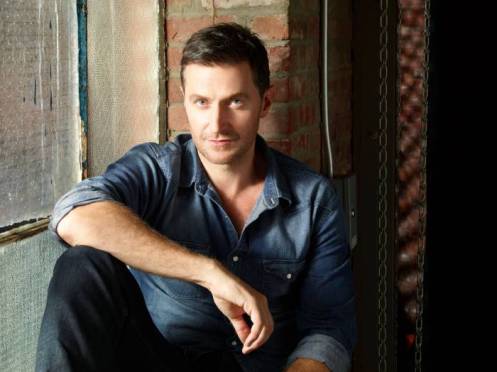
Richard Armitage as a Dreamboat, photographed by Robert Ascroft, 2013
Sourced via Ranet.com
This is image is an example of those blurred boundaries that I mentioned earlier. We have Armitage posing here for Ascroft again. He is sitting on a window sill, dressed extra-casually in denim shirt and trousers. His shirt sleeves have been rolled up, exposing his sin-inducing forearms. The scene is distinctly different here from the other Ascroft images (with the exception, obviously, over the other two images from the window series – and the images shot on location in the street): Most of the RARA images (I really like my little acronym that I have coined – there is something about Ascroft’s way of shooting RA that makes you want to roar…) have been shot in a somewhat artificial setting. By that I mean that they have been set up in a studio against a neutral backdrop, giving the resulting images a feeling of artificiality because they are not incidental but clearly posed and carefully arranged. This picture, however, shows RA sitting on the windowsill in an industrial environment. There are bare brick walls in the background, a rough, single-glazed window with translucent glass. There is an electricity box visible behind Armitage, as well as some metal chains and a steel girder. The chains are most probably part of the backdrop, which is also just about visible on the right hand side, for operating the heavy rolls of different colour paper that act as backgrounds. So while we are still in a photographer’s studio, the set-up is deliberately “incidental”, or realistic.
Through the window on Armitage’s right, natural light illuminates the sitter. This is beautiful – as a photographer I *always* prefer natural light to studio flash, because not only is it easier to shoot with, but it also has a quality that is hard to replicate with artificial light. In this case, we have a nice side-lighting effect that reveals Armitage’s face softly and almost completely. Only about a quarter of the face has traces of shadow on it – and Ascroft has cleverly directed Armitage to sit on the sill in such a way that the light from the window does *not* obscure RA’s left eye. We are thus afforded a glimpse of *both* eyes unobscured. Armitage’s position on the sill is very deliberate – not just for the angle of light, but also as to give the photographer space to actually move in and get the right perspective to shoot from.
The setting suggests to me that this is a transitory moment. We wouldn’t assume this setting to be a place to dwell in (this reading obviously is also informed by the fact that we *know* the image is part of a wider shoot with Ascroft, and thus does not take place in the sitter’s personal home, for instance). Much like the backgrounds a press photographer like Nearmy works with (places where the sitter is quickly arranged for a shoot, clickclickclick and done). While the denotation says “loft”, there are connotations that go with the setting – adjectives like “cool”, “edgy”, “gritty”, “unconventional”, “relaxed” come to mind, all working to evoke a certain interpretation of the subject – as an artist, an unconventional, unusual man, a free-thinking, free-living individual, focussed on the essentials of life, the “brick and mortar”, literally, rather than the superficial beauty of glossy, interior-designed spaces.
This is also reflected in Armitage’s styling and pose in the shot. Fitting for an industrial setting, Armitage is dressed in denim, head to toe, actually. His denim shirt is left open at the collar, exposing part of his neck and chest. He has casually rolled up his sleeves, giving us an enticing view of his forearm and with the sidelight from the window catching the little hairs on his arms, do you also feel this irresistible pull to reach out and stroke the fuzz? Ahhhh… Eh, where were we? *guyltyrummagesforherwitsinthepoolofdrool* Particularly the pose has me wiggle my bum nervously on my seat my heart in flutters. Here is RA sitting rather naturally, not artificially standing in front of a pristine white backdrop, with his right leg drawn up on the ledge, resulting in an open-legged stance. The view of an unprotected package core is always a thought-inducing sight. How can we help it, we are only cave women. There is a delicious promise in that, as it speaks of unguardedness and invitation to explore. The just-about-noticable adam’s apple and the tendon on the neck are details that amplify this, as does the slightly bunched shirt over RA’s belly. “The promise of oftness beneath”??? This is almost a version of the Diet Coke window-cleaner outside the women’s office – not a cerebral man, but a man who is supposed to appeal with his sexual magnetism rather than with his inner beauty. And all of that without a single pec on sight! *sighs*
You would think that a deliberately open pose like this, addressing our ovaries baser instincts directly, would go along with Armitage’s trademark under-brow-smoulder. But oh no! Not here. And this is probably where my fascination with this image comes from. For once we have an image of RA where he has to look up into the camera. Ascroft is probably shooting this while standing in front of his seated subject. Armitage has still habitually angled his face slightly down, but that forces him to look upwards with his eyes. His brows are raised and his eyes appear wider open than in most other shots of him. Is it just me who finds this facial expression friendlier than the usual? There is less of the narrow-eyed predator and more of a wide-eyed boy wonder. A hint of vulnerability and naiveté are in those eyes, but also a large appeal to our trust and love. Armitage smiles with his eyes, particularly his left eye – and the overall message of the facial expression is that of a smile, even though the mouth does not curve up to match the benign, trusting friendliness of the eyes. On top of that, the slightly higher perspective makes Armitage’s lower lip look bigger than the usual thin lip line. There’s a hint of a soft-promise kiss there, and you can almost imagine the softness of the otherwise usually rather ascetic lips, a promise of warmth, and sweetness and sensuality.
Getting back to where I started from – so how are Ascroft’s shots different to Nearmy’s when I have attempted to prove that this shot is so similar in terms of the sense of informality and reality in the background? For me, Ascroft’s images simply have less immediacy to Nearmy’s. It is hard to tell whether my impression is guided by my hermeneutic knowledge – carefully planned studio portrait vs. time-efficient and background-challenged photo call. Nearmy has to work with what she has been given – that is, a setting she might not have chosen herself to take the *ideal* photo; Ascroft has chosen the locations himself. In his images there is less sense of “The subject is gonna get up and walk off” as there is in the Sydney images. There is contextualisation, but it is artificial, deliberate context: a portrait of the actor in a loft-y setting.
The window sill decoration Armitage looks much softer than ordinary angel Armitage in Nearmy’s photo. Some of that is due to the light, the soft, glass-filtered natural light in Ascroft’s shot vs. the harsh direct sunlight in Nearmy’s photo. That does not mean that this image is out of focus, but there is a feeling of hazy distance, while the Nearmy image was crispy clear, more immediate, more “touchable”, more slice-of-life. Here is a feeling of cotton wool, cloudy dreaminess, some of which is caused by the look on Armitage’s face, but not all. Ascroft’s work can be considered more deliberate and more aesthetic, because it is carefully composed from the placing of the sitter’s head in front-centre of the strip of brick wall to the many vertical lines in the image. It is compositorially more pleasing with the irregular pattern of verticals and the visual contradiction of straight lines of the inanimate objects against the soft contours of the human body. There is, again, more “soul” and “sublime” in Ascroft’s interpretation of Armitage than there is in Nearmy’s, but there is more “here” and “real” in hers.
The dreamboat is in full sail, though. Invitingly, friendly, promisingly. Again, I can hear the call. I want to sail that ship. It’s as if the sirens have switched bodies. All of a sudden we are Ulysses, sitting on shore, and the siren is on the dreamboat, beckoning, teasing, pulling. I’d love to be the first mate, no doubt. Siren Armitage, you can tie us to the mast, if you want. We’re all aboard.


Thanks for analysis and for the fun. You made me smile during a not very happy day. Thank you.
LikeLike
🙂 – Hope you are still smiling, micra!!
LikeLike
I do my best… 😉
LikeLike
Yes, :0) we’re all abord!
LikeLike
We are quite a crew. Ship ahoy, Ana!
LikeLike
We are indeed… 😛
LikeLike
I really like the industrial backdrop in this, it sets the tone and feeling for me. if RA was in the same clothes, same position, etc. but against a plain or artificial background, i wouldn’t like it nearly as much. as for the full on face shot and the casual feel of his expression, I think it almost seems like he’s waiting for the photographers next direction, or trying really hard not to fidget 🙂 I was wondering though, knowing your dislike for the beard (I have no preference, I like him both ways!) would you consider “ooof”ing one of the bearded shoots? (Keith Clouston or Matt Holyoak)
LikeLike
Yes, I like the industrial setting, too. Probably because I find them “cool”. Plus, I would like to think that RA is “cool” and “edgy”, too. Yeah, that is me projecting… The expression on his face is quite unusual, isn’t it? He usually looks much fiercer than this, I think. But that’s what draws me to this one – the fact that he looks a bit different.
I really have to dial my beard-hat down a notch. I don’t really want to let that come between me and my mission ;-). Or me and my readers, for that matter. I’d be delighted to have a look at bearded RA again. I’ve done a Holyoak before, so Keith Clouston sounds like a good idea. Noted, Kelbel. Will be done! And thanks for suggesting.
LikeLike
Well, well. This post has given me a hard time. The last hours I had been pondering about your analyses (not the worst way to spend a day off) and I still cannot really agree on all above. You know, the Ashcroft pics make me feel uneasy. Several times the thought crossed my brain that this is not even Richard Armitage at all, but some other (handsome, darkhaird) man. Other Ashcroft pics had given me this feeling even more. I searched the dungeon of the web to find a post of a blogger I recalled to have come across some months ago, and hear hear:
http://crispinseclipse.blogspot.ch/2013/02/picture-perfect-or-imaginary-image.html – I am not the only one who cannot really put her finger on it, but is quite sure there is something wrong.
Maybe it’s because I suffer on severe shortsightedness (can’t be helped) or maybe I lost connection to my inner cave-women (must immediately be helped!).
Maybe it’s because I have a slightly different cultural background (naah, it’s still Western European) or maybe I seriously lack empathy (uups, I really don’t hope so).
But after having had a look at the picture for the 25th time, increased it to a 400% to get the smallest detail I still cannot find him looking friendly and promising (although RA pictures have a constitutional bonus from me and I tend to watch them with more than positive feelings *ahem). This facial expression comes across to me as the sitter being extremely annoyed (which is possible, as I have heard this is not the part of his business he likes most) or the sitter is going to burst into laughter right in a second (just after this moment is banned on film and the sitter is released from posing) about the absurdness of the situation.
I am worried why my interpretation differs so substantially from yours?
Although my head can agree with all of your connotations when it comes to cool/edgy/gritty/unconventional/relaxed” resp. unconventional/unusual/free-thinking/free-living individual, focused on the essentials of life – this is exactly as I picture RA for myself. But it doesn’t work with the Ashcroft pictures. My guts reject.
The last passage of your post? Kudos to you. I wholeheartedly agree. Thanks for booking me a nice place on your dreamboat. Preferably one with a good view on the siren.
LikeLike
Ah, i.f. – look, don’t worry about it. We just have two different tastes in photographic aesthetics. There is nothing wrong with that. You simply don’t like Ascroft’s style. I love it. But even if I am the one “supposedly” in the know about photography, that does not mean that my opinion is the only permissable one. You quite obviously do not like the aestheticised look that Ascroft produces. You may be more into the documentary work of press photographers such as Nearmy, Wills, Deutsch. Fair enough! We bring our own aesthetic principles to what we see. I am quite possibly unduly impressed by the technique that I can detect in Ascroft’s imagery, and that may cloud my vision. For me, good photography is about composition as much as representation of the subject. I get distracted by imperfections that are a given in the incidental nature of press photography. But that is just ME. You and everyone else is gladly permitted to overlook those and to zoom in exclusively on the sitter and revel in the life-like-ness of him in less deliberate (non-studio) photography. It just means that you are better at focussing on the parts that really matter, while I get distracted by other details. It’s YOUR gaze and noone can prescribe what you should like!
I looked at the link you provided. That particular photo of RA’s is not really a favourite of mine either, although it displays Ascroft’s characteristic approach – all sleek, all carefully composed, all polished. All artificial? Too perfect? Possibly. But I very, very VERY much doubt that Ascroft would go as far as photoshopping heads onto body doubles.
LikeLike
Glad to hear my comment doesn’t upset you.
You are right – for me the sitter himself is a bit more important than the surrounding (shallow person that I am). But I have always been (told to be) obedient to the advise of people with authority. And as photography is part of the world of creativity that is so far beyond my own (static) world I am more than happy to accept your authority to read a (professional) pic in the correct way. I know that finally it comes down to each ones personal taste – but I am also curious how the mechanism of other people looking at these pics works. I often wonder how it would be to see the world through the eyes of others. Have you ever come across portraits of Jim Rakete? What do you think of them?
ps: I never had the intention to imply that Mr. Ashcroft would photoshop heads onto body doubles. That thought didn’t even cross my mind. I am sure a photographer of Mr. Ashcrofts calibre would never jeopardise his reputation with such a cheap trick.
LikeLike
No, i.f., it hasn’t upset me at all. I will admit that I can be quite a mimosa where criticism is concerned – but only if it is levelled at me *personally*. You have discussed the object of our discussion and not me, and I am fine with that. And I hope you feel equally respectfully treated by me!
BTW, I know where you are coming from (haha, literally) re. believing in the authority of “experts”. After all I am German, so there, I have that tendency myself. Just see me as someone who is giving you food for thought – not food for belief ;-). I am as fallible as anyone.
The gaze of other people is infinitely fascinating, i.f. Let’s face it – there are as many different opinions as there are people. And it is interesting to ponder how somebody else perceives the same situation that we are seeing. (I struggle with that every day when it comes to me and my partner *haha*)
Jim Rakete – immediately makes me think of Nena. Wasn’t he her manager. I must look up his work; I do know that he got into photography. Nice suggestion.
My reply as to the photoshopping of the armchair RA was unclear – you didn’t say that. I read it in the link. Apologies.
LikeLike
You know what? I really love the discussions on this blog and I feel very much welcome to your part of Armitageworld. Thank you so much.
I will happily join in the discussions and will try my very best to stay strictly focused on the subject and under no circumstances offend my discussion partner on a personal level. Just sometimes I struggle with the language. It’s not so easy for me in English. Rather limited skills and lack of opportunity to practise it.
Jim Rakete was indeed Nenas manager. But last Christmas I came across a book he had published with numerous b/w pics of a respectable number of celebs he managed to shoot in quite a short time. If I recall correctly it’s called 1/8. Astonishing pics. Recommondation of BIL, of course. Stunnig.
LikeLike
Hehe, I feel a bit like a preacher here, all that demanding of respect and so on. You are most welcome – as is everyone. “Welcome in the bosom of my bosoms” *ahem*
I followed your suggestion, i.f., and surfed over to Jim Rakete’s website. I am afraid to say that we must agree to disagree there. I am really not trying to be contrary at all, believe me. But Rakete’s images did not impress me at all. It is neither the subject matter, nor the set-up. His technical abilities are obviously on par with any professional photographer. However, imho, there is something off with almost all of the images I have seen. They are compositorily flawed, all of them. The sitters are not quite in the centre, they are just marginally off-side, but not far enough off-side to be a deliberate statement (as in negative space). He has a tendency to scrunch his subjects either at the bottom of the frame or to the right. Sometimes the horizon is ever so slightly off. These are details – but for me they marr the shots completely. I also noticed the use of silly props in a couple of images (supermodel Claudia Schiffer with a rather heavy-metallish looking e-guitar… why??? the woman has no association with rock music whatsoever; entertainer Götz Alzmann handling a speed graphic (classic press camera)??? I don’t get it.).
Unfortunately the more I looked at his imagery, the more this feeling of resistance and annoyance grew in my stomach, almost to the point of anger at what I perceive as carelessness in post-production and/or shooting. I suppose that is what you must have been feeling when looking at the Ascroft stuff. The whole experience just reinforces the belief for me that there is no objective good or bad. You find Rakete’s style stunning – I can’t feel it at all. That has to do with some irrational pet hates of mine (not a fan of symmetry while being a sucker for the rule of thirds) and does not mean Rakete’s work is sub-standard. His international success quite obviously proves me wrong.
But hey, I can’t send off this comment without reaffirming that I hope you will continue to read here and comment. Prove me wrong and challenge me. It’s good for me 🙂
LikeLike
Interesting — looked at his website and it’s almost strange, the slight offcenteredness, as if he’s doing that on purpose. And wow, that pic of Joschka Fisher — I thought, heck, I could have taken that one.
But I don’t really know anything about photography.
LikeLike
Well, that was my impression as well – that it was done on purpose. But I just cannot see the point or the beauty in that. *shrugs*
LikeLike
Wow – I really didn’t mean to upset you. Sorry for the bad recommendation.
Certainly I will continue to follow your blog – just you not having the same taste as me is no reason for not enjoying your blog otherwise immensely. Over all it’s the big picture that I try to keep in mind. There are hundreds of photos out there of RA – just not all of them to the tast of everybody (how could be?). So what? I am sure once in a while I will open a new *ooof and fall from the chair. Hope this will not happen when I am at the office. It always gives such a bad impression and ruins my aplomb. And I would not be interested to explain to my colleagues what had already happend. Would definitely ruin my reputation.
LikeLike
i.f., let me underline Guylty’s repeated statements that we do not have to agree on everything. As long as you disagree about the *thing* we’re talking about (as opposed to criticizing the person making the judgment), we’re all fine.
LikeLike
you like what you like and you should never feel shamed for that or “try” to like something just because, seemingly, everyone else does 😉 I personally like different pictures/shoots for different reasons, and the ones I do like, I don’t like everything about them; it’s just the positive or negative feeling that they overall leave me with that matters. I like this shoot, but there are many things I don’t like about it: his hair for one, and as has been mentioned the possible photo-shopping or makeup to hide all his delicious crinkles and laugh-lines; so in that respect I can understand them feeling “off” or not real (those are his hands in that chair pic you linked, trust me on that 😉 *blushes*) he also seems uncomfortable in several of the shots, stiff or awkward in his poses (which may be why the chair pic doesn’t look real to some, the way he’s almost shrugging with his neck). I like the colors though, and the lighting, the atmosphere/settings, the clothes, and the openness of his features; he seems youthful to me in a lot these shots. do I faint at every shot that comes out? no. but overall I enjoy them 🙂
LikeLike
thanks for your kind words. Calms my worries.
Ahemm….
is there anything you know about his hands that I don’t do?
Details please!
😉
LikeLike
*laughs* no, I just really like men’s hands in general, so i pay particular attention to them when they’re visible 🙂 RA has long straight fingers, with large knuckles and the veins over the tops of his hands are often quite pronounced.
LikeLike
Once again, Guylty, I am with you, perhaps especially with the strikethroughs. Just can’t get enough…
LikeLike
Thanks Leigh – the strikethroughs are my guilty pleasure *heehee*
LikeLike
the strikethroughs? 🙂
you *are* easily amused 🙂
LikeLike
LOL – totally. I am quite easily pleased in any respect.
LikeLike
Hmmm, it’s an interesting comparison. I’ll own that this isn’t my favorite of the Ascroft works — maybe I like the rather more surly look? Not sure 🙂 What is becoming clear to me is the decided aesthetic that Ascroft is crafting…this is Richard Armitage, but viewed through a very specific lense – the vision of the photographer. To an extent (IMO), this is absent in the Nearmy and other press shots because they don’t have control of the whole photographic universe the way Ascroft does in a scheduled studio shoot.
The conversation about how much or how little a particular image speaks to an individual is important – I think that many people have been told what “art” is, as if it were a universal truth – I don’t think that it is…what is striking to one can be plain puzzling to another… for instance, people rhapsodize about Michelangelo’s David…I can’t get past the disproportion of his head and hands *shrugs* I don’t dispute the command of medium or the artistry in general, it just doesn’t speak to me like the Pieta does…eye of the beholder is key 🙂
LikeLike
Ascroft has a distinct personal style or aesthetic, correct. The polished, abstracted portrait with a certain fuzzyness that turns the sitter into an object of beauty. I am deliberately using the term “object” here – there is some objectifying going on, I think. That could also be something that the critics of his approach do not like?
You make a good point with the lack of a distinct style in press photographers. I think that is deliberate – press photographers have a different objective to (art/commercial) photographers, namely the quick documentation of news-worthy events. It is essential for them to appear documentary. That ensures that their images are distinguishably current and useable for illustration of news items. At the same time images from different sources may appear as illustration for the same news item. It would be less appealing, visually, if the individual images differed too much in style. (Just my own thoughts – there is no handbook for press photographers that says this…)
Thanks for raising the issue of art reception. I think, the great achievement of post-modernism is that there is no such thing as prescribed art anymore. Art can be consumed and enjoyed by anyone, and it is assumed that art appreciation does not require any specific pre-acquired knowledge. While there still are distinctions between, say, kitsch and art, or popular art and academic art, I think that the boundaries have become blurred, and people are more accepting of differing attitudes and verdicts about art. Unless they are ignorant twats! 🙂
LikeLike
An art object – yes, exactly – that might be what is subconsciously bothering people about these shots – there’s a certain amount of disconnection perhaps.
Fortunately there are decidedly few of those IT’s (…and I don’t mean Information Techs…) around here 🙂
LikeLike
I think, together we are getting there, Obscura – you have thrown in the keyword “disconnection”, which leads me to think of alienation. Not strictly in the Marxist (ahem) way, but more in the deliberate distancing of subject and viewer through the photographer’s interpretation. – Now, this is intellectual wanking at its finest. Sorry. I stop. I am an IT of a different sort…
LikeLike
Don’t stop on my account 🙂 Alienation…interesting -that’s at the heart of artistic license isn’t it…”I know some people won’t like this, but I don’t care…it’s MY vision.” It’s all subjective.
LikeLike
..and sing to us ,sing…we are not affraid of you !. It was beautiful,Guylty!..and thank you for making me smile 🙂
PS: I love everything about this shot, except..(do not listen ,Richard!)..his eyes. I can’t decide if they are playful or sly. Don’t hit me,girls!
LikeLike
Ha – that never occurred to me about my own metaphor. Yes please, Siren Armitage – with that voice he really could be quite distracting. I would love to have him act in musical, preferably in the Westend.
oooh, you didn’t like the eyes? Hehe, and I really liked the eyes this time round, because they looked bigger and more innocent. All in the eye of the perceiver, I suppose!
LikeLike
Thanks again for an interesting analysis! I like his posture and the composition as such. But I agree with Joanna as far as the eyes are concerned. His gaze is so strange, even a little bit disturbing – I really don’t know what to make of it. Cold, emotionless, even a little bit scary in my eyes ( sorry for the bad pun 😉 ). I wonder what ” stage directions” Ashcroft gave him, or maybe he just released the shutter at an awkward moment…
LikeLike
Hahaha, I just *cannot* deliver the right picture for you, it seems. (I will soon, though, promised, Nimue – the Vera Anderson images are on my list.) Funny how we can see it so differently – I love the eyes, you find them cold. As for the directions – I would imagine Ascroft to direct his pose rather than the actual expression. Maybe like “Chin down, Richard. But keep your eyes on the camera. Open them up a bit.” I take it Ascroft is not too fond of a smiley RA – all bar two of the images we have seen so far show Richard with a rather neutral to scowling look on his face. Is Richard morose? That is not how I have perceived him in the latest interviews. This must be a conscious decision on the photographer’s part. He has made a subjective choice from the archive of his images. Who knows – there could be loads of radiant smiles in there.
LikeLike
There’s always the question, when his brows go up like that — is he about to smile or about to frown? It could be either; we’ve seen both … Il Giocondo again …
LikeLike
Sorry, but you lost me at the picture. Will have to read the rest tomorrow as I intend to gaze and ooof a bit more. *off ooofing* 🙂
LikeLike
*phew* For one moment I misread your comment, Bryni, and thought you were not feeling the image, either… Hope you had some hot *ooof* moments there 😉
LikeLike
What I like out weights what I don’t. Joanna you said the eyes look different, I agree but I will go a bit more to say I think his face looks a bit washed out, pale. I still like the pose the arms , rolled up shirt sleeve, the causal pose. I do like RA in a causal setting more than formal. I do think that in a setting like this that he would have to pose in what ever way Ascroft wanted him to and they may not always make him look the best. I say this because every year for school pictures ( in the US) they tell son2 to smile and it really don’t look like him at all. He looks cheesy to say the least, fall 2012 he asked for retakes before I even saw them, better the 2nd time but not great. We get the real son2 when we take them and he can even smile and look great, he has always been like this.
Sign me up for the dreamboat too, with a life jacket as I can’t swim.
LikeLike
You are right, Katie. The face (particularly his right side) is a bit washed out due to the daylight hitting him from the right. Acroft overcompensated for the dark shadow on the left side of RA’s face because he didn’t want it in full shadow, I presume.
In my work behind the camera I have noticed that some people are loved by the camera, others unfortunately not. I belong to the latter category. I look shite in each and every photograph. A TV/film actor such as RA most definitely is loved by the camera – any camera. I don’t think he can do much wrong but will always look pretty. Lucky man.
LikeLike
Wow S., you leave me rather speechless here. I’m deeply impressed about what you brought up at the end of your picture description. Now as you unexpectedly name it „Siren Richard“, it offers an explanation why for years now I have this persistent wooing (tingling!) in my ears, sugar-sweetly sounding calls, though whispered in a dark voice. Hell yeah, siren calls! Untiringly tempting and alluring and hauntingly beautiful. „OOOOOOOF“…. It is soooo distracting and it absolutely can’t be ignored at all!
Maybe therefore I like „my Richard“ to be a tad more real, as you pointed it out for the pics of Tracey Nearmy, for we mainly get to see him in fictional (film)worlds and stories. Too many mysteries for my liking or is it that it is those mysteries that I can hear singing all the time?? 😛 You see, I’m already aboard. 😎
LikeLike
Oh G!!!! How did I miss your comment??? Yes, that Siren’s call – it seems to be getting stronger with time. Very strange. At the beginning I didn’t hear it at all, and then all of a sudden it has become so strong, it sounds over everything else!
LikeLike
[…] Something shot along the lines of the images by Tracey Nearmy which I discussed here, here and here. The photographer has been called in to take pictures for circulation in the press. He has to work […]
LikeLike
*ooof*: Every (Armitage) Shot’s a Hit | Me + Richard Armitage said this on September 16, 2013 at 10:00 am |
[…] the casually dressed Armitage in front of a wall with peeling paint in various poses, he had him perch in front of a window, and he took him outdoors on the street in a coat. Dunn did the same here – she shot the […]
LikeLike
*ooof*: Viewer ReActions | Me + Richard Armitage said this on March 11, 2014 at 8:01 am |
[…] A photographer with a classic and classy approach. ooof ooof ooof ooof ooof ooof ooof ooof ooof ooof ooof […]
LikeLike