
*ooof*: A is for Armitage
Ladies and gents, we have successfully returned to normal scheduling. *phew* Nothing new these last couple of weeks, and so Guylty can catch up on a few requests that have come in during the controversial RARA vs press imagery phase. Catching my breath, I thought I’d give you a little insight into how I work on these picture analyses. I hope that is not too egocentric for your taste. I promise that there is some *ooof*y stuff for you to swoon over, later… But there is the usual insight into the working life of a photographer in this, too.
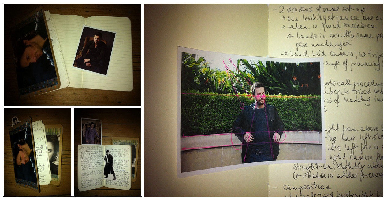
You see, even in the digital age, (some) photographers still hang on to good old practices from analog times. Like many others, I have the habit of carrying a little notebook around with me at all times. The notebooks used to serve a good purpose: Back in the day, photographers used to jot down the coordinates of their photographs in their little black book – number of image on the roll of film, exposure, shutter speed, ISO, focal length. Shooting digital, it is not necessary to do that anymore, as this so called “metadata” automatically gets recorded in the image file in-camera. The reason for recording this was to be able to reconstruct how an image had been technically produced – for later reference or in case one needed to re-shoot. Nonetheless, even today it is practical to have a little notebook at hand when shooting – for instance for recording the coordinates that are not automatically documented by the camera, such as lighting set-up, props that were used, actual location used, name of sitter etc. I was recently gifted a couple of personalised mini Moleskine books when the Tumblr RArmy organised a RA Valentine’s swap. The lovely richards-smile craftily embellished the notebooks with pictures of my beloved Guy – as you can see in the pictures – and they have been accompanying me ever since.
When I get ready to *ooof* I lock the door and dim the light print the image in question and start brainstorming in my little notebook. I look at the picture in-depth, first on the screen of my computer, because the digitally displayed image is always clearest and has the added advantage of being resizable. And as we all know: Size matters. I jot down in my book anything that I want to cover – such as his neck with kisses… ooops… wrong context the composition of the photo, the lighting, the framing, the colours, the styling and finally the associations that come to me when I am looking at the image, i.e. mainly that he is the most handsome man I have ever seen and… *ahem*. Sometimes I also draw on the print-out of the image itself, in order to visualise sight-lines, make a note of contrasts or simply marking down points of interest. Only then do I sit down at the computer and actually write the analysis on the blog. The notes help me to remember all that I want to say, and to structure how I am going to say it. But even then, oftentimes the *ooof* changes half way through my notes, I suddenly see something new or different, and I rewrite my structure as I go along.
All of this takes between three and four hours to put together. Occasionally I have to research technical details, look up the photographers’ other work, or reference other theoretical writing. It is a process that I enjoy immensely. Even though it is slightly academic in its procedure, and sometimes a challenge to find something to write about and to explain it coherently, it is a relaxing, enjoyable exercise for me. I learn something new every time I do it, it gives me ideas for my own portrait photography and has actually grown my confidence in my own photographic and analytical abilities over time. – And after I have written my *ooof*s, the little notebooks are a record of my photographic journey.
This week I had to start a new notebook. This time ’round it is a bigger format classic Moleskine notebook. It is actually part of a wider art project organised by an arts council in Ireland and asks artists of all media to keep a notebook and then to donate it after a few months. I’ll be handing this in. Richard Armitage as a work of art. Well, it’s kind of fitting, I suppose, but my plan is to enhance my analytical work with some own images that will be made on the basis of the images that I am analysing. But enough of my own insignificant self, let’s have a look at today’s image.

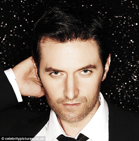
“Here’s looking at you” says Richard…
Richard Armitage in two images by Tracey Nearmy, 2013.
Sourced via RAnet.com
You are no doubt all familiar with these shots as I have discussed Tracey Nearmy’s imagery before. These two were suggested to me by tumblr friend Yungarnet. I happily oblige, beard and all ;-), because this is interesting as we have two almost identical images to look at in which the set-up is always the same. The only difference, really is, that in one version the subject looks at the camera, in the other, he looks away. And identical they really are: If you look closely, you will see that nothing has changed between the two shots. Armitage has not shifted his position at all, his hands remain in exactly the same position. However, there is a tiny change which the gif makes visible: One version has been straightened and lightened a bit. Presumably this was done in post-production – there could not have been an adjustment to the lighting during the shoot without Armitage moving his pose. I nonetheless conclude that Nearmy was shooting hand-held, without a tripod, but in quick succession. This is, of course, typical for a photo call scenario where there is no time (and space) for a deliberate tripod set-up, but the emphasis is on the quick shooting of images.
As in her other images, Nearmy has to work with what she is given. The lighting here seems to consist of the ambient light from above and behind, touching Armitage’s right shoulder. Another “light from the heavens above“? It should really leave the sitter’s face in shadow, but Nearmy uses fill flash to light her subject from the front. Her off-camera flash illuminates Armitage from above front, as can be deduced from the shadows under his forearms.
The composition of Nearmy’s photograph is characterised by the straight lines of the location. There is a wall with a ledge against which Armitage is leaning, as well as a straight-cut green box hedge behind him. The subject has been placed in the middle of the composition, making the image a lesson in symmetry. Although I have often derided symmetry as “boring”, it can work very well, as in this example. Symmetry is expectable, and therefore largely unchallenging, but it has a calming effect.
People/portrait photography is usually done in the eponymously named portrait format (i.e. the short side of the image up). This is fairly logical, considering that the human shape favours that kind of format – it applies both to the head alone, as well as full- or half-length portraits. We simply get more detail of the subject into an image if we shoot at portrait orientation. Therefore it is interesting that Nearmy decides otherwise and shoots this in landscape format where parts to the left and right of the sitter depict only background. She is obviously interested in creating a visually pleasing overall composition. Well, she doesn’t have to worry much about a visually pleasing subject. That’s a given. And in a way, shooting landscape orientation is a safe option, because it still leaves the option to crop the image to portrait format in post-production. (The high number of ppi in today’s pro-cameras easily allows for that.) This can even be done by the picture editor/graphic designer of the newspaper that buys the image for publication.
The colour composition of the image is equally calming. There is nothing too loudly colourful in this image, it is quite pleasing with its shades of grey and green, and only adds a few speckles of colour thanks to the Birds of Paradise flowers dotted in the shrubbery of the background. However, with a subject dressed in dark colours, this image is clearly meant to be reproduced in colour. It would not work in b/w because there is not enough contrast between the hedge and the dark top/jacket of the subject.
Our eyes, in this calming exercise in symmetry are, of course, drawn to the subject in the middle. Armitage is leisurely leaning back against the wall behind him. He has placed his elbows on the ledge and matches the calm that the symmetrical composition implies. The pose could have been assumed naturally by Armitage, without any prompting by the photographer. It seems logical to place oneself in that position while being subjected to the (tedious) procedure of a photo call. But this particular pose works very well in the setting: By drawing his elbows up onto the ledge, the subject takes up more space in the frame than with his arms hanging loosely down. The pose breaks up a predictable and rigid vertical vs horizontal arrangement by adding diagonals (the angled upper and forearms) into the composition. You could also argue that it highlights the contrast of the rigid horizontal lines with the soft, round human shape. But more importantly, it brings the subject’s hands into the frame – which otherwise would have been cut off in this particular composition. And that would have been a pity unsightly.
If you have looked a bit closer at the nasty iPhone pictures of my notebooks above, you may have noticed my notes on the lines in the image. The above mentioned horizontals are obvious to anyone. Interestingly, they run pretty much exactly along the “rule of thirds”-lines. Very pleasing! But what I found more compelling was another little detail: The metallic zipper edges of Armitage’s leather jacket turn out to be sight lines that guide our eyes exactly to the eyes of the subject. That is, no doubt, coincidental, but an interesting little detail. And now add the horizontal lines to the zipper diagonals and what do we come up with? The letter A. Yes, A as in Armitage. Sweet. And completely incidental, but any detail counts when obsessively *ooof*ing…
Could you say which of these two images is your favourite? They are identical but in the end everything comes down to the difference between the direct and the averted gaze. In one version Armitage looks directly at the camera. His eyes indicate a smile (I find it difficult to tell exactly as his beard obscures his mouth to some extent) and by gazing at us as an extension of the camera, he establishes a parasocial relationship with the audience. We feel directly addressed by the sitter, he is communicating with us by allowing us to look into his eyes. The direct gaze leaves us feeling connected to him, we are bound to each other through the shared activity of (seemingly) gazing at each other. Version 2, on the other hand, has Armitage averting his gaze. He looks off-camera to his left. With his mouth ever so slightly open, it feels as if he is about to say something. The communication in this image is one-sided – the viewer tries to establish communication with him by looking at him. He is deliberately breaking the communication by looking away (although the act of looking away can be interpreted as a message in itself, I guess). Personally, I prefer the version where Armitage gazes off-camera. In this instance, it could be caused by the facial expression that looks slightly more attractive to me than version 1 or by the slightly less static feel of version 2 where Armitage seems to be caught in motion, just about to say something.
But thank you, Ms Nearmy or Mr Armitage – whoever may have been responsible for the pose. By drawing the elbows up on the ledge, the body posture also causes the jacket to open at the front. Thus, we are allowed an unrestricted view of the abdomen and a bit more chest. Do you also feel the motherly urge to step up to the boy in the picture, to tuttut at him and to wedge his bunched up t-shirt back into his trousers? “Really, Richard, you must look after your appearance a bit more. What are those lovely ladies going to think of you? A sloppy dresser?” Ah, never mind, that’s actually one of the attractions of the Armitage – the normal-guy-next-door attitude that still occasionally shines through in the little details. And never more so than in the slice-of-life imagery of a photo call. There. I may have convinced myself that photo call images are actually more “Richard” than the artificial products of studio photography. If you keep suggesting these to me, I may become a fan.
All text © Guylty at me + richard armitage, 2013. Please credit when using excerpts and links. Images and video copyrights accrue to their owners.


What an amazing ooof as always, guylty. And thanks for the very interesting look insight of a photographers work (I´m such a bloody amateur myself), was never interested in professional photography, but your ooofs open new horizons…
Wish that you´ll get the opportunity to “shoot” that man one day, you really deserve it.
To the image: I like the first one a bit more because of the direct approach. And this kind of pic makes me feel he´s a real human being, not a god who drows a little attention to us earthlings like the Ascroft ones.
LikeLike
Thanks Ute 🙂 glad to hear that my writings widen your horizon. I am curious by nature (pre-requisite for a photographer ?!) and love insights into things that are usually closed to me. Hence I am giving away the secrets of my trade here 😉
The direct gaze has its attractions. Strangely, it slightly unnerves me. I had a whole paragraph written about “As is so often the case in life, your individual preference of which picture you like says more about you than about the sitter”. And then I left it, because I was totally giving away too much about myself *haha*.
As for shooting RA myself – I think that would unnerve me too. But then again, I love rising to a challenge, and ultimately conquering it. *ggg*
LikeLike
Guylty – I actually asked Ilaria Urbinati (on twitter) if the untucked shirt in this picture was intentional – and she said YES!!!! OMGWTFBBQ I CAN’T EVEN ASDFGHKL;K;DA DKSJFA;LDKFJ
LikeLike
I suspected it 😉
LikeLike
W-T-F??????????????????????? Abby!!!!!!!!!!! I am dumbstruck. a) I can’t believe that you actually asked her. b) It is incredible that she answered. And c) I am obviously so out of touch with fashion if blowsy, frouzy bunched up t-shirts are a fashion statement. *ROFLMAO* Well, please pass on my thanks to Ilaria – she’s given me opportunity for a bit of a mothering fantasy there *ggg*
LikeLike
Very nice post as always, my dear! Love the pics of your notebook and the explanation of your method to *ooofing* 😛
I too like image 2 more, I usually love the off camera gaze of a sitter.
I also think that this photo shoot (one of my fave) shows a bit of a real Richard. It doesn’t seem so *built up* as the RARA ones (excuse me if it’s not the right verb but I hope I explained what I feel). They are simple great pics of a very handsome man sitting on a bench or standing by a wall. Very normal, very down to earth except the man is incredibly beautiful. The two close up from this photo shoot are my ever fave ones. Those eyes are so bright, so beautiful yet so simple, nothing fake, nothing pretended… I can see the whole universe in those eyes. Ok, now I stop before fainting and drooling on my keyboard… Thanks as always for the good lesson in photography tecnique and for the weekly *ooof*! 😀
LikeLike
Yeah, his eyes come out really well in the close-ups. Brighter than usual, actually. There *is* the whole world reflected in the sitter’s eyes when you are outside the confines of a studio. Thanks for commenting, micra 😀
LikeLike
Yes, probably is the out of studio situation that please me… wait, I am just kidding myself, I perfectly know what is pleasing me… LOL! 😀 😉
LikeLike
HERE IS THE PROOF:
LikeLike
LOL ROFL You’ve made my day with that, Abby. This is just the funniest thing I have seen today. Good on ya!
LikeLike
LOL indeed! I must say they know how to do their work 😉 But they way the question is put puzzle me. Is Ilaria approving the fact that the shirt was untucked (by chance) or has Ilaria dictated the thing? Sorry if my bad English don’t let me understand fully 😦
However, the halfway-untucked shirt is very much RA waking up and grabbing his dress from the floor while the driver is waiting for him at 5,30 a.m.!!!! 😛
LikeLike
You are posing the important questions of the 21st century, Micra: Is Richard Armitage deprived of his self-autonomy or not? I would like to think he is an autonomous dresser.
LikeLike
Exactly, I’d like to think he is autonomous in every “important” aspect of his life, dressing included (not so important as other things of course, also taking in account what he says in that hilarious 60 seconds interview).
LikeLike
Well, getting dressed as opposed to getting styled. We know about the latter *haha*. I am sure RA is delighted that slovenly appearance nowadays counts as a fashion statement. (Before you kill me – I jest. He’s not slovenly. And if he was, I’d approve of slovenly. Slovenly is my middle name.)
LikeLike
Well, yes! I don’t like too perfectly dressed men, usually. Of course there are certain circumstances (in RA case the movies’ premiere, i.e.) in which you have to be perfect. But a bit of a slovenly is added value to the man. I adore his crooked black tie in the Popcorn Taxi Q&A event. He was great, very well dressed and then that little particular that let us think he is a normal man. I don’t know if it was thought or casual, but the result was magnificient. btw; I bought myself a pair of CK trousers of the same green as his jacket 😛
LikeLike
Great example, Micra. Yes, the crooked tie just reminds us that there is a real person behind the otherwise pretty perfect exterior. Or “pretty exterior”.
Re. trousers: Are those the new olive green trousers of sex??? *ggg*
LikeLike
eh… I must admit that being 4’11” short I cannot pretend to be a sex symbol, but I’m sure they would be really trouser of sex worn by RA, with black jacket (maybe my beloved Belstaff leather jacket, the Porter one) , black t-shirt. Or black jacket, white shirt + black (crooked) tie. Yes, I’d really like to see if these combo work on him.
LikeLike
For heaven’s sake!! That really is a bit too much!! I mean, we were talking of RA looking a bit more RL in this pics of Ms. Nearmy, in constrast to the very styled ones of R. Ascroft. And now, this!!! Even that tiny detail of a partial loosely tucked t-shirt is planned. I’m shattered!! Ohhhh weh!!!! …. you know…
LikeLike
…. contrast!!! 😉
LikeLike
Maybe it is more of an impromptu kind of planning. Working with what he’s got.
LikeLike
I am glad that SOMEONE gets me & my particular brand of crazy! ❤
LikeLike
Yours is a quality brand of crazy. Brand name crazy. The ACE brand of crazy, actually. I’d (almost) pay to read more ACE crazy, Abby 🙂
LikeLike
hahaha from your keypad to God’s ears!!! Speaking of which, I need to self-motivate to cartoon something. My queue’s not getting any shorter and I’m lazy….
LikeLike
Are you telling me you have lots of ACE submissions in your queue and you’re not showing them to us???? Shame on you, missus! (Now, if *that* kick up the arse doesn’t work, and the flattery didn’t do the trick either, I do not know which strategy to turn to :-D)
LikeLike
Hmmm. Maybe I’ll tweet a screencap of part of my queue to see if there’s any interest…..? #PinkyToCornerOfMouth
LikeLike
*nodsheademphatically* and *runsovertotwitter*
LikeLike
Someone told me at some point that she doesn’t just style people who can pay for her services. You have to be willing to sort of serve as advertisement for her brand by doing what she says. Hopefully he had the conv w/her in advance where he said, I am kind of a slob, and she said, it’s fine, we can work that into your style …
LikeLike
*bruhahaha* The Armitage School of Dressing. Kind of reminds me of the Gumby School of Flower Arranging.
LikeLike
Hehehe, more slice of life. Thank you very much for choosing these pictures for today’s *ooof. Despite the beard (*ducking to avoid thrown stones…) I do like them both – direct stare as well as looking to the left. There was something with people looking to their left and downwards that I cannot recall exactly at the moment. It has something to do with making up a lie or trying to be creative (on a story they already build up). When people look to their right they tell the truth. Or was it the other way round? Should check that out….
I noticed the untucked shirt when I first saw these pictures. But I cannot say this produced any motherly thoughts. Ahemmm, rather the opposite. I was not sure if this happened by mistake or was some kind of styling statement. But to hear this is Ilaria approved makes my day. This is the way I like to wear my shirts as well. Like it verrry much. If there is something that I do not agree on it’s the way he very often wears his belts slightly to the side instead of placing the buckle correctly over the button of the trousers. But I am just a nitpicker.
Just the other day I found a youtube behind-the-scene-clip about Mr. Ascroft shooting a commercial for Puma. Two days of shooting resulted in 5000 pictures. So maybe there is a large pipeline of pics that will surface in time when considering he was working with Mr. Armitage a whole day. I would not bet on returning to normal schedule too soon – I think the marketing machinery is still in full gear.
LikeLike
Hehe, i.f., I knew you’d like this 🙂
Re. the motherly thoughts: well, if truth be told, they were just a ruse to get my fingers on his body *haha*.
I saw that Ascroft Puma video as well. 5000 images – a vision of horror. I hate having so many images to look through after a shoot. It’s one of the by-products of digital photography that we shoot too much. Although a lot of photographers argue that you can never shoot too much. But I think back to the analog days when every image was carefully composed, lit and exposed – it took the same amount of time and produced the same amount of useable images, but the editing was much easier.
LikeLike
I really enjoyed that look into your thought processes and how you work 🙂 I especially like the fact that you use a notebook! I write everything down on paper, this baffles my husband “it’s so much easier on the computer”, it’s really not 😉 I won’t remember what I’ve written two minutes later if I’m typing it, but if I’m writing it I will not only remember but will also be able to keep the thought process going.
as for the photographers process though, do most photographers size up their subject and map out the sight-lines, think of how his slightly upraised arms will pull his jacket open, or how the arms themselves will balance out the shot, etc. beforehand or is that mostly an unconscious thing? I initially thought that the untucked shirt might have been intentional because it brings the eye automatically to the belt/waist area, it least for me it does 😉
LikeLike
I am the same: if I write down something I remember it forever (almost): When I was a student I needed to write salient things on paper, just taking notes during lessons meant studying it. It helps focus the mind on things, at least for me.
LikeLike
Same here, Micra. When I studied for my exams last year, I copied the stuff I needed to know by hand. It meant that I read, understood, summarized, wrote and visually as well as mentally memorized the topic.
LikeLike
I wish students believed this these days. There’s something about the mechanical act of writing that means you distill stuff down to the absolute essentials — as opposed to just copying big swathes of text into your notes.
LikeLike
I guess I am a dinosaur. Kids nowadays are so used to “cut/paste”, they probably don’t know how to filter out the important information and summarise a text. If they had grown up like us with only your hand as your tool, you learn very quickly to whittle down the essentials – otherwise you end up with a cramp.
LikeLike
I also am a pen and paper type of girl. My husband who has to write a lot of reports for his job does everything on the computer. I don’t type fast enough to get all my thoughts down. The last class I took we had to write one sentence for every paragraph we read, so much faster for me by hand, but I did have writers cramp and lots of notes. My teacher was every happy with my detailed notes, hand written.
LikeLike
I am a weird hybrid of a visual and a verbal person. I like writing things down by hand because it helps me to visualise and remember things, hence the notebooks. Also, as an ex-historian, I am slightly obsessed with keeping records, and the notebooks are like diaries for me.
Re. the sight-lines: Photographers will definitely be aware of the major sightlines in their frame of vision and adjust their composition accordingly. In this case, Nearmy definitely worked with the horizontal lines in the background to create a visually interesting shot. The sightlines of the zipper, however, are a coincidence. I am pretty sure the thought never entered her mind that there was a direct line from the zippers to the eyes and a letter A arrangement made up of the zipper lines and the horizontal lines. More often than not these things only become apparent in post-production. And if they make sense and enhance the composition of an image, the photographer may choose an image that has such flukey extras as his/her favourite. (Even though I always stress how deliberate photography is, I admit there is a lot of fluke in it as well…)
Good point about the bunched up t-shirt drawing our eye to that particular, sensitive area of the body. Again, I think it was incidental in the shot, and unplanned. At least on Nearmy’s part. (I still cannot quite believe that RA, or his stylist for that matter, would deliberately arrange his clothing in a slovenly way…)
LikeLike
+5 for especially qualified use of the term, “parasocial” 🙂
LikeLike
Hahaha – parasocial sounds slightly freaky. Paranormal. Paranoid.
LikeLike
It was the word that troll used for explaining how we were all mentally disturbed 🙂
LikeLike
So freaky is right. Trollie got us down to the tee. But she forgot that it takes two to communicate parasocially. Armitage must be a freak, too?!
LikeLike
bollyknickers did some research and it turns out that part of what actors do to appeal is to exhibit parasocial behaviors. That’s why your usage hit it right on the head, and why you got +5 🙂 Not that you needed it. You were already getting 100%.
LikeLike
(Where is the blush smiley when you need it?) But yeah, communication is always two-way, parasocial or not, involving famous actors or not. Even the most critical, fan-policing member of the RA fandom is engaging in parasocial behaviour in relation to RA. We are all the same. I still find that consoling 🙂
LikeLike
yeah, or as I found myself thinking yesterday while observing another conversation about the line that separates okay fandom from not-okay fandom, none of our hands are clean …. 🙂
LikeLike
I’d include the subject of our interest in that, tbh. Fandom is not a one-way (parasocial) relationship.
LikeLike
That’s exactly right. Perhaps our object in particular, given some of his early behavior.
LikeLike
Very much so – although that was more social than parasocial… And why shouldn’t he have engaged in it. I actually believe that the interaction between fan and celebrity can be mutually pleasing and beneficial, and is not necessarily wrong. Probably gets more difficult, the bigger the fandom gets. As a matter of fact, RA is still keeping it up with his occasional e-mails to his fans.
LikeLike
He! The picture of RIchard sitting on a chair on the upper left image: that image is my first drawing of him. In the weekend I shall post it. But where did you find it? I found it in a free newspaper in the bus I take every morning to school. Thanks for the compiment by the way for my English!
LikeLike
Hi Rianne – the image of RA sitting in the armchair is by Robert Ascroft. It came into circulation via a Russian fansite, I believe, but I sourced it via RAnet and printed it out for later *ooof*ing. (Incidentally it is today’s “picture of the day” on RAnet 🙂 http://www.richardarmitagenet.com/images/picoftheday/pod1806.jpg )
edit: I look forward to seeing your drawing of it. Where are you posting?
LikeLike
IT’S AMAZING!!
LikeLike
Yeah, he’s got a very intense stare there. I haven’t *ooof*ed it yet, but had been planning to do so. (We are currently on a RARA hiatus :-))
LikeLike
What do you mean with RARA hiatus?
LikeLike
RARA — pictures of Richard Armitage taken by Robert Ascroft. She did a lot of analyses of those for a while, so she’s doing other stuff.
LikeLike
A pause in writing about pictures of Richard Armitage by Robert Ascroft.
LikeLike
No motherly thoughts at all, Guylty ! I wasn’t aware of efforts dedicated to all your *ooofs*. I thank you the more 🙂
I like the sense of safety, photos are “safe” because I can stare in his eyes as long as I want and… this is really,really important to me :D…he doesn’t sees my stupid smirk .
LikeLike
Oh, the *ooof*ing is no hardship, Joanna, so all good!
Yeah, photos are sort of safe. But only sort of. The subject can’t see you, but that doesn’t prevent *you* from falling head over heels in love with the sitter… Photos are dangerous…
LikeLike
except on those occasions when you catch your own reflection on your computer screen *eeek*
LikeLike
Indeed – occasionally I scare myself…
LikeLike
😀 😀
LikeLike
Oh goody it’s *ooof* Tuesday today. (It’s still Tuesday where I am yet) Back in the garden trying to get everything planted, so it’s late again.
I find it interesting that you put in the time to get the post right. Thank you! I am learning every time I read a post.
I like the direct photo over the averted one. It like he is looking at us. I don’t have a motherly bone in my body when it comes to Richard. It is another one of those I just want to slip my hands between shirt and jacket picture.
Really starting to like these photos a lot.
LikeLike
[…] call photo. Something shot along the lines of the images by Tracey Nearmy which I discussed here, here and here. The photographer has been called in to take pictures for circulation in the press. He has […]
LikeLike
*ooof*: Every (Armitage) Shot’s a Hit | Me + Richard Armitage said this on September 16, 2013 at 10:00 am |
[…] a picture, and I have blogged on Capt. Haddock… ooops… bearded RA many different times before… Take that for pleasing my audience… So we return to Australia in spring (their autumn) […]
LikeLike
*ooof*: Armitage as a Sitter (Literally) | Me + Richard Armitage said this on October 8, 2013 at 10:02 am |
[…] end, that the journey actually looks like a letter α (Greek alpha) – for Armitage, again? (Cf. “A is for Armitage”) But notice how light and colour or absence of light and colour guides our eyes – or in absence […]
LikeLike
*ooof*: Here’s Looking at You, Armitage | Me + Richard Armitage said this on October 15, 2013 at 10:01 am |
[…] time when the Victoria Wills shots came out during the Hobbit promo in December 2012. Then the Tracey Nearmy shots had us all enthralled. I briefly discussed a Sarah Dunn shot (or two???) in my post for the […]
LikeLike
*ooof*: The Gaze | Me + Richard Armitage said this on December 17, 2013 at 11:54 am |
[…] Check the ethereal quality of the imagery in “girl” and “limbo”. ooof ooof ooof […]
LikeLike