
*ooof*: What Next, Mr Armitage?
What is it that catches your interest when you look at a photograph? Most of you would probably answer that it is the subject matter that determines whether you want to look at an image or not. In the context of the *ooof* series of photo analyses that is not particularly apt – after all they contain the (same) subject matter in each and every image, the delectable Mr A. What is it then, that we get drawn to, individually, when it comes to the available photography of Richard Armitage? Maybe you have never thought about it, but let me tell you – besides subject matter your interest is probably determined by a) composition, b) contrast and c) colour.
The composition of images is influenced by a number of things which I have probably touched upon in all of my posts. Strong lines and shapes that stand out from the depicted scene are hard to miss and are evaluated by us as potentially pleasing (or not). There are compositorial devices such as symmetry, negative space, inversion or deliberately crooked horizons that attract and hold attention. We react to the simplicity or complexity of an image, and framing (the inclusion of objects at the sides of the focussed-on subject/object) can literally suck our gaze into the center of attention.
Contrast is another easy-to-see artistic device. This not only refers to the technicalities of a photograph, such as the difference of light and shadow that makes an object distinguishable in an image, but also to the more tangible contrast between an object in sharp focus and a background that is blurred out, or the amount of light on the photographed object as opposed to the background. But also to the contrast between monochrome parts of an image and colour parts, and of course the content of a picture, e.g. a naked body among only clothed ones.
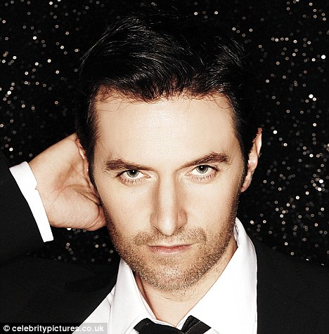
Colour can also attract attention. When it comes to paintings, for example, I personally often find myself drawn towards bright, fresh colours. They make me want to look at the painting closer. Dark brooding paintings initially hold little attraction to me – unless there is a spot of light(ness) somewhere in it that holds my gaze and which I will then examine in-depth. I had a similar reaction to today’s image which was suggested to me by KatharineD and to whom I hereby dedicate my *ooof*.
 What next, Mr Armitage? From a 2012 shoot for Glamour Magazine. Source.
However fashionable grey is, it is not a shade that usually attracts me. It was the yellow stab of colour that drew my eye into this image before my gaze obviously settled on the object of my general attention. Yellow – a colour of warning, used in warning signs; or a device of attraction, seducing bees to fly to flowers like women flocking to Richard Armitage. It often replaces the “colour” gold in painting, printed matter and textiles (cheapskates!!!). It’s the colour of sunshine, pleasure and light – but contradictorily and intriguingly also of envy and jealousy. And it makes a yellow car instantly recognisable as a NY cab. (Unless you are in Germany, where it is – rather mundanely – the colour of the postal service…) Oh, surprise, surprise, there *was* actually a cab in the image. And lo and behold, that meant that there was going to be some sort of scenario involving a taxi and my favourite pollinator… erm… actor. Only on second view I then started recognising all the other photographic tricks that would hold my attention – the subject placed bang in the middle of the image, the shallow depth of field that puts the subject into sharp focus and blurring everything before and behind him into secondary undistinguishableness, the sense of dynamics emanating from the scene, where a beautiful, extremely attractive, dashing man gets out of a car.
There is context in this image – not just a RL background with a discernible car that places the scene in a particular city – but the captured movement of the subject appeals to our imagination. Unlike a lot of studio portraiture with (more or less) neutral backgrounds, we are witnessing an incident – or life, or living, if you want. The subject has not been isolated from the every-day run of life but is shown in the midst of it. Even if this is an acted scene, it is RL context, and as such something that we can relate to because we have comparable RL experiences of our own. We can interpret such scenarios much better than just an isolated sitter on a box, in front of a white background, with only his face to offer any intrigue. It will therefore hold our attention much longer, because we have to read the signs. Where is he? He is in NY, because the cab is a typical NY yellow cab. What is he doing? He is getting out of said cab. When is this taking place? It must be autumn or winter because he is dressed in a heavy coat. And most of all: What is going to happen next? A staged scene will make us wonder what has been leading up to this moment and what is going to happen after. Our imagination is beginning to work its magic. This may well happen to *any* image of Richard that you see, simply because *your* imagination may *always* be inspired by the sight of this attractive, talented, good-natured man. But possibly more so when you have already been given a bit of context to work your fantasy in.
Richard’s facial expressions in such staged photo shoots are infinitely more varied than in the studio portraiture that we have seen so far. In the studio-portraits, more often than not RA adopts a smouldering expression – accompanied by the forward, under-brow tilt of the face. His eyes often show an intense gaze, a stare, almost. His brow tends to be static and therefore uncreased, and he does not often grace the photographer (and viewers) with (even a hint of) a smile. This may well be because it is harder to make a usually fleeting expression stay static on your face (see last week’s *ooof*) than to simply inflame your viewers’ ovaries with an intensive stare. It could be the go-to-expression that Armitage PR has settled on for fabrication of a particular representative perception of the actor.
Or is it good old-fashioned vanity? The practiced smoulder is a certified cherry-teaser, a validated ovary-burner and a guaranteed pant-ripper. I could go on with the similes, but I will refrain… *ooof* The RL expression could possibly be less than flattering – deep brow ridges, silly grins, geeky eyes. A picture statically posed in the studio is created in a much more controlled moment than an image made during an acted scene. But I would hate to think that RA is a “one-expression-man”, which is why I love getting to see images that show some expressive variety. Because we *know* that Richard is masterful at creating different expressions on his face. And it is quite possible that what applies to “The Man” in Judiang’s fiction is also true for RA – it is his business to *act* rather than to pose. It’s what he does for a living, it’s what he knows, what he loves doing and what he is good at. It makes him feel confident and comfortable. And with the expected rush of adrenaline and endorphins that comes with acting, he simply lets go and dazzles us. He plays another role and he is bloody good at that.
So what about that scenario. What story is this picture telling? Well, maybe the story goes like this:
“Stop, stop right here!” “What, now? But we are not at the hotel yet.” “No matter, stop the cab right now, I need to get out.” The cab driver managed to weave out of the traffic and brought the taxi to a stand-still at the curb in a Manhattan side-street. “24 Dollars”. He shoved a few Dollar bills into the cab driver’s hands. Why did these American notes all have to be green and grubby-white. They all looked the same. He had no time to sort this out now. “Keep the change”, he said curtly, didn’t even bother to put the remaining bills back into his pocket and reached for the cab door. — There she was, just a few paces away from the cab, walking up the street, with a determined step. He’d spot his old theatre-classmate from miles away, the dark long locks and the womanly, curvy shape, even when hidden under a knee-length winter coat. How lucky to catch her here, just while she was playing somewhere off-Broadway. He opened the cab door into the path of the sun-shade-clad woman. “A___, fancy meeting you here”, he beamed at her. — Katharine stopped dead in her tracks. It couldn’t be. Was this? Was this really? Was it her moviestar love interest, accosting her on the street? She nearly ripped off her sunglasses in an attempt to have a closer look. His ecstatic expression darkened. This was not his friend A___. How embarrassing. “Oh. No.” He was taken aback and surprised. “Not you.” It all came out wrong. Katharine scowled and threw her head back. “Well. I see. Not you, either”, she growled back. He opened and closed his mouth like a carp panting for air. “I mean, I… “ he scrambled for words while the attractive brunette with the lively twinkle in her eye shook her head and took a step to her right to pass around the door and move on. “Pardon me… I am so sorry… That was rude.. I didn’t… How can I… ” — The words still jumbled from his mouth unsystematically. Katharine moved on, reaching in her purse. She let the little white card fall onto the pavement at his feet with a noticeable flourish. “Favourites are roses.” He frowned, uncomprehending. She was already two steps away. “First drink is on you”, she threw over her shoulder, then flounced on without turning back. He bent down to pick up the business card. Richard steadied himself on to the cab door when he got back up and turned around, searching for her in the crowd. — She was gone.
All text © Guylty at me + richard armitage, 2013. Please credit when using excerpts and links. Images and video copyrights accrue to their owners.


Oh gosh why am I not asleep? Fighting such dizzy spells last night I had to resort to a cane. Not the kind of dizziness Mr. A causes, not nearly as pleasant. I love your scenario. I love those pics with the cabs . . . brain too tired to be very good at expressing my thoughts pre-dawn. Thanks as always Guylty.
LikeLike
Angie!!! Sorry to hear you are suffering a sleepless night (for the wrong reasons ;-)) At least you got to have another “first” here 😉 And thanks for liking my scenario – that is praise indeed, coming from my fanfiction-idol! Get better soon! x
LikeLike
*blushes* why thank you, lovely to have you as a fan, G. Our weather is veering back into summer temps and stormy weather, which seems to be having an unpleasant effect on me. Unsteady on my pins, woozy head. You’d think I’d been tippling.
LikeLike
Hope today was a better day in terms of weather. Maybe if you *were* tippling, it’d be better to endure 😉
LikeLike
In principle I would say I watch his pictures for the sheer context. As in *watching for the plot*. Of course.
But of course there is far more to it – and the wandering mind can’t be helped.
This story is really intriguing (and funny!). I wonder what the guy who drove the cab would be able to tell about that special day? Maybe he also noticed the sun-shade-clad woman?
http://www.taxihack.com/taxi_companies/manhattan/midtown/4140-budd-taxi-corp/4Y21
LikeLike
Oh, I know that you *all* watch for the plot and gaze for the context *coughs*. But what *attracts* your attention is the big question 😉
Love your suggestion for a different POV of the same scene. There’s your cue – you go and make it up 😉
LikeLike
This is one of my favorite photos Guylty- along with about 25 others. Probably because it is so NYC. My eyes are always drawn ( after the requisites appreciation of the subject) to the spot of red on the right.
And quick thinking on the part of the female – Katharine you, say? Lucky, smart Katharine-D-lightful.
LikeLike
Slightly distracting, that red wall on the right, no? I suspect the image would have not passed muster for a photographer – not ideal in its colouring, but it is strangely attractive, nonetheless. (It is most definitely not a still, anyway.)
Thanks for commenting, Perry x
LikeLike
Oh I do think it’s attractive. It adds another pop of color, and I think the placement is just right. Yes, this is not a still, I think because there is a video of this fashion shoot.
LikeLike
Oh, I know that. I am surprised, actually, that we haven’t seen any stills from *this* setting yet. If you remember, the other part of the Glamour video has a loft setting, RA wearing striking red-backed waistcoat – but there are actual fashion photos by Anders Overgaard in the Glamour magazine article. I am confused over the one taxi image that is in the article – it looks to me like a screencap/title image of a video clip that is included as an extra in the digital version of Glamour?
LikeLike
Yeah- why would they dress him and get him outside just for the video? But if they haven’t released them to date, is it likely Glamour ever will?
LikeLike
! red wall?! ah, yes 😦
LikeLike
*muhahaha*
LikeLike
I know! When I read that I was like “red wall”? and had to scroll back up to have another look! Can’t imagine why I was so distracted that I missed it each time I’ve looked at that picture – not that I’ve looked at it often of course. 😉 *cough*
I loved the Glamour video, particularly that scene where he walks out of the steam towards the camera pulling on the above coat! *goes weak at the knees*
LikeLike
(Damn, I just had to re-watch that video. What a nuisance!!!) I found the scene you are talking of was almost like a moving picture – probably because there is no talking in it, and it is quite clearly done for the camera – and yet more posing than acting. Intriguing actually.
LikeLike
something surprising that I’ve noticed since paying more attention to the details in photos (thanks to you 🙂 ) is that I enjoy the off-centered subject. that is surprising because everywhere else in my life I crave symmetry! I especially like it if it’s just empty space filled by color. I also enjoy the pictures within a real life setting because it tells a story. that is not surprising, because I love stories 🙂
LikeLike
The off-centred composition and the inclusion of negative space are great directional devices. Symmetry – although outwardly pleasing to the eye – is somewhat predictable. It has become quite conventional, at this stage, and the off-centred composition seems to be more favoured at the moment. However, we (here, in the *ooof* context) may also have become more appreciative of it because we get to see a lot of images of RA that have been produced for (fashion) editorial purposes – and for that the magazine designers need empty (negative) space to place their text on… We are used to seeing images like that, in short.
RL settings are another thing that could possibly be connected to the prolific nature of fashion photography, which are at the moment inclined towards elaborate settings and contexts, rather than clinical backdrops with a mannequin-like sitter who is modelling clothes.
LikeLike
Am I the only one who, after my initial “God someone REALLY needs to remake all of the Cary Grant/Gregory Peck Hitchcock films!” was to check out the lettering on the cab. I didn’t even notice the red building until I read the comments. But the more I look at it, the more I agree with Perry. The red is a nice complement to RA’s grey ensemble. I especially liked the narrative you provided, Guylty! And there is a nice bit of thumb porn, too, Servetus.
LikeLike
OMG – I never copped on at all, Chaifreak. Not even to i.f.’s link – she was referring to the RL cabbie!!!!!!!!!!!!!!! *eeeeeeeeeeeeeek* And I was self-absorbedly only thinking of my ficlet *hammers forehead with fists*. You are absolutely right. Anyone want to make contact *ggg*???
On Grant-Peck-Hitchcock (somehow that sounds mildly dirty *hm*) – Armitage is classic B/W-filmstar-material – I am long waiting for some remakes for him to star in. I will then volunteer to do the shoot of my dreams with him – some good, oldfashioned Hollywood Glamour a la Hurrell. (I am still rooting for Roman Holiday as a remake, btw.)
Still not convinced by the aesthetic qualities of the red wall in this shot, but that is completely subjective on my part 😀 I was, however, very aware of the thumb porn, too…
LikeLike
LOVE old movies, love Hitchcock, every time I watch one of his films with Grant or Peck or even Stewart I find myself imagining RA in a remake. Roman Holiday would also be great. *sigh* He has that old-fashioned silver screen allure. In spades.
LikeLike
I like to imagine him in a remake of Notorious.
LikeLike
Oooh, yes, that would be great. With the right actress with whom there was great screen chemistry.
LikeLike
I think I have not watched ‘Notorious’ (gap in my cinematic education, I know), but I’d love RA to inhabit any role that Cary Grant or Gregory Peck have played…
Oh, and thanks for your comment, summerswiftly!
LikeLike
🙂 Very promising begining,Guylty!
I like our confident and flirtatios heroine, Katharine (D)? 😉
PS: I love intriquing photos..just like this one..http://wiadomosci.gazeta.pl/wiadomosci/5,114944,14401301,Cyganie__USA___uprzywilejowany_moment___
LikeLike
Hehe, are you implying that I should continue the story, Joanna?
Your link doesn’t work – and I am soooo curious. Post again?
LikeLike
Oh, Sorry…I’ll try once again http://wiadomosci.gazeta.pl/wiadomosci/5,114944,14401301,Cyganie__USA___uprzywilejowany_moment___Najlepsze.html?i=2
LikeLike
Ah yes, that works – incidentally I have seen those images before – recommended by a Polish friend! THere is a lot in Tomaszewskiego’s images. He does highly aesthetic documentary, very very arty, and yet straight into the heart of the viewer. That would be another approach I would love to adopt if I were his photographer – aesthetic documentary: He provides the aesthetics, I document 😀
LikeLike
It would be great,Guylty 🙂 BTW, I’m just hopeless , perceptively and technically challenged 😦
LikeLike
🙂 ..and again..
http://wiadomosci.gazeta.pl/wiadomosci/5,114944,14401301,Cyganie__USA___uprzywilejowany_moment___Najlepsze.html?i=2
LikeLike
First up, let me say a HUGE thank you, Guylty- this is a splendid ‘ooof’ and I’m very pleased to have my name attached to it (even though its not even my birthday!).
I love the outdoor setting- the busy metropolis where there’s always something happening. It makes me think of ‘Breakfast At Tiffany’s’, a world where fabulously well-dressed people step out of taxis and go about the business of leading effortlessly glamorous lives. RA is certainly dressed to kill here, and because of the dark clothes my eye is drawn not only to the bright colour of the taxi, but also the lovely pale skin of his face and hands.
What to say about your little scenario? I like ‘this’ me- quick-witted, sassy and alluring. In reality of course I’d be the one doing the stammering in the face of all that elegant male beauty, but I do have a business card I could fumble into his hands given half a chance.
Once again- thank you, thank you!
LikeLike
Dear KatharineD – you are very welcome! I love having images suggested to me, as I said before, because I usually do not see the wood for all the trees… This was fun to do because it was the opposite of all my chosen shots (which tend to be studio-based) – and I am glad to have seen the merits of it. Plus, I loved veering into fiction, again. So thanks to you for choosing wisely 🙂
Oh yes, he’s all too believable as one of those effortlessly glamourous people. Although I wonder whether he’d take that as a compliment…
LikeLike
Well, that’s only in my own little fantasy world, of course and as with Holly Golightly in Breakfast At Tiffany’s, the image often belies the reality hiding away underneath. Would I rather meet elegant Armitage on the streets of NY or plaid shirt/ Todd Snyder jacket RA? Hmm……
I realise this image didn’t lend itself so much to close photographic analysis as the Ascroft shots, so thanks for stepping out of you usual milieu for me- much appreciated!
LikeLike
I just read all the comments further up after I posted, and can I say a thousand times yes to a b&w classic remake for RA. ‘Roman Holiday’ would indeed be fabulous, or on the Hitchcock side of things, Maxim de Winter in ‘Rebecca’ would most certainly fill the bill. All done in proper period detail, naturally- none of this updated, modern take, thank you.
LikeLike
Oh, I wouldn’t mind a contemporary re-make, either. In fact, I think that would add a nice twist to those films. But then again, with “vintage” being all the rage at the mo (‘Mad Men’ etc), a “period” interpretation would certainly go down well, too.
LikeLike
Stupid WP ate my comment…I’ll try to remember it. I know it had something to do with being able to utter nothing intelligent when faced with some of these images. I do really like the gaze here that appears to be drawn off by an outside stimulus. I will cop to being slightly discomfited by the penetratingly direct gaze of some of the studio shots.
Classic film remakes? Right on! I like Roman Holiday…Love Rebecca – what about Spellbound? Sigh, so many role fantasies, so little actual role news!
LikeLike
Haha, Obscura, join the club – I usually stare for a few minutes, open-jawed, drool gathering, before I can pull myself together to find some vaguely intelligent things to say. Takes a lot of willpower 😉
I have this theory that RA is better at posing when he is given an “outside stimulus” as you put it. Or certainly his range of facial expressions is wider. That’s why I would favour a more documentary approach for a shoot with him.
‘Rebecca’ is a great idea. He *is* Maxim de Winter. *ooof* ‘Spellbound’ is another gap in my education. Looks as if I need to get my hands on a Hitchcock box-set…
LikeLike
OMG! I know exactly where this picture was taken. When Perry pointed out the red wall, I thought to myself that it seemed familiar. Well, I walk past thT spot every day on my way to and from work!! It’s the place I always had a fantasy that I would see RA. Now I know why! I did see him there! (In a picture!) It’s right by the Teibeca Grand Hotel – where I imagined meeting Mr. A. in one my blog posts! LOL Happy now!
LikeLike
OMG!!!!! How cool is that, Marie. Oh man, I so wish you had happened on that shoot that day. When the hell were they shooting there, what time of day was it? Would there have been a chance that you *could* have walked by? Is it a really quiet street (it looks pretty empty in the shot – much unlike my imagined scenario for the *ooof*iclet above) or did they have to close it for through-traffic for the shoot?
Have you already left work or will you be walking down that street now? Stop there, where the cab must have been, and drop to your knees and kiss the hallowed ground where once l’Armitage walked… *hehe*. I know that from now on you will always walk through that street with a big grin plastered on your face, lucky you 🙂
LikeLike
When I was walking to the subway I suddenly saw the red wall! So I stopped and stood there to look around to make sure. There’s we’re the buildings with the fire escapes right in the left hand corner just like the pic ! It’s a busy block and the cab is pointing in the wrong direction from traffic. If I did see the shoot it would have meant nothing to me before January of this year. They do lots of shoots in that area.
LikeLike
Ah, of course – it was done some time last autumn, I guess. In any case, I am sure you feel some sort of connection with that street now. I have a similar thing with a house in a street near-by. No, Armitage has never been to Dublin, but there is an office building in a Georgian street, and above the characteristic neo-classical columns of the doorway the letters “ARMITAGE HOUSE” are written. Every time I walk past there, I smile broadly. http://24.media.tumblr.com/tumblr_m336fiRqtP1rug3xvo1_250.jpg
LikeLike
Is this the same location as in the one above? The traffic all seems to be facing the same way as the taxi in this one so I was curious.
LikeLike
Oops! Should have read *all* the other comments before I posted this! 😦
LikeLike
I understand RA is a fan of North By Northwest; could he be tempted by a remake of that, including the adorable scene in which Cary Grant tries to hack through his stubble with an undersized razor? 🙂 Time to put that Thorin beard to the blade!
Seriously, given the number of vintage enthusiasts who actively cultivate mid-century styles, it would be interesting to remake those films as stories role-played in a contemporary context. We might love Audrey’s Givenchy dresses and Grace’s wardrobe by Edith Head, but how would we as modern women deal with the 1950s social mores? (Example: An American In Paris, the 2013 remake. Me to Gene Kelly’s sexy sexist pig: “You are hot, but you are loathesome. I’ll pash you, I’ll shag you, but I am so not hanging out with you. And you are not my Facebook friend.”)
LikeLike
North by Northwest is a personal favorite of ours, too. In part because we used to live very close to Mt. Rushmore, where the exciting denouement takes place (well, the replica of it, of course). Having read a recent bio of Hitch, I think someone like Richard—handsome, charismatic and possessing a dangerous sex appeal with a dark edge—would have been just his sort of leading man (due to the studio system in place back then, Hitch had to settle for actors that were not his first choice in some of his films).
LikeLike
“handsome, charismatic and possessing a dangerous sex appeal with a dark edge” – I like that description very much. UNF.
LikeLike
That’s exactly why I am so interested in contemporary re-makes. Not just for the easier identifiability (is that a word?) with plot and characters because they look like us, but because they are operating within the changed parameters of society and social mores that we are used to. As much as I love the screwball comedies of the 50s, there is always something slightly disturbing about the expected end-result of “happy ever-after wife of successful, attractive man/will look after kids and make a beautiful home” – nothing wrong with being a homemaker *at all*, but the meek submissiveness of the implied female gender role always gets my back up. For that matter I loved ‘Sparkhouse’ btw, because it turned the roles around and used ‘Wuthering Heights’ as an identifiable starting point without clinging to it too much.
LikeLike
False alarm. 😦 I went and looked at other pics from that shoot and it’s def not my location. Oh we’ll. It was exciting though! LOL! I’ll take a pic of my location to show you. Phooey. :))
LikeLike
*eeek*! Whot???? Oh no. I am gutted. Somehow I was living this through you 😉 Ah well – still wanna see that picture!
LikeLike
Looks just like it until you look at other pics.:(( So sorry, G,!! 😦
LikeLike
It was good while it lasted though, eh? 😉 But hey, at least it made you look around yourself and see the dreary old way to work through new eyes *she says, ever the optimist*…
LikeLike
Yup. I’ll never look at that nasty red wall the same way! 🙂
LikeLike
psst….Guylty…OT, but I just updated a certain fic 🙂
LikeLike
yaaaaaaaaaaaayyyyyyyyyyyyy!!!!!!!!!!!!!!!!!!!!!!!!!!!!!!! Brilliant, thanks for letting me know! xxxxxxxxx
LikeLike
there is actually a way to subscribe to the story updates on any story that you’re following if you’re interested, I’ll email it to you.
LikeLike
yes, please!
LikeLike
I agree, I like the “outside stimulus” theory, although putting the words stimulus and Richard together doesn’t evoke discussions of photography to me. But I digress, I like the drama viewers can play out in their heads with a natural setting like this. And I love your fic, guylty, well done.
LikeLike
Hi Kathy, and thanks. Yep, one has to be careful how to phrase things in the context of RA *ggg*. Armitage is one big stimulus himself, so to speak *coughs*.
LikeLike
*ggg* Hot damn, Guylty, I love your *ooofs*. The potent combination of humour, erudition and cue to sinful fantasy, er, I mean, divergent thinking is just what a good education should be!
Your discussion of yellow made my mind diverge … via plausible RL scenarios (as Melbourne also has yellow cabs and, I am pleased to say, quite a lot of good-looking men) all the way back to whence I first beheld the Armitagean splendour, in North and South. In the Victorian language of flowers, yellow roses symbolised love unrequited or forsaken. I like how Elizabeth Gaskell defied that cliche by using the yellow roses of Helstone to symbolise the ardent, undying (torrid, bosom-heaving, ovary-bursting) love that brings John and Margaret together after all seems lost. She was indeed a subversive wench, that Mrs G.
I wonder if ficlet RA will send yellow roses to Katharine D?
LikeLike
Oh Groovie – you always make me laugh… “sinful fantasy – divergent thinking”… you could say that *coughs*. I had to look up the word ‘erudition’ – and my bososm swelled up about 2 inches when I found out what that means 😀 Thank you! x
Thanks for the explanation re flower/colour symbolism. That is an interesting little fact about N&S… And while I had red roses in mind for ficlet RA to send to Katharine as an apology, I think the yellow ones are much more likely. Plus, it would be one of those little facts that he might possibly know and play on, himself…
LikeLike
I finally get to read your *ooof* today, well it is still Tuesday here for a bit. I had to wait till I was destressed (If that is even a word, if not it is now) to read. It has been a bad day to start, but knew it would be for awhile. I sure could have used a RA looking like that when I was going in for my meeting this afternoon for my dad (ok he would have had to shed the coat, or die from the heat, over 90 F today). He has that “I am confident and know what I am talking about” look to him and I really needed that in spades today. All is better when I left the meeting and I am feeling better now.
Your *oooflets* are turning out very nice. Keep up the good work!
LikeLike
Sorry to hear you had a bad day. Hopefully all over by now.
Thanks for cheering me on re. ficlets… I am beginning to get a little taste for it.
LikeLike
[…] (gettin’ there) our hearts persistently a-flutter (there we are!)? Paula Parrish for Fault. Anders Overgaard for Glamour. Robert Ascroft. And now we are looking at Ben Rayner, probably one year on. Just […]
LikeLike
*ooof*: Baby, It’s Cold Outside | Me + Richard Armitage said this on September 10, 2013 at 9:53 am |
[…] portraiture via fashion to commercial and travel. His imagery is crispy clear with a lot of detail. ooof […]
LikeLike