
*ooof*: An Act of Philanthropy
A new image! Oh, if that isn’t something that gets the Army excited… Even after a flurry of photos from CinemaCon, WonderCon and the Empire Jameson Awards. But wait… hold on… something looks familiar.

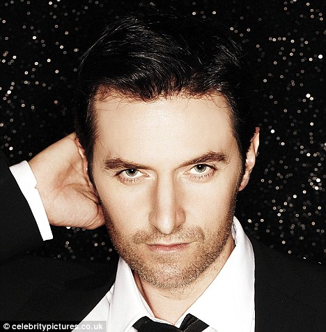
Benign, poised, demure Richard Armitage in a shot by Sarah Dunn 2014
A b/w of Richard Armitage – dropped into our laps like an act of philanthropy after sufficient teasing by someone who knows how to use the marketing tricks of the trade photographer Sarah Dunn. I had expected an as yet unseen image from Dunn’s shoot with Armitage last year. Instead we receive something current *yeh* with the sleeked-back let’s hide the 90s footballer ponytail *meh*. Initially I was slightly disappointed as this looked like a half length of the larger group shot that Adam Brown photographed from the current Empire “Director’s Cut” edition and tweeted. But careful perusal revealed that this is actually slightly different – and flummoxed me as much as it delighted me in the sense that it is always nice to see a new picture of Mr A. You see, I got completely sidetracked by the whole issue of fake group shots, because I initially assumed the image of Armitage, Nesbitt, Brown and Fry which this single portrait harked back from, was a composite. And I launched into a whole spiel on how composites are created when I prepared my notes for this *ooof*. I might as well use them now…
In the day and age of the global village, with people moving fast between places, getting six people onto the same set for the sake of a 20-minute photo shoot is near impossible. Busy schedules, promo obligations and acting engagements make it unlikely that six actors can find the time to be in the same place at the same time. Luckily, with digital photography, that is not necessary anymore, because group shots can be easily constructed as a composite – and without the unsuspecting public noticing the fake group conviviality. The photographer can shoot person 1 in London, person 2 in New York and person 3 in Timbuktu with three weeks in between – as long as she keeps all details (save the sitters) identical. So with the camera always at exactly the same spot, the same height, trained at the same angle, used with the same aperture, shutter speed, WB and ISO, and the lighting set up the same way – intensity, angle, attachments – it is theoretically possible to shoot individual portraits that can combine into a composite in post-production and still appear like one organic shot.
With the group shot of Armitage, Nesbitt, Brown and Fry I had assumed that Dunn had her camera and settings “frozen” and then got the four actors to pose one by one, to later photoshop them into one image. I had worked on the assumption that those four busy, successful actors would not be in the same place at the same time to pose together. A suspicion that had been fuelled by the fact that Armitage had been flipped in the group shot for Empire.  (Trust the fans to notice that. We *know* where the man’s hair parting sits, which side he wears his… tie clip (!!!), and how his smile always edges up on his left cheek.) That is until I copped on that there had been an opportunity for them to get together – the Empire Jameson Awards. So bin all my notes about composites and start anew. But no, bear with me, I am getting into some “investigative photo critique-ing”
I looked back at the single portrait of RA, suddenly realizing that here was an image that had not been flipped horizontally. The parting was on his left, the tie clip on the right, and smile sat on the usual corner of his mouth. But what surprised me was that his posture in the looked identical to the one in the group shot. In the group shot tweeted by Brown, RA appeared flipped – parting right, tie-clip left. As the body posture looked so similar to the single portrait, I got sidetracked into believing they had actually flipped and photoshopped RA’s head onto the group image, but no – his whole body was flipped (indicated by the lack of breast pocket in the group shot, hidden by the lapel). However, what still stood out was that neither Nesbitt nor Brown are flipped, but both RA and Fry. Two conclusions: Nesbitt and Brown were photographed together. And Fry and RA had to be flipped for the final composite because of the larger arrangement of the group including youngsters Sophie Turner and Thomas Brodie-Sangster, who probably were shot separately from the four men. I presume, they flipped RA for composition purposes: Had he sat with his back towards the two youngsters, the image would have appeared to have two separate groups of people in it. The way it is now, Armitage acts as the hinge that joins the two groups: His body is turned towards Turner and Brodie, his head is directed at the camera, and his placement slightly in front of Nesbitt anchors him to the group to his left.
On the issue of flipping an image – is it allowed? Well, anything is allowed, when it comes to Photoshop. But there are always little hints, and to the discerning viewer, manipulation is stands out like a sore thumb (or a characteristic crooked nose, as in Fry’s case). While it is easy to cut individual figures out of a picture, the pasting back in usually is much more difficult. Joining two groups together – even when the lighting and set-up have been meticulously preserved as in this instance – is always tricky. It is hard to find exactly the right spot on an image to place the cut-out on, for instance. When a figure in an image appears to be floating, you can be sure that they have been photoshopped in. Also, getting the respective heights in correct relation is equally tricky (Is Sophie Turner as tall as RA? Well, possibly with *those* chunky heels…). Sometimes you can tell an image is a composite when you look at the less conspicuous or interesting details such as the backdrop or a patterned carpet. While the backdrop here looks continuous, the carpet pattern shows some irregularities where the pattern doesn’t really match up (check in front of Sophie Turner and between RA and Brown). But hey, those are niggles.
As for the single shot of RA that I *really* meant to get into today – I think what Dunn does really well is conversion into b/w. You may not like her set-ups (the fake film noir – although I do not find this image noirish at all; it does not have enough strong shadow for that) and her penchant for strongly, discernibly posed images, but she creates very good b/w versions of her colour images.In this one she has chosen to add some visible smudge effects around the sitter – possibly to conceal the backdrop. I actually like the way she creates the impression that RA is sitting with his back to a corner. What I have noticed in a couple of her images already is that she manages to place extra emphasis on the sitter’s face, and his eyes in particular. (A definite favourite of mine in that respect is the shot of RA in leather jacket, gazing up to the heavens…) This image is another example. Note how you can even tell from this b/w image that the sitter’s eyes are of light colour, i.e. blue. I assume this is due to Dunn applying a yellow or possibly green filter when she converts her images into b/w. The yellow filter makes blue appear lighter; green would make skin details appear slightly more “rugged” – lines, as well as stubble and note how “beardy” Mr A looks in this image… (A blue filter would lighten the blue eyes even more, but had she used that, his tie and suit would probably look lighter.)
I have read criticism of the photographer’s decision to blur out the beautiful hands. I personally think it is in keeping with the blurry, vignette-y effect of the image that the hands appear smudged. They are only on the margin of the image, and by blurring them out Dunn puts more emphasis on the parts of the image that are in focus, i.e. the head. A closer crop might have been advisable – making this portrait a head-and-shoulders rather than a half-length/seated portrait. Overall, I find the edit rather well done – the composition is pleasing to the eye with the head in the lower half of the upper mid third. The pose is a little bit too demure for my liking (the clasped hands), and more suitable for the corporate portrait of the scruple-less CEO of a predatory multinational who wants to look like a philanthropist (the minutely inclined head – that is probably the *real* Armitage coming through?). I do like the facial expression Dunn has caught Armitage with, though – there is a bit of humour in the eyes, yet sufficient mystery around the closed mouth with the typical Armitage non-smiling smiling lips to keep the viewers’ attention or maybe that is just us…
Someone comes to mind…
“You need some good press, Thorin.” Balin was unhappy with the latest press coverage that Erebor Mining Co had received after the debacle with the Industry Awards. Not only had Thorin’s childish, abrupt manner at the Elrond dinner filtered through (some of the house staff obviously could not keep their mouth shut), but Thorin’s dance floor escapades after the awards ceremony had also found their way into the tabloid press. With new revelations about the apparently hereditary greed of the Erebor family – in the light of multiple acquisitions that Erebor Mining had recently and quietly conducted in the background, industry commentators had warned over an impeding market monopoly, should Erebor win the contract on the Lonely Mountain site against Elrond Industries, Thranduil Co, the Eagle Estate and Dale Developers (dubbed by insiders the “Battle of the Five Armies”) – Thorin badly needed something to boost his reputation.
The opportunity to prove Thorin’s philanthropic credentials to the press vultures, and the wider public, arrived in the post a couple of days later. Balin practically bounced with excitement, as he handed his CEO a letter from a little-known charity. “This is it. Read this, and I tell you what to do!” Thorin carefully scanned the letter.
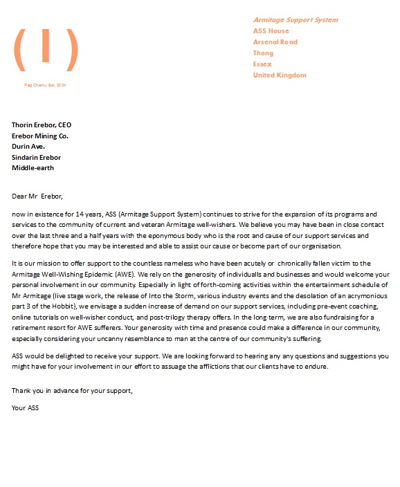
A wide smile plastered itself on the handsome mining tycoon’s face. “I see. An unrelated cause to show that I care. This is made for me. A few donations, some public appearances in support of ASS, heck, I will suggest myself as patron of the ASS! They need a figure head for their cause, and I have got the right head for that”, Thorin’s eyes twinkled. “Good thinking, Balin. Now, get me that photographer on the phone. I need a portrait session. And I have just the right pose in mind that will cement me as the benign patron of a good cause.” He paused. “Let’s just hope I won’t make an ass out of myself in the process…”


Patron of ASS. Perfect. 🙂
LikeLike
😀 All the acronyms that came to mind started with a…
LikeLike
I think this is my favorite ficlet of yours so far, Guylty! Great job!
LikeLike
hehe The ficlets that reference the Army always work best 😉
LikeLike
LOL i required ASSistance from my ASSociates in recovering from laughing ASSault caused by this ficlet. I ASSure you I will be fine after a short rest, and ASSign no blame to the author for being excessively hilarious.
LikeLike
giggles oh, there is so much room for acronymic fun… I settled on ASS because it was shorter than PEACH. 😀
LikeLike
I’m rolling. ROLLING. On the floor, laughing my, well. You know… off.
I’m down with ASS! Or shall I say, Up with, oh dear dear dear. What would the rallying call for ASS’ supporters be? — And I love “Thong”. Oh. So many good things here.
This has spectacular cheek. It’s well-rounded. I have no rebuttal. I’ll stop. dies
I’m in love.
LikeLike
grins I m glad you noticed the little details, too :-D. I actually had to do some research for that. There are some very, very naughty placenames out there in the world. Unrepeatable. And Thong actually exists!!!
LikeLike
Ha!! Really? Oh, lord, am I glad I don’t live in Thong. :}
LikeLike
The LOGO sets off again
LikeLike
That was the hidden bonus for the readers who are visually inclined. 😀 If I had had more time, I would have experimented more with the logo. I wanted the open bracket to have a round A nestle in, the close bracket and the line in the middle to be Ss.
I hope you also noticed the colour choice. It was very deliberate.
LikeLike
I did. I felt I should limit how many things I commented on. snort Because otherwise I would simply comment on EVERYTHING. Brilliant. ❤
LikeLike
blushes – glad you like it so much. Fun is the best way of dealing with all this, isn’t it?
LikeLike
I think so. Otherwise we’d go spare. :}
LikeLike
Damn, just noticed several mistakes in that charity letter. For starters, ASS has only existed for 10 years. Grah…
LikeLike
OH, what fun! I have been so out of touch between work for PRP and also freelance newspaper stuff, it was a pleasure to just chill and read this . . . and smile. You are right, the blurring of the hands fits in with the whole editing style of the image–I just love looking at those beautifully sculpted digits so much, I tend to miss them when I can’t get a proper look-see. I dearly love the expression on his face. Humor and mystery mingling. The enigmatic bonhomme.
LikeLike
🙂 I’m extra-pleased to hear that you used the ooof and ficlet for chilling. I must be doing something right 😉
You are right about the “digits” – they are nice to look at and it seems a shame to disguise them. But “editorially” the decision seems right to me.
LikeLike
Reblogged this on the armitage effect and commented:
This “ooof” is particularly fun. 😉 Enjoy!
LikeLike
Thanks for the reblog 🙂
LikeLike
fantASStic!
I don’t think about the image flips, so I was really interested in that. Also, I totally agree re her relative skill with black and white. I’ve liked those photos best — it’s like her penchant for the atmospheric doesn’t get quite so overwrought in b/w.
LikeLike
Ass-some ;-)… I couldn’t really say that I like the b/w work better. For me a lot hinges on the pose. There were a few colour images that I really liked. But the pared-back b/w were my favourites.
LikeLike
LOL! I’ll just cut to the ch-ass-e and call this “ass-tastic”!
LikeLike
I know that this ficlet is definitely going to come back to bite me in the ass. Eh. Ooops.
LikeLike
subscribing.
LikeLike
These ficlets keep growing funnier. Oh God, Patron of the ASS XD
Brilliant!
LikeLike
😀 – remember, this is Thorin, not Mr Arsitage, ooops, Armitage.
LikeLike
*Assitage
LikeLike
Hahaha, yes, that comes to mind…
LikeLike
😛
LikeLike
My husband calls him Thorin Oakenchump 😉
LikeLike
Aw. Oakenhunk more like 😉
LikeLike
But is a composition so apparent like that group picture really a good job? That photo leaves a sour taste – to my mind. But I am not objective, I admit ;-).
As for the other Dunn photos of RA: the one in the leather jacket has become one of my RAvourites up to now!
Thanks for your ooof and the brilliant ficlet! LoL!
LikeLike
I am not sure whether the composite would have been quite so apparent had Armitage not been flipped in it. That’s what made me look twice and examine it closer. But that is you and I, who are fans and therefore more observant. I don’t think it would’ve been so obvious to the wider public. And most of the time we (still) give photography the (undeserved) benefit of the doubt and accept it as authentic.
Glad you liked my cheeky little scenario 🙂
LikeLike
XXXXXXXXXXXXXXXXXXXXXX Great piece guylty. And I had thought he looked dressed for church but like your idea better, the CEO pose. Not always attracted to B&W but this one is excellent and the ficlet is perfect.
LikeLike
I really am not that fond of the pose with the folded hands. Altogether too goody-goody. Or, as I misread Servetus’ tweet, too “corporate sexy” 😀
LikeLike
🙂
LikeLike
All your comments are so funny to read – I just don’t have it in me. Way too serious some times. Anyway, there’s something about this shoot…
It suddenly dawned on me what it is about this actor that appeals to me.
His eyes…Oh, man…his eyes!
In what I too would call “a corporate picture”, these eyes are at the same time…empathic, kind, apprehensive, guarded, penetrating, and…even devilish (perhaps this has something to do with the lighting of the b/w). But, holy m…, those eyes.
You can write about his assitage, but I’m all for the eyesitage (No, no, won’t go there:-))
LikeLike
eyes, eyes, baby.
LikeLike
ROFL
LikeLike
Thanks Mermaid 🙂 . As a German, I am naturally humour-challenged ;-), but somehow the fun just flows. And what can we do but laugh at ourselves…
Yes, Dunn really has a thing with the eyes. Have you looked at that leather jacket shot? That one really does it for me – the light blue seems to radiate from that one. Not quite as pronounced in this shot.
Eyesitage LOL
LikeLike
LOL! ” Eyesitage stare”.. he almost got a squint here..don’t you think, girls?
LikeLike
I agree, Guylty, Dunn portrays the eyes really well. Although I’m not too happy about the pictures in the pool where our hero hides (from the storm?) on/behind a ladder. Tracy Nearmy’s pictures are much more to my taste; particularly the picture from which Servetus got her current eye-banner also got the eyes spot-on.
The eyes are the entrance to the soul, and the reference to ‘ice ice baby’ is just perfect, Servetus. Though hip-hop is so over the top, there’s a line in there “turn off the lights and I’ll glow” which makes me laugh when I think of RA and his amazing eyes:-)
Any ‘squint’ could be RA’s attempt to stay focused amidst all this gushing giggles.
LikeLike
A pool. It was a pool!!! I never copped on where that Dunn picture with the ladder was taken. Your interpretation makes perfect sense. (I still think the image of RA behind the ladder is ridiculous, though.)
LikeLike
Well, he’ll have to hold on to something. There’s a storm going on:-) When I first saw the picture, I thought it was inside a submarine – What the h… is RA doing in sub? But it’s got to be a pool – the colour of sides alone…
LikeLike
Yes, I think you are right – it is the inside of a disused pool. See, I had it placed on a rooftop, a ladder to a chimney pot, and I had assumed the blue hue of the walls was actually white that turns blue when used with an irregular WB setting. But a pool makes much more sense.
LikeLike
It’s safe to say that those pictures are not our favorites. I didn’t even consider filters – See I’m learning about photography. This is such an amazing forum. I hope you have a great day:-)
LikeLike
Great if there is an educational side effect to this 🙂
And a lovely day back to you, Mermaid ❤
LikeLike
Helpless giggles as usual… And Thong could only be in Essex 😉
You’ ex surpassed yourself, Guylty! 😀
LikeLike
ggg I admit, I am not as funny as I pretend to be. I researched for “placenames with arse in the title” and came upon a site that had “rude placenames”. I wish I could unsee some of them. Thong was perfect – and still acceptable enough for consumption by well-educated, Radio 4-listening well-wishers 😀
LikeLike
Loved it! And I LOVE the demure Mr. A. with the twinkle in his eye.
LikeLike
he’ll sort out your corporate problems … and then he’ll love you in an elevator 🙂
LikeLike
Yes, please!
LikeLike
Well, the twinkle cancels out the demure… 😉
LikeLike
Reckon Mr Thorin Erebor CEO should move his mining operations to Australia quick smart; he’ll find some easy dirt, easier tax laws, cheap imported labour and a compliant federal government here, no worries. And I could take a price-inflated charter flight to meet him about getting positive press on the Sydney-Melbourne axis, heh heh.
That is most fASSinating about the yellow, green and blue filters to make those beautiful eyes pop
As for ASS, it certainly has a ring to it 🙂
LikeLike
Hello Groovie :-)!!! “The Melbourne-Sydney axis” had me in stitches. I am sure Erebor Mining Co. is going to expand, no matter what.
Oh, and I hope the ass (ASS) in question has no ring on it ouch.
LikeLike
Brilliant ficlet Guylty…the clever little details you’ve included, I love it! 🙂
As for the photo, it’s his eyes that draw me in – they are stunningly beautiful – but overall the shot is a bit “meh” for me. I didn’t get quite the same hit to the feels as I usually do, unlike the candids from this event, which had me positively drooling.
LikeLike
I have to agree with you – it wasn’t the kind of immediate “WOW” that other images have ellicited from me. Last year’s RARA, for instance, had my insides afflutter the second I spotted each single one of them. (And they are still among my favourites.) Some of it may be due to this image only existing in relatively low resolution. The bigger a picture, the better to see all the details. Having said that, not all photographic styles appeal to me, and this one, for instance, although executed nicely, is not my thing, either. I like it big and sharp. I wasn’t enamored with the press photos of the event, either, but that is a purely personal opinion based on my dislike of formal wear and ponytails…
LikeLike
Thanks for the perfect end to the day. Those ficlets keep getting better and better. Love the new photo, adds to the perfect end to the day thing going on.
LikeLike
Hello Katie!!! Nice to hear from you again. I am glad this brightened up the end of your day. 🙂
LikeLike
LOL! Guylty !You yourself are ass ..I mean ace of philanthrophy ! Thanks for the laugh! 😀
LikeLike
giggles I sure am an ass, too, for losing my mind over an actor, like a teenage girl… And I love it 😀
LikeLike
I worship you, smart ass! 😀
LikeLike
ROFL – you are just looking for an excuse for your fangirling 😉
LikeLike
LOL! it’s an exuse for using the world “ass” 😀
LikeLike
Where are the days that a photography could be used as an evidence? Gone… Your analysis of the pic is illuminating as always, and the ficlet… 🙂
Corporate identity pic, where are the job advertisements of Erebor Mining Company?
LikeLike
Seriously. Dibs on personal assistant to Mr. Erebor!
LikeLike
LOL – a much coveted position.
LikeLike
Yup, photography is manipulated, all the time. But it has also given us more artistic scope – and possibly more to write about and discuss…
Great point about the job ads for Erebor Mining Co. The management positions are all taken by Thorin’s pals… no career in that macho mining environment for us 😦
LikeLike
Patron of the ass. snort You kill me, Guylty.
LikeLike
😀 Sorry. Not sorry. It had to be said. Sooner or later 😉
LikeLike
Very UNINTERESTING photo…..
Yes, boring shirt/tie corporate.
LikeLike
So funny!
LikeLike
Thanks for the comment, and welcome!
LikeLike
Cheers Julie 🙂
LikeLike
[…] Dunn is the only photographer who seems to have photographed Armitage more than once. She produced an early headshot in 2002, and a series of photographs in 2013. Varied in style, her images are often monochrome and deliberately colour-drained. Watch out for her focus on the eyes. ooof ooof ooof ooof ooof ooof ooof […]
LikeLike